2. Main Product... We chose to place our artist on the pavement of a very busy road, we then increased the speed of the shot in order to show the movement of time, suggesting that time is moving too fast for the lovers while one of them – the female artist - stands still. We used this aspect of the music video in colour due to it being placed in the chorus – where the music is at its climax. The implication of distance is effective because it provides the narrative. We decided to pick out a line from the first verse ‘I’ll find a map and draw a straight line’ followed later by ‘the distance from A to where you’d B.’ Due to the main implication of our product being about distance between lovers we felt it would be effective to portray this through quick shots of a map. We used cuts and fast paced shots within the opening of the song’s slow tempo. The genre and mood are implied by the use of editing as it was a verse, we needed it to be black and white.
3. Main Product... Again to portray the feeling of distance and time we positioned both these shots of the male and female character leaving through a door in opposite directions. Combined with the lyrics of the song, the colour editing, the ancillary texts and even style of blogs it has been very important to us to convey a real sense of confusion and distance. We benefited from the weather being indecisive during our filming; there was blue skies yet dark clouds. The use of pathetic fallacy automatically provides mood for our piece – both the lovers having mixed feelings about each other and not really understanding what is going on. In terms of mise en scene, the use of natural lighting effectively helps our piece come together.
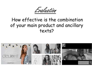
4. Ancillary Texts... In order to continue the theme of our music video we decided to combine both black and white images with colour . We did this because of the mood and genre, furthering the appeal to our target audience. Advertising Poster We also decided to download suitable fonts from the internet such as ‘HaloHandletter’ and ‘Newgarden’ to ensure that the style was in keeping with the image we wish to portray of our artist. We chose the artist’s name to be in a curly, handwritten font and the album title to be bold yet still continuing the ‘girly’ theme.
5. Continued... Again to add the authenticity further we used the iTunes logo and also to add to the modern approach of the album being available to download. We also designed our own production company with a toadstool logo again to add to the realism. We thought this logo had both a quirky and post-modern approach to a production company and this is the sort of brand we thought would suit our music video. We created a mock quote from BBC Radio One’s DJ Jo Whiley to make our advertising poster look more authentic.
6. Ancillary Texts: We provided our artist with three different flowery dresses because we felt it was in keeping with the ‘girly’ theme and also had the intention to pick out the colour and intensify it the make it stand out. We thought this would be effective because it is automatically eye catching to our target audience of teens and young adults.
7. After detailed research into digipacks and magazines we realised that the majority of the production companies edit and airbrush their artists in order to make them appear flawless and perfect. We used a series of tools in order to get these images e.g. the Spot healing tool. Editing Photographs to continue theme... In order to continue the combination of both black and white and colour from the music video, we edited the photographs using the loop tool that allows you to select a certain part of the image – keeping it in colour and adjusting the rest of the image to black and white. To add the quirkiness of the music video we decided to vary our photographs for example; inserting the lyrics as background to the image which we then edited to look drawn . This allows you to see the lyrics of our chosen song ‘Miles From Where You Are’ and shows the implication of distance from a lover.