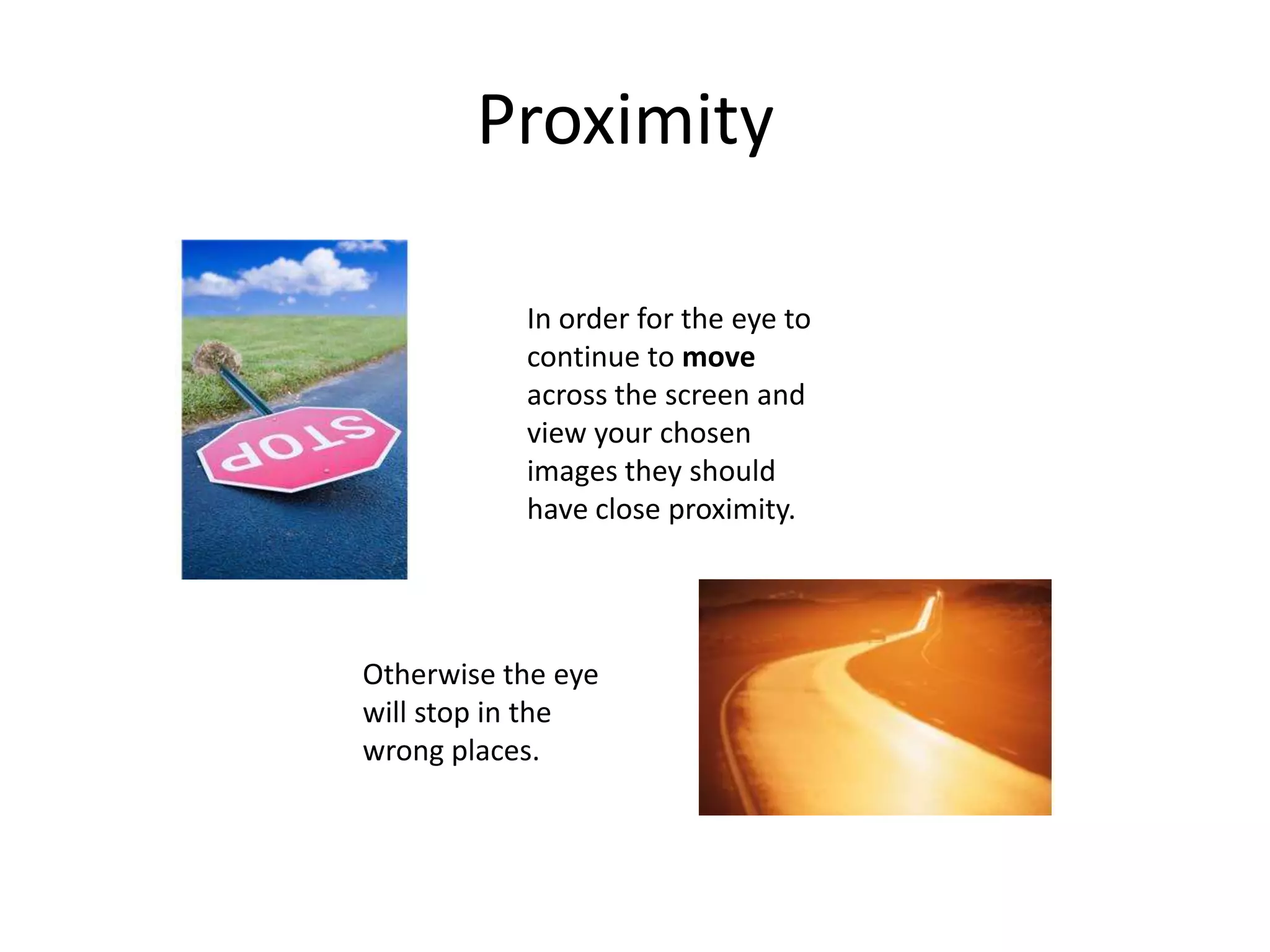
Bad/Good Power Point slides
By Lindsey Patrick
 Bullets should be on the left hand side of the screen
 NOT the right.
 It is harder to read when they are lined up on the right.
Bad Bullets
Bullets should line up on the left.
It is easier for the eye to follow from left to right.
Well Done!
Good Bullets
Backgrounds are important for aesthetics of your
power point.
They should never over power the words or information
you are trying to display.
Bad Backgrounds
Good Background
When you are trying to
portray a message when using
clip art or images, always
make sure they do not distract
from the information.
Fonts and backgrounds should compliment each
other and be easy to read.
The background color and font color should be
distinctively different.
Bad Contrast and Color
When choosing background and font colors
they should be complimentary.
The font color should stand out on the
chosen background color.
Easy for audience to view!
Good Contrast and Color
Bad Graphics
When using
graphics, one good
graphic will do
better then several
poor ones. Make
good choices!
Good Graphics
When choosing graphics
they should relate to the
information you are trying
to portray. If someone
could question why you
are using a graphic don’t
use it.
When making lists of information on your page do not…
1. Add
2. More
3. Information
4. Then
5. Make
6. Sense to
7. Subject
Bad Rule of Four
When making lists on your power point…
Remember the rule of four.
Four items on the page…
Is easier for the mind to remember.
Good Rule of Four
Bad Proximity
In order for the eye to
continue to move
across the screen and
Otherwise the
eye will stop in
the wrong places.
View your
chosen images
and text, they
should have
close
proximity.
Good Proximity
…from the beginning to the
end of your information…
When the proximity…
…is
appropriate, eyes
will move…
…with the help of graphics.
Use visually distracting fonts
Stay away from gimmicky fonts
Keep type sizes consistent
DONT USE ALL CAPS!
Avoid text overload. When too much information is on the
screen your audience will begin to loose interest in your
blah blah blah blah blah blah blah!
Bad Fonts
Vary font for emphasis or to group words
together.
Use visually simple fonts. For a visually
simulating appearance.
Good Fonts
When two properties must differ use fonts or
colors to make the difference obvious.
Backgrounds should not interfere.
Bad Perceptual Differences
Good Perceptual Differences
When you want two
properties to differ…
They must be obvious
enough to the
audiences eye.
The End

Good and Bad Power Point Examples Ed Tech

  • 1.
    Bad/Good Power Pointslides By Lindsey Patrick
  • 2.
     Bullets shouldbe on the left hand side of the screen  NOT the right.  It is harder to read when they are lined up on the right. Bad Bullets
  • 3.
    Bullets should lineup on the left. It is easier for the eye to follow from left to right. Well Done! Good Bullets
  • 4.
    Backgrounds are importantfor aesthetics of your power point. They should never over power the words or information you are trying to display. Bad Backgrounds
  • 5.
    Good Background When youare trying to portray a message when using clip art or images, always make sure they do not distract from the information.
  • 6.
    Fonts and backgroundsshould compliment each other and be easy to read. The background color and font color should be distinctively different. Bad Contrast and Color
  • 7.
    When choosing backgroundand font colors they should be complimentary. The font color should stand out on the chosen background color. Easy for audience to view! Good Contrast and Color
  • 8.
    Bad Graphics When using graphics,one good graphic will do better then several poor ones. Make good choices!
  • 9.
    Good Graphics When choosinggraphics they should relate to the information you are trying to portray. If someone could question why you are using a graphic don’t use it.
  • 10.
    When making listsof information on your page do not… 1. Add 2. More 3. Information 4. Then 5. Make 6. Sense to 7. Subject Bad Rule of Four
  • 11.
    When making listson your power point… Remember the rule of four. Four items on the page… Is easier for the mind to remember. Good Rule of Four
  • 12.
    Bad Proximity In orderfor the eye to continue to move across the screen and Otherwise the eye will stop in the wrong places. View your chosen images and text, they should have close proximity.
  • 13.
    Good Proximity …from thebeginning to the end of your information… When the proximity… …is appropriate, eyes will move… …with the help of graphics.
  • 14.
    Use visually distractingfonts Stay away from gimmicky fonts Keep type sizes consistent DONT USE ALL CAPS! Avoid text overload. When too much information is on the screen your audience will begin to loose interest in your blah blah blah blah blah blah blah! Bad Fonts
  • 15.
    Vary font foremphasis or to group words together. Use visually simple fonts. For a visually simulating appearance. Good Fonts
  • 16.
    When two propertiesmust differ use fonts or colors to make the difference obvious. Backgrounds should not interfere. Bad Perceptual Differences
  • 17.
    Good Perceptual Differences Whenyou want two properties to differ… They must be obvious enough to the audiences eye.
  • 18.