
Recommended
More Related Content
Similar to Planning of Lifestyle Magazine
Similar to Planning of Lifestyle Magazine (20)
Recently uploaded
Recently uploaded (20)
Planning of Lifestyle Magazine
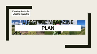
- 1. Planning Stage of a Lifestyle Magazine LIFESTYLE MAGAZINE PLAN
- 2. These photos are the photos I will be using for the mock-ups and in the actual magazine. Photos for planning (All Original Photos)
- 3. Logo design • To start I used Wix to create a logo but then the website wanted to charge me to use it so I recreated it in photoshop • The logo is green and blue to make the reader visualise the earth • The at sign above the A is because of the name 'At Large' and is also there to make the company seem newer and more modern which the younger readers will see as important. • The shadow in the final version is only there for aesthetic's for when the logo is used in my covers.
- 4. Mocku p • In this mockup I set up rough sections with temporary designs and titles, although much of it will be similar to the final product. • The line down the side will contain information on it in white and will not look so blocky in the final version. The photo will also be changed since although I will be using this photo, I don’t think it works well as a cover.