NewBase 19 April 2024 Energy News issue - 1717 by Khaled Al Awadi.pdf
Cover construction
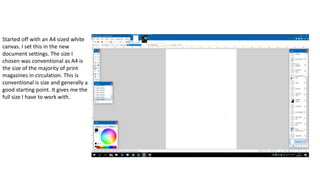
1. Started off with an A4 sized white
canvas. I set this in the new
document settings. The size I
chosen was conventional as A4 is
the size of the majority of print
magazines in circulation. This is
conventional is size and generally a
good starting point. It gives me the
full size I have to work with.
2. I found a good picture I took on my
photoshoot that had the colours that I
initially wanted. I really like the blue
and the position of the main character. I
think the way the blue goes from a
lighter blue up toward a more darker
tone of blue makes the background
really stand out and not look plain and
boring. The character on the front is
breaking the fourth wall by looking
straight into the camera and effectively
at the audience he is addressing. The
main character takes up a fairly large
portion of the page. This is a
convention in music magazines that the
main character is large and takes up
space on the front.
3. I then separated the person from the sky
background so If I needed to place text under him I
could. This was relatively straight forward as it
wasn’t a hard shape to cut round. This then
allowed me to be able to put text behind his head.
Many magazines do this not just music magazines.
By placing the character over the top of the text
makes him the main focus of the magazine and
adds depth.
4. Because I created two layers for
the character and the sky I was
able to have him over the top of
my masthead. I think this looks
pretty good and is conventional
with many print magazines. This
adds depth and shows that the
character is the main focus of the
magazine. The masthead is still
very much readable from an
audience perspective.
5. I put my pull quote/ magazine tagline
above my masthead instead of below
as I felt it filled a void of space at the
top and it looks good above the
masthead. This does not go against
conventions but it isn't the common
thing in most magazines. However
this time it looks good and does not
obstruct the character on the front of
my magazine. The tagline I chose was
short but informative and clears up
what the title means if it confuses
some people.
6. Now I have my masthead and
background sorted I started putting on
my main article title and a few other
smaller articles around the side. I
didn’t know a good subheading to put
for my main article at this point so I
left the space below my article
heading blank. The text from this
point onward is going over the top of
the character but will not obstruct his
face. It does not matter if the rest of
the text goes over him. Magazines
tend to place text on the main
character on the front of the magazine
as long as it does not obstruct them
from being seen.
7. I finished writing my main article so I
found a good quote/ subheading to put
below my article headline. I also put
coloured boxes behind exclusive
interview and the subheading. Think it
looks pretty good and the colours I chose
go very well together and with the
yellow.
I saw in other magazines they have
pictures on the front so I found an old
holiday photo and turned it into a piece
on Ibiza. It looks really good and goes
with my summer house theme and
colours.
8. I mentioned in my draft and in my
magazine analysis that I wanted to
include some form of pull to my
magazine that gives the reader
something free. I opted for a free
download in the end. It takes up
less space on the cover and is more
realistic now as opposed to a
physical disk. I like the arrow box it
is in. I think it the black and yellow
really pop.
9. I then added an additional article on
the left top side using the character
image. I didn’t know what to put on the
background for him so I found a
awesome looking pattern that I have
seen done elsewhere in other
magazines. I then put the article
headline and subtitle below. Again the
text is in front of a black box.
I also added a plus symbol to the other
articles as I have seen it done before
and it looks really good.
10. The final thing I needed to do
was add my barcode and the
date with the price and web
address. I put them in the
bottom right corner. This is
pretty standard.