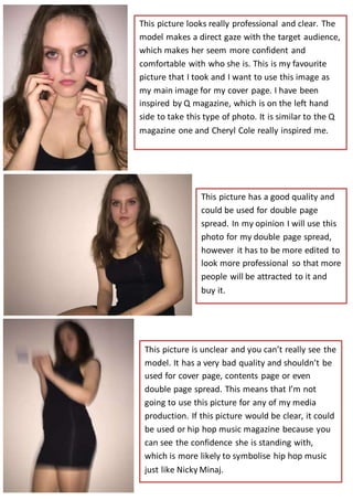
1. This picture looks really professional and clear. The
model makes a direct gaze with the target audience,
which makes her seem more confident and
comfortable with who she is. This is my favourite
picture that I took and I want to use this image as
my main image for my cover page. I have been
inspired by Q magazine, which is on the left hand
side to take this type of photo. It is similar to the Q
magazine one and Cheryl Cole really inspired me.
This picture has a good quality and
could be used for double page
spread. In my opinion I will use this
photo for my double page spread,
however it has to be more edited to
look more professional so that more
people will be attracted to it and
buy it.
This picture is unclear and you can’t really see the
model. It has a very bad quality and shouldn’t be
used for cover page, contents page or even
double page spread. This means that I’m not
going to use this picture for any of my media
production. If this picture would be clear, it could
be used or hip hop music magazine because you
can see the confidence she is standing with,
which is more likely to symbolise hip hop music
just like Nicky Minaj.
2. I wouldn’t use this picture for any of the media
production because the image has been took from
the wrong angel. Lower angels are not usually used
in music magazine, sometimes it can be used for hip
hop music magazine to show power and confidence
with direct address, however my style of magazine
is pop. Therefore, this phot wouldn’t be suitable for
my magazine. Also the image seems unclear and not
focused which shows it’s not professional.
This picture is very similar to the first
picture that I took but the only
difference is that its horizontal. This
picture would also be useful because it
looks professional and clear. However,
the image isn’t vertical which means
that it is not suitable for any type of
cover page magazine.
This picture has been took from a full body angel,
and could be suitable for cover page and contents
page but not for double page spread. This is
because most of the images on DPS are mid shot or
close up shot with direct gaze, but this image is
more suitable to be used on cover page or contents
page, however on the left side you can see the side
of the door and some clothes which makes it look
less professional.
3. This picture is very unworkable
because the model hides her face
by having her hand on her face.
This makes the picture not suitable
for any of the media production
because the audience won’t
recognise the model/artist that is
on cover page or contents page or
double page spread.
This picture has been taken from a extreme close
up and doesn’t classify to any of the media
production. This is because it makes the reader
feel uncomfortable, but more likely there would
be no space for stuff like masthead, cover line’s,
barcode, date and price and many more.
However, a good thing about this picture is that
its focused and clear with direct address which
could still catch my target audience eye.
This picture could be used for double
page spread, however its unfocused
and not clear enough to go next to
the main article in the magazine. It
seems like the picture has been
taken very quickly as the model
doesn’t stand straight and looks like
she’s not bothered to do nothing.
This picture isn’t useful to be used
for any of my media production.