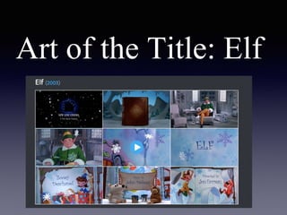
Art of the Title: Elf
Elf is a Christmas film made for all audiences.
It is about Buddy who accidentally ends up in
Santa’s work shop when he was a baby. He
grows up in the North Pole until he finally goes
on an adventure to find his real family.
The opening credits start half way through the opening
by showing who the film was by and also naming the
principle characters. The credits are presented like pages
of a book being turned, a different name on each page.
The opening then moves on to who did the casting also
the visual effects, music, costume design and editing.
This shows that the film is more focused on the looks
and presentation as they are shown before the producers
and other important roles. Whereas, the production
company(A Time Warner Company)is shown at the
beginning.
The colours that are used are mostly light blue and
white which represent the iciness of the North
Pole. It gives off a Christmas feel to the audience
as Christmas and snow are thought of as together.
The snow flakes and candy canes on the pages
also bring the mood of Christmas to life as it’s the
typical Christmas atmosphere. The time periods
between the pages getting turned makes the
audience feel as if they are really turning the pages
of the book as it allows them time to read what is
on the pages.
The music in the opening is like Christmas jingles
which also adds to the christmas atmosphere. The
music changes to Christmas bells and musical
whistling whilst the pages are turning. The whole
lay out of the opening draws in the audience as it
gives you the idea of the film but doesn't give too
much away making them want to watch all of it. It
also gives off a sense of comfort as Christmas is
time of year everyone loves.

WORK

  • 1.
    Art of theTitle: Elf
  • 2.
    Elf is aChristmas film made for all audiences. It is about Buddy who accidentally ends up in Santa’s work shop when he was a baby. He grows up in the North Pole until he finally goes on an adventure to find his real family.
  • 3.
    The opening creditsstart half way through the opening by showing who the film was by and also naming the principle characters. The credits are presented like pages of a book being turned, a different name on each page. The opening then moves on to who did the casting also the visual effects, music, costume design and editing. This shows that the film is more focused on the looks and presentation as they are shown before the producers and other important roles. Whereas, the production company(A Time Warner Company)is shown at the beginning.
  • 4.
    The colours thatare used are mostly light blue and white which represent the iciness of the North Pole. It gives off a Christmas feel to the audience as Christmas and snow are thought of as together. The snow flakes and candy canes on the pages also bring the mood of Christmas to life as it’s the typical Christmas atmosphere. The time periods between the pages getting turned makes the audience feel as if they are really turning the pages of the book as it allows them time to read what is on the pages.
  • 5.
    The music inthe opening is like Christmas jingles which also adds to the christmas atmosphere. The music changes to Christmas bells and musical whistling whilst the pages are turning. The whole lay out of the opening draws in the audience as it gives you the idea of the film but doesn't give too much away making them want to watch all of it. It also gives off a sense of comfort as Christmas is time of year everyone loves.