Credit Card Fraud Detection: Safeguarding Transactions in the Digital Age
7 Steps to Better Charts
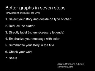
1. Better graphs in seven steps
1. Select your story and decide on type of chart
3. Directly label (no unnecessary legends)
2. Reduce the clutter
4. Emphasize your message with color
5. Summarize your story in the title
6. Check your work
7. Share
Adapted from Ann K. Emery
annkemery.com
(Powerpoint and Excel are OK!)
3. 25%
44%
58%
77%
21% 22%
14%
2%
IQ 1 IQ 2 IQ 3 IQ 4
UID
RSBY
Figure 1: UID and RSBY coverage rates, as of 2013 (not weighted for population size)
2. Reduce the clutter
4. 25%
44%
58%
77%
21% 22%
14%
2%
IQ 1 IQ 2 IQ 3 IQ 4
UID
RSBY
Figure 1: UID and RSBY coverage rates, as of 2013 (not weighted for population size)
2. Reduce the clutter
5. 25%
44%
58%
77%
21% 22%
14%
2%
IQ 1 IQ 2 IQ 3 IQ 4
UID
RSBY
Figure 1: UID and RSBY coverage rates, as of 2013 (not weighted for population size)
2. Reduce the clutter
6. 25%
44%
58%
77%
21% 22%
14%
2%
IQ 1 IQ 2 IQ 3 IQ 4
Figure 1: UID and RSBY coverage rates, as of 2013 (not weighted for population size)
2. Reduce the clutter (don’t worry)
7. 25%
44%
58%
77%
21% 22%
14%
2%
IQ 1 IQ 2 IQ 3 IQ 4
Figure 1: UID and RSBY coverage rates, as of 2013 (not weighted for population size)
3. Directly label
RSBY
UID
8. 25%
44%
58%
77%
21% 22%
14%
2%
Figure 1: UID and RSBY coverage rates, as of 2013 (not weighted for population size)
3. Directly label
RSBY
UID
Income quartile
1
Income quartile
2
Income quartile
3
Income quartile
4
9. 25%
44%
58%
77%
21% 22%
14%
2%
Figure 1: UID and RSBY coverage rates, as of 2013 (not weighted for population size)
4. Emphasize your message with color
RSBY
UID
Income quartile
1
Income quartile
2
Income quartile
3
Income quartile
4
10. 25%
44%
58%
77%
21% 22%
14%
2%
Figure 1: UID and RSBY coverage rates, as of 2013 (not weighted for population size)
4. Emphasize your message with color
RSBY
UID
Income quartile
1
Income quartile
2
Income quartile
3
Income quartile
4
11. 25%
44%
58%
77%
21% 22%
14%
2%
5. Summarize your story in the title
RSBY
UID
Income quartile
1
Income quartile
2
Income quartile
3
Income quartile
4
Figure 1: UID coverage in poor states lags far behind rich
states; the same is not true for RSBY.
Rates as of 2013 (not weighted for population size)
16. 25%
44%
58%
77%
21% 22%
14%
2%
Figure 1: UID coverage rates in poor states are far
behind those in rich states; the same is not true for
RSBY.
Rates as of 2013 (not weighted for population size)
Income quartile
1
Income quartile
2
Income quartile
3
Income quartile
4
RSBY
UID
7. Share
17. 25%
44%
58%
77%
21% 22%
14%
2%
Figure 1: UID coverage rates in poor states are far
behind those in rich states; the same is not true for
RSBY.
Rates as of 2013 (not weighted for population size)
Income quartile
1
Income quartile
2
Income quartile
3
Income quartile
4
RSBY
UID
7. Share
20. 0%
20%
40%
60%
80%
100%
0 20,000 40,000 60,000 80,000 100,000 120,000
Quartile 1
Quartile 2
Quartile 3
Quartile 4
GDP per capita
Tufte-esque
UID enrollment is high in rich states, but poor—and
populous— states are lagging behind
Lots of tools to make great graphics but you can make them with what you already have. Excel and powerpoint are OK!Select your story. Look at the data first in scatter plot.5. Idea is to make the chart self sufficient and stand by itself. Become a piece of content by itself. 7. Share – social media, blogs, etcNextslide: one of many possible examples. not picking on anyone
PauseNext slide: left axis
Next: gridlines
Next: tick marks and x-axis
Remove the legend – and don’t freak out
Because you start adding things back. Next: Directly label
Next: emphasize with color
Next: summarize message in title. Remove guess work. Tell ppl what they should get out of it
Next: check your work. Squint text: does the shape and message come through?
Next: second opinions
Next: share
Next: If I upload this image to twitter it would be cropped. Not awful because you see the full thing when you click, but better if you can get I to fit. Not always possible
Next make some changes to fit Twitter dimensions
Next and here it is. Some extra work and you have a clear, compelling image that’s ready for social media.
Exaggeration but Tufte doesn’t like Powerpoint. The same prob for excel. Click. Why? He likes things with high information density. Most graphs are too simple don’t convey enough information. He likes things like next slide.
Tons of information yes but not quick. Not really for us