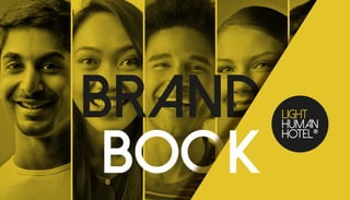
Brand book light_human_hotel
•
2 likes•173 views

The document provides branding guidelines for the Light Human Hotel brand. It outlines the logo, color palette, typography, and proper usage of visual elements to ensure brand coherence and recognition. Specific rules are given for applying the logo and other identity elements correctly across various promotional materials and touchpoints like uniforms, signage, business cards and social media. Adhering to the guidelines will help achieve the brand's communication objectives.

Recommended
More Related Content
What's hot
What's hot (16)
Similar to Brand book light_human_hotel
Similar to Brand book light_human_hotel (20)
Recently uploaded
Recently uploaded (20)
Brand book light_human_hotel
- 2. Next time you’re in town we’d love if you stayed with us
- 3. TO A BRAND NAME BE ESTABLISHED AND EASILY RECOGNIZED BY THE PUBLIC, IT NEEDS COHERENCE IN ALL OF ITS APPLICATION. FOR THAT REASON, WE DEVELOPED THIS BRAND BOOK. HERE YOU’LL FIND A COMPLETE GUIDELINE THROUGH THE CORRECT APPLICATION OF OUR BRAND THROUGH THE PROMOTIONAL MATERIAL IN GENERAL. Following strictly to the instructions established in this manual will allow you to achieve our objectives written in those pages: An efficient communication with our target and a solid Brand composition. This guide is essential for the correct application of our brand. In any situations that is not foreseen in this Manual, our company should be consulted Any variations resulting from subjective interpretations aren’t allowed either. The development of materials and parts containing the Light Human Hotel brand must follow the guidelines contained in this Manual. For any question, please contact Infinity Studio by the email: suporte@studioinfinity.com.br Or phone number +55 11 3571-0422
- 4. 05CONCEPT 06MAIN LOGO 07GRID CONSTRUCTION 08SAFETY MARGIN 09Minimum VISIBILITY 10Visual signature 11COLOR CAST 12Yellow 13color applications 14Positive and negative 15MAIN typography 16support typography 17font ranking 18Incorrect use of the logo 20Polo shirt 21Apron waiter 22Cap 23Door Hanger 24BUSINESS CARD 25SOCIAL MEDIA 26STICKERS
- 5. WE ARE LIGHT: BRIGHT AND CLEAR IN ALL THAT WE DO. WE ARE HUMAN: MANAGEMENT IS NOT VERTICAL NEITHER HORIZONTAL. THE MANAGEMENT IS CIRCULAR LIKE THE MYSTHYCAL ROUND TABLE: WITHOUT HEAD AND WHERE EVERYONE, TOGETHER, SEEKS TO BUILD THE BEST EXPERIENCE TO THE GUESTS. WE ARE HOTEL: A PLACE FOR REST, HAVEN AND REFUGE. WE ARE THE LIGHT IN THE MIDDLE OF THE NIGHT, THE WARM IN THE COLD, THE SHELTER IN THE MIDST OF THE STORM. The word “light” has two distinct meanings: Light means weightless, soft and gentle. The Hotel’s concept is based on bringing to the guest a pleasant and hospitable environment, more 1 on 1 and less stratified. Light also symbolizes glow! Light means shine, clarity, transparency and warmth likewise to the service offered to the consumer: It is clear, transparent and pleasant as a spring sun. Finally, the Circle crowns the concept. The circle is endless! It adds the concept of continuity, it has no beginning and no end. In today’s hotels, there are a huge hierarchy nearly military, but at the Light Human Hotel, this is not how it works:
- 6. 06MAIN LOGO This is the Light Human Hotel Logo’s final model application.
- 7. 07GRID CONSTRUCTION The brand building grid restrict its proportion based into 4 parts’ division of the yellow circle. On each sideways we have the ratio of 3/4 to 1/4 of the circle. The grid lines tends to align the elements positions in an organized and defined way. The same logic has been used in the other applications of the logo.
- 8. 08SAFETY MARGIN This is the minimum distance required between the tag and another element, including the page edges. This space serves as a brand’s protection against interference, ensuring its legibility and visual integrity. 1X 1X 1X 1X
- 9. 09Minimum VISIBILITY When reduced, the brand must maintain the proportion among its elements. The minimum size has been established so that legibility and comprehension are preserved. The use of the Light Human Hotel logo should not exceed the reduction limit of 1.5 cm (or 44px). Smaller uses can imply in elements losses that compose the set and compromise its original configuration. 1,5cm 44px 3,5cm 104px 2,5cm 74px
- 10. 10Visual signature When necessary, for a better composition, use the signature in the distances and proportions indicated. OPTION 1 our brand: e.g. independent owner. OPTION 2 by your brand: e.g. management company. OPTION 3 your brand, LHH concept: e.g. hotel chain. 1x 1/2 x 1/2 x by
- 11. 11 A2 R29 - G29 - B27 C0 - M0 - Y0 - K100 WEB #1D1D1B A1 R227 - G196 - B41 C15 - M19 - Y90 - K00 WEB #E3C429 COLOR CAST Color is a fundamental part on a brand consolidation and recognition. Below we have listed the institutional color settings that builds Light Human Hotel's main logo on the CMYK, RGB and Hexadecimal scales (both for electronic and digital media). A1 A2
- 12. YELLOWA clear association between the color and the logo strengthens the Brand mark. The yellow light brings warm and coziness. To the human eye the yellow is a hot and thrilling color. This color brings the feeling of bright, warm, relaxation, optimism and happiness. Yellow is the sun, the summer, prosperity and joy. It’s an inspiring color that awakens the creativity. It stimulates mental activity and reasoning. It is a color that emits lightness, transparency and well-being. Combined with the black color it reflects refinement and finesse. Aligned to the languid and elegant letter brings luxury but without snobbery.
- 13. 13 R330 - G33 - B84 C00 - M95 - Y50 - K00 WEB #E62154 R199 - G213 - B48 C30 - M00 - Y90 - K00 WEB #C7D530 R29 - G29 - B27 C00 - M00 - Y0 - K100 WEB #1D1D1B R238 - G114 - B3 C00 - M65 - Y100 - K00 WEB #EE7203 R110 - G54 - B140 C70 - M90 - Y00 - K00 WEB #6E368C color applications This color palette will ensure the brand versatility and application in several materials and occasions. Here are the color scales set for application in institutional materials.
- 14. 14Positive and negative For special cases where the use of the Light Human Hotel Brand is necessary in a single color, we provide positive and negative monochrome versions. Those versions ensure good visibility and legibility. On materials with a light background, use the positive version. And on a dark background materials, use the negative version.
- 15. 15 Aa Bb Cc Dd Ee Ff Gg Hh Ii Kk Ll Mm Nn Oo Pp Qq Rr Ss Tt Uu Vv Ww Xx Yy Zz 01234567890!@£$% Dolce Vita regular Aa bold Aa MAIN typography The typography used in the brand development is DOLCE VITA. It was chosen because it is a geometric letter that brings straight and angled lines, revealing a strong personality.
- 16. 16 Aa Bb Cc Dd Ee Ff Gg Hh Ii Kk Ll Mm Nn Oo Pp Qq Rr Ss Tt Uu Vv Ww Xx Yy Zz 01234567890!@£$% Montserrat Hairline Aa regular Aa bold Aa support typography We chose the MONTSERRAT family font as a support typography. It’s a Modern letter that brings clean and direct lines, used along with the main fount brings a modern atmosphere.
- 17. 17 T1 TITLE: T2 SubTITLE: D Highlights: P Body text: Dolce Vita Bold | 28pt/32pt Dolce Vita regular | 18pt/21pt Montserrat Regular | 9pt/12pt Duis mollis, est non commodo luctus, nisi erat porttitor ligula, eget lacinia odio sem nec elit. Donec sed odio dui. Duis mollis, est non commodo luctus, nisi erat porttitor ligula, eget lacinia odio sem nec elit. Praesent commodo cursus magna, vel scelerisque nisl consectetur et. Nullam id dolor id nibh ultricies vehicula ut id elit. Sed posuere consectetur est at lobortis. Duis mollis, est non commodo luctus, nisi erat porttitor ligula, eget lacinia odio sem nec elit. Donec sed odio dui. Duis mollis, est non commodo luctus, nisi erat porttitor ligula, eget lacinia odio sem nec elit. Praesent commodo cursus magna, vel scelerisque nisl consectetur et. Nullam id dolor id nibh ultricies vehicula ut id elit. Sed posuere consectetur est at lobortis. Montserrat Light | 12pt/15pt Duis mollis, est non commodo luctus, nisi erat porttitor ligula, eget lacinia odio sem nec elit. Donec sed odio dui. font ranking In titles use the Dolce Vita Bold. In subtitles use the regular version. In long texts should be used the Montserrat font family.
- 18. 18Incorrect use of the logo The manual’s purpose is to equalize the applications and ensure their correct use. Application errors such as: distortion of shapes, main color distortion, palette and typography changes must be avoided. The rules for the brand and logo application must be fulfilled so that there isn`t a malformation on the visual identity. Proper use strengthens the connections that Light Human Hotel seeks to establish with its public. Inappropriate use (as demonstrated in the examples below) is a strong impediment to that goal. DO NOT ALTER THE COLORS DO NOT APPLY AS WATERMARK DO NOT APPLY ON BACKGROUND WITHOUT CONSTRAST DO NOT DISTORT DO NOT APPLY CONTOURS DO NOT CHANGE TYPOGRAPHY DO NOT ALTER THE SYMBOL POSITION DO NOT APPLY SHADOW DO NOT ROTATE
- 20. 20 From now on it will be suggested application of the logo in clothes and also on printed and digital media. The frames suggested here will guarantee the legibility, understandable and penetration of the brand. Polo shirt 7cm 4cm *For reference and use of the original files, see the appendices of this manual. *Fabric colors MUST follow (or approximate) the color scale established on page 11 of this manual.
- 21. 21Apron waiter *For reference and use of the original files, see the appendices of this manual. *Fabric colors MUST follow (or approximate) the color scale established on page 11 of this manual.
- 22. 22Cap 5cm *For reference and use of the original files, see the appendices of this manual. *Fabric colors MUST follow (or approximate) the color scale established on page 11 of this manual.
- 23. 23Door hanger Please CLEAN Please do not disturb *For reference and use of the original files, see the appendices of this manual.
- 24. 24BUSINESS CARD NOME SOBRENOME gerente nome@lighthumanhotel.com Rua Nome da Rua, 155 | bairro +55 11 2222 2222 | +55 11 2222 2222 *For reference and use of the original files, see the appendices of this manual.
- 25. 25SOCIAL MEDIA *For reference and use of the original files, see the appendices of this manual.
- 26. 26STICKERS lighthumanhotel.com *For reference and use of the original files, see the appendices of this manual.
- 27. by