
Recommended
More Related Content
What's hot
What's hot (12)
Similar to Exp Realty Brand Guidelines
Similar to Exp Realty Brand Guidelines (20)
Recently uploaded
Recently uploaded (20)
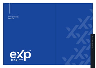
Exp Realty Brand Guidelines
- 2. Over the course of this document, you will be introduced to all of the elements that make up the eXp Realty brand – including our logo, typography, color palettes and image styles. Together, these elements will help us create a strong and consistent brand identity in everything we do. If you have any questions about these guidelines, please contact marketing@exprealty.net. Welcome to our brand guidelines. 2
- 3. TABLE OF CONTENTS COMPANY LOGO BEHIND THE LOGO LOGO VARIATIONS LEGIBILIT Y CLEAR SPACE INCORRECT USAGE IMAGE STYLE PROFESSIONAL HEADSHOT GUIDELINES VIDEO GUIDELINES IMAGERY & LOGO PLACEMENT COLOR PALETTE BRAND PATTERN TYPOGRAPH Y BUSINESS CARD STATIONARY AND SWAG YARD SIGN PRINT MATERIALS EMAIL SIGNATURE WEBSIT E POWERPOINT TEMPLATE 04 05 06 07 08 09 10 11 12 16 22 23 24 25 26 27 28 29 30 31 3
- 4. COMPANY LOGO Our logo is a unique, easily recognizable mark of who we are as a brand. A clean and modern design, it was developed in conjunction with our agents, delivering a strong graphic statement that emphasizes our brand values. 4
- 5. BEHIND THE LOGO The eXp name comes from eXp World Holdings Founder and CEO Glenn Sanford and other eXp leaders when they started the company in 2009. It was selected as a prefix for words that signal success and represent the experience we create for our agents. These positive words support eXp Realty’s core values of integrity, community, service, sustainability, collaboration, innovation, being agile and lastly, fun! The bold, thick typography conveys our strength and resilience as a business and the solidity of our platform for the success of our people. The X mark with the ascending line represents our rapid and exponential growth as a global organization, the trajectory of our company and our agents. At the same time, the disconnected piece of the X looks as if it is a packet of data flowing into our brand, representing our digital platform. Lastly, the X can also be seen as a celebratory person, with the disconnected piece forming a head and the extending line becoming an arm raised in triumph. 5 Words such as: Expert Experienced Exploration Expansion Expeditiousl y Expectation Exponential The logo similarly represents our values and promises to our agents:
- 7. LEGIBILITY Our logo should never be too small to read. We’ve set a minimum size of 0.8 inches or 60 pixels. Based on the standard range, the recommended sizes are shown here. There should be enough clear space at the top of the logo to allow for this in print or online applications. It is not recommended to use the logo at less than 0.8 inches in width. Take into account that the icon is not the brand logo and should never replace the main eXp logo. 32 x 32px 7 App Icon / Social Media 2.7 in 1.7 in 1.18 in 0.8 in | 60px Minimum Size
- 8. CLEAR SPACE We’ve defined a minimum exclusion zone that stops other graphic elements interfering with the eXp logotype and ensures that our logo is easy to read. The size of the exclusion zone should be at the height and width of the letter “e” as shown on the right. Proportions, space and size relationships of all blocks must not be altered, redrawn, embellished or recreated in any way. An important part of maintaining a consistent presentation is keeping a clear space around the logo from other text, graphics or illustrations. 1.14 in | 40% 1.18 in | 40% 2 in | 100% 3.7 in 8
- 9. INCORRECT USAGE The logo must be used as is and not be altered in any way. This means that you MUST NOT: Change the logo’s orientation or rotation. Disproportionately scale the logo. Change the logo’s colors. Display the logo in a configuration not previously specified. Attempt to recreate the logo. Make alterations to the logo’s text. Add special effects to the logo. Display the logo as an outline. Display other elements within the logo’s designated clear space. Crop or stretch the logo in any way. 9
- 10. Satisfaction Dynamism Precision Neutral 10 Professional Corporate IMAGE STYLE Photography is a key part of our identity. We should use simple, clean imagery with natural lighting. When showing people, we should always strive to represent diversity and inclusiveness in our images. Our use of color must always complement the chosen image.
- 11. PROFESSIONAL HEADSHOT GUIDELINES Recommendation s Please follow these recommendations for a professional headshot that will be consistent with our brand and other eXp headshots. • Business casual recommended (tie is not necessary) • Dress in dark, solid colors • Avoid busy patterns, large logos, bright clothing, and hats • Take the photo in an area with natural light • Have the photographer take many iterations but we request your a headshot is forward-facing, rather than angled If your photographer is editing your photos, request they use: • Gray Background • Pantone Cool Gray | 1C C0 M0 Y0 K15 | R226 G227 B228 | Hex #e2e3e4 Forward facing pose, with good posture and lighting. Appropriate clothing. 11 Blurry photo, sun exposure on the face. Unprofessional clothing.
- 12. VIDEO GUIDELINES Recording tips Preparation • Make sure you are in a well-lit area. For lighting purposes, please stay away from the window or any TV/computer screens • Make sure you are free of distractions such as external noise (including wind) and movement • Refrain from eating or drinking while on camera • Restrict movement of other household members or pets from view of the camera • Standing when speaking on camera looks great. However, if you prefer to sit, a non-swivel chair is best. Tip: You really don’t need more than your head and torso in the frame. • Make sure to sit up straight to where you feel almost awkward (it will look good on camera, we promise) • Feel free to have someone shoot the video for you Production (We recommend doing a test first) • Ensure the phone is close enough to hear you clearly • Make sure your phone is on a steady and flat surface • Film the video horizontally for a widescreen effect • Finally, have fun! • Pro tip: Leave a little headroom in the video What to include in the bio detail • Current job title • Previous job and relevant experience and qualifications • Industry awards/accolades/achievements or accomplishments • Personal information is fine, but do not overpower the main professional content 12
- 13. IMAGERY & LOGO PLACEMENT Care must be taken to create well-balanced and considered compositions. When placing the logo over photography, choose a light- or solid-colored area to ensure the logo does not get lost in the background. Use pattern to make the imagery more ownable Ensure the logo is legible and has a clean background Place the logo over a uniform background Don’t overlay the brand pattern over people Don’t place the logo on busy backgrounds Don’t place the logo in random places within the layout 13
- 14. PRIMARY COLOR PALETTE — Pantone 7687 C C99 M84 Y2 K0 R25 G70 B157 Hex #19469D Brand Blue — Loyalty Ownership Corporate — Pantone 1505 C C0 M60 Y100 K0 R245 G130 B31 Hex #f5821F Brand Orange — Dynamic Inviting Growing C0 M00 Y0 K0 R255 G255 B255 Hex #ffffff C0 M0 Y0 K100 R0 G0 B0 Hex #000000 White — Black — The primary color palette is a very important brand element as it helps to tie in all the elements, assets and templates. All eXp assets should feel part of the same identity and therefore must have a coherent color treatment. Brand Blue Clear and reassuring, this is our main color. It can be seen in the logo and in all eXp assets, and drives brand recognition and cohesion. Brand Orange Vibrant and dynamic, the new brand orange is our action color. It is meant to draw attention to the most important UI elements, such as buttons, as well as tasteful accents in the brand pattern. Black For optimum text legibility and contrast on white and light backgrounds we use black. White In the same way, on full color or dark backgrounds we use white text. 14
- 15. SECONDARY COLOR PALETTE — Pantone Cool Gray 1C C0 M0 Y0 K15 R226 G227 B228 Hex #e2e3e4 Light Gray — — Pantone Cool Gray 11C C0 M0 Y0 K80 R88 G89 B90 Hex #58595a Dark Gray — — Pantone 1375 C C1 M38 Y100 K0 R249 G168 B26 Hex #f9a81a — Pantone 7459 C C70 M25 Y13 K0 R105 G154 B189 Hex #699abd Bright Yellow — — Pantone 3597 C C100 M91 Y28 K14 R18 G50 B113 Hex #123271 Light Blue — Dark Blue — Expanding on the primary color palette, we added a few more options, Bright Yellow, Light Blue, Dark Blue, Light Gray and Dark Gray. 15
- 16. CORE VALUES COLOR PALETTE — Pantone 1375 C C1 M38 Y100 K0 R249 G168 B26 Hex #f9a81a Integrity — — Pantone 1365 C C1 M29 Y81 K0 R250 G186 B75 Hex #faba4b Transparency — — Pantone 4010 C C8 M68 Y100 K1 R225 G111 B11 Hex #E16F0B — Pantone 716 C C0 M65 Y100 K0 R244 G120 B12 Hex #F4780C Fu n — — Pantone 715 C C0 M55 Y93 K0 R245 G139 B47 Hex #F58B2F Agile — Innovation — This color palette reserved only for when being used to display our core values. It uses shading and tints of the Brand’s Blue, Orange along with the secondary colors Bright Yellow and Light Blue. — 16 Pantone 7459 C C70 M25 Y13 K0 R105 G154 B189 Hex #699abd Collaboration — — Pantone 3597 C C100 M91 Y28 K14 R18 G50 B113 Hex #123271 — Pantone 2133 C C92 M77 Y0 K0 R28 G78 B179 Hex #1C4EB3 Community — — Pantone 2386 C C83 M65 Y0 K0 R34 G96 B219 Hex #2260DB Service — Sustainability —
- 17. SECONDARY COLOR PALETTE These additions help to further diversify and enrich the user experience by assigning them to content sections of a web page or the footer, for example, or chapters on a PowerPoint deck, or sections in a brochure. Just remember: they can only be assigned to elements that hold secondary or tertiary orders of importance. We always lead with the Brand Blue and trigger action using the Brand Orange. Color coding chapters in PowerPoint 17 Website accents Website footer
- 18. BRAND PATTER N The brand pattern is the mark of our brand. It has the sole purpose of making our assets and imagery more ownable, sophisticated and polished. It is comprised of different sections of the “X” in the logo and is meant to convey growth, positivity and a forward- looking mindset by extending the upper right “arm.” For flexibility, we have the choice of a “single X pattern” as well as a “multiple X pattern.” Only one pattern should be used on any created asset at a time — never a combination of both. Download the brand patterns here. single X pattern multiple X pattern 18
- 19. BRAND PATTER N Spacing Single X Pattern: There must be clear space between the pattern and text to keep the text legible. On the single X pattern, this is measured by taking 50% of the width of one X arm, as defined in the diagram to the right. When full color is used, the pattern should never overlap text. Multiple X Pattern: On the multiple X pattern, clear space is measured by taking 50% of one full X width. When full color is used, the pattern should never overlap text. The spacing between each ‘X’ within the pattern should not be altered from the files provided. Lorem Ipsum Lorem ipsum dolor sit amet, consectetur adipiscing elit. Curabitur fermentum lectus vel sagittis lobortis. Aenean iaculis, magna vitae ornare tempus, odio ligula ornare lectus, eu egestas velit nulla ac orci. Proin consectetur at elit at commodo. Curabitur sed nisl in tortor malesuada vestibulum sed a orci. Lorem Ipsum Lorem ipsum dolor sit amet, consectetur adipiscing elit. Curabitur fermentum lectus vel sagittis lobortis. Aenean iaculis, magna vitae ornare tempus, odio ligula ornare lectus, eu egestas velit nulla ac orci. Proin consectetur at elit at commodo. Curabitur sed nisl in tortor malesuada vestibulum sed a orci. clear space clear space 50% of X width X width X width 50% of X width 19
- 20. Sizing Single X Pattern: Approximately 20% of the 'X' should be cropped off the edge of the asset, ensuring the full ‘X’ is not visible. Multiple X Pattern: The multiple X pattern should take up approximately 20–30% of the total design template, and should be approximately the same size as the ‘X’ in the eXp logo being utilized in the design. This pattern should have at least two full visible ‘X’s’ with the rest of the pattern cropped off the edge of the design. BRAND PATTER N 20
- 21. Color Acceptable colors are all white, all black, all blue, or blue with one orange X. On print assets (i.e., flyers, yard signs), full color should be used with no transparency. When using digital assets over imagery, always make sure to use less than 20% transparency in order to allow the background to be seen through it. Optionally, different blending modes can be used (Screen, Overlay, Multiply) depending on context. If in doubt, please seek guidance and approval from our creative team at: marketing@exprealty.net. BRAND PATTER N Agent Name o: 123-456-7890 c: 123-456-7890 Agent Name o: 123-456-7890 c: 123-456-7890 Agent Name o: 123-456-7890 c: 123-456-7890 Agent Name o: 123-456-7890 c: 123-456-7890 Agent Name o: 123-456-7890 c: 123-456-7890 Agent Name o: 123-456-7890 c: 123-456-7890 Pattern at 10% opacity 21
- 22. Application: Single X Pattern Avoid altering the pattern in any way that hasn’t been approved in this document. The single X pattern should never be combined with the multiple X pattern, they should always be used separately. Only use files as provided and do not try to recreate the pattern in any way. To the right are examples of incorrect applications of the single X pattern. BRAND PATTER N Do not flip the X pattern. The X arm must always extend upwards to the right Do not stretch the brand pattern disproportionately Do not rotate, use at an angle or use upside down Do not add any effects such as outlines or drop shadows Do not alter the brand pattern color with an unapproved color palette The full ‘X’ should not be visible 22
- 23. Application: Multiple X Pattern Avoid altering the pattern in any way that hasn’t been approved in this document. The single X pattern should never be combined with the multiple X pattern, they should always be used separately. Only use files as provided and do not try to recreate the pattern in any way. To the right are examples of incorrect applications of the multiple X pattern. BRAND PATTER N Do not change individual sizing of the X pattern Do not stretch the brand pattern disproportionately Do not add additional colors to the pattern or apply other special effects Do not alter the brand pattern color with an unapproved color palette Do not change the brand pattern ‘X’ offset positioning Do not flip, rotate, use at an angle or use upside down 23
- 24. Download the font here. Roboto font family thin light regular medium bold black Aa ABCDEFGHIJKLMNOPQRSTUVWX YZ abcdefghijklmnopqrsutvwxyz 0123456789 !”$%&/()=? The quick brown fox jumps over the lazy dog The quick brown fox jumps over the lazy dog The quick brown fox jumps over the lazy dog BRAND TYPOGRAPHY Typography is an essential tool in the development of a brand identity and is a key element to create a distinct and cohesive look across all communications. Our chosen font, Roboto, is clean, modern and well suited to a wide range of applications, particularly digital. 24
- 25. eXp branding Agent and eXp branding BUSINESS CARD Dimensions: 88x55 mm / 3.5x2 inches Font: Roboto Colors: Text in Black and Orange Logo: Top Left Corner Distances: 5 mm from all borders Imagery use and placement: On business cards, the right side of the business card is meant to accommodate an image. We should always use good quality and well-lit shots as shown in the example. Optionally, we can accommodate the agent branding as the main logo on the front and keep the eXp logo on the back. 5mm 5mm 5mm 5mm 3.5 in 2 in Amy Lee Real Estate Agent (123) 456 7890 AmyLee@exprealty.com exprealty.com Amy Lee Real Estate Agent (123) 456 7890 AmyLee@exprealty.com exprealty.com 25
- 28. PRINT MATERIALS EXAMPLES Contact Amy Lee at: Amy.Lee@exprealty.com www.exprealty.com Contact Amy Lee at: Amy.Lee@exprealty.com www.exprealty.com 28
- 29. Download the email signature templates here. EMAIL SIGNATURE For a strong corporate image, all email messages should identify the sender in a standard and clear manner. Please follow the examples shown. Amy Lee | Real Estate Agent eXp Realty Office (123) 456 7890 | Cell (123) 456 7890 AmyLee@exprealty.com www.exprealty.com Amy Lee | Real Estate Agent eXp Realty Office (123) 456 7890 | Cell (123) 456 7890 AmyLee@exprealty.com www.exprealty.com 29
- 31. POWERPOIN T TEMPLATE As part of the brand, we also created a new PowerPoint template to help agents have a common internal tool for sharing and collaborating. Download the PowerPoint template here. 31