
Recommended
More Related Content
Similar to poster campaign research.pptx
Similar to poster campaign research.pptx (20)
More from JakeSmith458407
More from JakeSmith458407 (18)
Recently uploaded
Recently uploaded (20)
poster campaign research.pptx
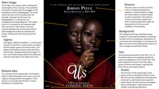
- 1. Director: Directors name in at the top of the screen in bold writing grabs the audience. It allows people to judge the movie before its release based on who is directing it. Also with its inclusion of previous awards and films it allows people who might not know who he is to have more confident in his directing Main Image: This image is of a woman who is taking off a mask replica of her own face. This resembles the theme of duality and the struggles of the protagonist and her doppelganger. The mask covers the tears of her true face that lies beneath, showing that whoever this doppelganger is, is taking over our protagonist and submerging her. This stands out as it is unnatural to see someone with their own face in their hands. The stark contrast between the red jumpsuit and the dark background further accentuates the masks, making them the focal point of the poster. Background: The background being a sold black colour creates an unnerving atmosphere as darkness conveys horror by creating an atmosphere of uncertainty, fear and danger. In the absence of light, the mind instinctively becomes alert as it can no longer see potential threats. Tagline: The tagline “WATCH YOURSELF" is a brief and to the point of the film's central theme of duality and the darker aspects of human nature. The tagline immediately communicates the film's central idea, creating interest and intrigue. It’s also use of bold writing catches the audiences attention and helps it stick within the mind. Studio: The inclusion of the studio logo on the poster serves to identify the source of the film and to lend credibility to the production. Universal is a well-known and respected studio which can help to attract moviegoers who are looking for a high-quality and reliable movie-going experience. Release date: The inclusion of the release date on the poster helps to build anticipation and create a sense of urgency among potential moviegoers. It also serves as a reminder that the film is only in theatres for a limited time. Title: The prominent placement of the title "Us" on the poster helps to immediately identify the movie and distinguish it from other films. The bold, stylized font used for the title adds a sense of tension and unease, matching the film's horror and suspense genre.
- 2. Billing block: The inclusion of the names of the director, writer, and lead actors on the poster serves to provide context and credibility for the film. This helps to attract fans of the director and actors, while also signalling the film's level of quality and professionalism. The inclusion of the movie's rating on the poster provides context for the film's intended audience and helps potential moviegoers determine if the film is suitable for them. Main image: The image of the protagonist holding a pair of scissors, serves as the centrepiece of the poster and creates a visually striking first impression. The image is meant to be suggest a sense of danger and uncertainty, while also giving a sense of the movie's visual style.
- 3. Main Image: This image is of a woman who is covered in shadows with the colour scheme being black, white and blue. The only colour on her that doesn’t fit this scheme would be her very prominent red eyes that catch the audiences attention. The only other colours are of the butterfly which is placed on her lips, as those are the only two sets of colours it tells the audience that there is a link between the two. Actor’s names: They are above the title showing how prominent they are to the advertisement of the film. Also it attracts some audience members to go watch it because they like the actors. Studio: This is to let the consumers know which company is creating the film, informing Title: Tells the audience what the film is called so they can look out for it when going to watch it or recommend it to someone else. Director: Directors name in a box so it stands out in the billing block. Billing Block: The billing blocks tells the moviegoers who not only is in the film but who helped in the making of it. This is so they know who to look forward to and also make judgement on the film by who worked in production and possible base it off of previous works that they have made. Misses BBFC certificate, release date, tagline, and format. The BBFC certificate and format are normally in the billing block. The tagline is normally separated from the rest of the writing, and the release date can be separated but can also be in the billing block sometimes.
- 4. Title: In big bold writing for the audience to identify the name without having to go through a strenuous time finding out what it is. Main image: So the poster not only is bland but also gives a sneak peak into what the film will be like. Tagline: So the audience can remember it and it can stick in their head. If that happens then they will want to see it or tell friends. Billing block: Has credits to actors, directors, writers, producers and more. May also include important information regarding the movie. Studio: tells the consumer what company is creating the movie, not only does it give them more publicity but it also allows the audience to make assumptions on it based on previous films they’ve made.