My INSURER PTE LTD - Insurtech Innovation Award 2024
Contents page analysis 1
1. Jade Challender
Contents Page Analysis – Media Studies
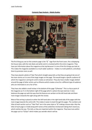
The first thing you see on the contents page is the “Q‟ logo from the front cover, this is displaying
the house style, with the red, black and white and it is involved within the entire magazine. They
have put information about the magazine at the top because it is one of the first things you look at.
This makes the magazine available to a much wider audience – makes it a multi-platform, and allows
them to promote more as well.
They have placed a photo of Take That which straight away tells us that they are going to be one of
the main stories as it is one of the large images on the page. This would target a specific audience of
which the magazine is aiming for and it creates an attraction. They also have smaller images dotted
around the page of other artists such as Rihanna which creates a lure for a different type of audience
who are interested or are a fan of her.
They have also added a small review in the bottom of the page “Q Review”. This is a focus point of
the magazine as it’s in the bottom right of the page which is where the eyes look last. It also
balances the page out with the way that the features are written on the left hand side and them
main image is towards the right along with the review.
Most of the writing is placed on either the left hand side or the right hand side of the pages with the
main image towards the centre left. This makes it easier to look through the pages. The numbers and
titles of each section such as “Take That” are in the same style as “Q” making a house style. Also the
titles of each page is in bold along with names of the celebrities mentioned making them stand out,
which catches the eye. This tells us they are important within the magazine. They have lures within
the page such as “Q Quiz” which makes you wonder what it will be.