Lucknow 💋 Escorts Service Lucknow Phone No 8923113531 Elite Escort Service Av...
Thriller Font Styles that Set the Scene
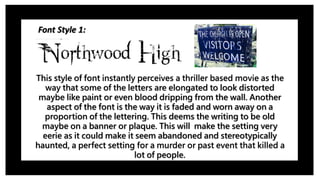
1. Font Style 1:
This style of font instantly perceives a thriller based movie as the
way that some of the letters are elongated to look distorted
maybe like paint or even blood dripping from the wall. Another
aspect of the font is the way it is faded and worn away on a
proportion of the lettering. This deems the writing to be old
maybe on a banner or plaque. This will make the setting very
eerie as it could make it seem abandoned and stereotypically
haunted, a perfect setting for a murder or past event that killed a
lot of people.
2. Font Style 2:
I have also chosen this font as an option for my thriller opening
sequence as the smudged writing as it stems of the lettering
creating a visual effect like when blood connects with ice, its rivers
down the ice cracks creating a chrysanthemum of blood just from
one drop. I like this idea incorporated within the font as it allows
blood to relate to the theme to allow the audience to know the
genre and aspect of the film by the opening sequence and credits.
3. Font Style 3:
This final font creates a visual effect that pieces of a newspaper
have been taken out and stuck together to create the title. This
could link to our opening scene as a shot of a newspaper is during
the opening sequence. It also creates the title to be very sketchy
and creative, looking like as if someone had taken the time to do
this. This font could be paired to an transition that creates this city
and rough vibe to the credits.