
Recommended
More Related Content
What's hot
What's hot (19)
Viewers also liked
Viewers also liked (20)
Similar to Font research
Similar to Font research (20)
Recently uploaded
Recently uploaded (20)
Font research
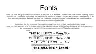
- 1. Fonts Fonts can have a huge impact on how a product is perceived to an audience. Different fonts have different meanings so it is important that I choose the right style of font for my poster. Usually in films the company will establish a brand identity so all their marketing campaign will share the same font. Therefore i am going to make sure that I have the same font for my poster, magazine cover and teaser trailer. Quite often, the film companies themselves produce these fonts for their own distribution purposes. However, there are many fonts in the vast Linotype Library that are similar to some of these designs, and which can convey the same mood as the film so I am going to research some of these for my products.
- 2. The visual appearance of words themselves have a huge effect on how something is received. Fonts can create mood and atmosphere. Fonts can give visual clues about the film or what the plot may be about. There are different types of fonts; Serif Fonts a slight projection finishing off a stroke of a letter in certain typefaces. Decorative Fonts Sometimes called script, novelty, or ornamental, decorative fonts stand out for their unique shapes and personalities. These tend to have a stronger personality or character than traditional serif or sans-serif fonts.
- 3. Fonts Used in Movies Before I Go To Sleep (Clarius Entertainment, 2014). Starring Nicole Kidman, Colin Firth, Mark Strong. Font: Adobe Garamond Interstellar (Warner Bros. Pictures, 2014). Starring Matthew McConaughey, Anne Hathaway. Font: Linotype Didot The Hunger Games: Mockingjay Part I (Lionsgate, 2014). Starring Jennifer Lawrence, Josh Hutcherson, Liam Hemsworth. Font: Bank Gothic
- 4. Font ResearchHere are a few websites which we used when researching what fonts to use for our promotional package; http://www.dafont.com/octin-spraypaint-free.font - Dafont.com http://www.fonts2u.com/ - Fonts2u.com http://fontmeme.com/vertigo-font/ - Fontme.com When researching different fonts we particularly liked this font. We felt that it was typical for a psychological thriller genre. The graffiti style reminds the audience of the age of the main character in our film as graffiti is stereotypically associated with the younger generation.It is imporant to highlight the age of the charcter because this will make the character appear more vulnerable to the audience as she is very young. We thought the border was interesting and would make our film more unique as it is not a typical style to use. However we decided it was important that we followed the conventions of our genre so we wanted to use a more commonly used style instead. This font worked well with our plot because the ink fades out on the letters which could connote that the characters happiness is fading out and that she is on the verge of a breakdown. We decided that this font was more suitable for an action/adventure genre rather than our psychological thriller film. This is because of the harsh bold letters which seem to ‘hit’ the audience in the face.