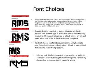
1. Font Choices
• This is the font that I chose. I chose this because I like the clean edges that it
has. The gap in the R also makes it different to other block fonts used in
magazines such as NME. The font can be easily recognised and isn’t
associated with a particular sub-genre of rock, such as the font below. All
titles and quotes will be in this font.
• I decided not to go with this font as it is associated with
heavier rock and the type of music that would be in Kerrang
magazine. My magazine is aimed at all sub-genres of rock so I
need a font that is not associated with on sub-genre.
• I did not choose this font because it seems fairly boring to
me. The spiked bottom looks nice but I think it is a very bland
font with no real defining features.
• I did not pick this font because it is has an electro feel to it
and I don’t want that brought into my magazine. I prefer my
chosen font to this one as this gives the wrong
2. Font cont.
• Body text will be in this font
• Subtitles will be in this font
3. Colour Schemes
On the left I have the scheme I have
chosen. I decided to go for the red
and a dark blue instead of the light
blue and green. The red is a
convention of music magazines. The
red fits the rock genre better that a
light blue. The dark blue helps
highlight the questions in my article.
On the right I have an alternative
scheme. I decided not to choose this
light blue and green as the green is
unconventional and the blue is not a
convention either.
4. Front Cover Planning
One image
• The front cover will be of a singe male stood in the centre
• Bright contrasts on one half and dark on another
• He looks friendly and warming despite wearing a “metal”
outfit to show how first impressions are not always the
correct interpretations
5. Contents Page Planning
• Various solo artists in the contents page as this is a solo artist highlight
month
• Showing no clear representations of genres
7. Pitch
The magazine that I am pitching will be called RMS; Rock Music Specialists.
This is a monthly magazine. RMS will be unique on the market and appeal to
more dedicated music fans. RMS would be a weekly magazine for £7.
The intended audience is aged 18-28 as this is a large audience for rock
magazines, also this magazine will be competing against other magazines
such as NME and this is their audience too. To appeal to this audience I have
not chosen a specific sub genre of rock.
There will be updates in RMS on festivals, new albums and one main
interview a month and two sub, smaller interviews. RMS will have a modern
feel with a simplistic colour scheme and simple layout.
My double page spread will feature an interview with a new and unique solo
metal artist. I will use details that would go overlooked by casual fans of
music as this magazine is aimed at fans of music and the collective rock genre.