The document summarizes the media product of a music video and album created by Xenia Petley. It discusses the various elements used that follow conventions of real media products in the singer/songwriter genre, including:
- The album cover uses simple fonts and backgrounds focused on the artist's face, similar to artists like James Blunt.
- Shots in the music video include extreme close-ups, mid shots and wide shots to connect with the audience, like videos by Seal.
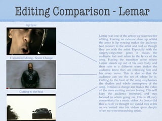
- Editing techniques like lip syncing, scene transitions and cutting to the beat are used to engage viewers, as done by Lemar.
- Artificial lighting gives the artist a glow, and a piano is included