2. : developing and challenging forms and conventions of real media
products.
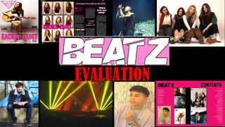
MASTHEAD- Both ‘Q’ magazine and ‘BEATZ’ use their brand logo as a masthead for the front cover. This is done repeatedly through the industry to establish the brands identity, the more the
audience views the logo (at the top) is the more likely its going to be remembered. As well as when the magazines are presented in various supermarkets (the most common place my target
audience purchased their magazines) /newsagents, they’ll most likely to be stacked so the logo may be the only aspect of the magazine the target audience sees initially.
FONTS- The fonts used follow the conventions of a music magazine such as ‘Q’ for example. Larger, bolder fonts were used for the names of headlining artists or important article
headlines/covellines. Although some freedom was allowed for creative styles of font (Om tolet om) there were some limitations as in real magazines the fonts must be as readable as possible. Some
of the fonts mentioned in the stylesheet had to be changed as once they were placed on the page seemed in appropriate for their use, for example initially ‘Nouvelle Vague’ was going to be used for
all pull quotes however not all of the quotes used illustrate this font as visually didn’t follow the style of the page, therefore Bell MT was used to give dimension as seen in my double page spread.
COLOUR SCHEME- ‘BEATZ’ uses a colour scheme based on Pink, white and Black. Within my research it was typical to find that magazines that used 3 staple colours as a theme for a specific article or
magazine of that week/month. This is most likely done to aid in organisation as visually having a limited colour palette looks clean and constructed, I’ve tried to challenge this concept used in the
industry by using contrasting shades of the three colours mentioned above in order to give more variation and distinction from other magazines.
STYLE OF PHOTOGRAPHY- The majority of images found in music magazines have been edited and re-touched in order to glamourize the subject/improve the quality of the image. A common device
used in photoshop would be to adjust the brightness/contrast which I have done in nearly all of my images specifically the ones of the artists for example, in my contents page The shot of the band
‘BUSTED’ that I took had to have the brightness adjusted as the raw image lost the action of the bandmates in the foreground. Aside from this technique using curves allowed me to contrast the light
and the shadows in pictures. From my research I learned that ‘TOTP’’ did not manipulate the face and body of an artist, As an example ‘TOTP’ was one of the weaker magazines that I had analysed.
Yet, my magazine replicated theirs on this exception as it is so vital for my target audience due to their particular vulnerability at this age range to have as realistic as possible representations of
both the male and female body. To summarise my pictures featured light editing as the images themselves were powerful enough on their own. The shots used comprised of long shots, medium
shots and wide shots. For example in the front cover ‘BEATZ’’ uses a long shot as found in my research on ‘mixmag,’ this was used to emphasise the setting, the prop of the guitar and Rachel’s image
as a singer. As it was shot at eye-level, it tells the audience that ‘BEATZ’ magazine breaks the platform between Rachel and fan; and brings an equaliser that allows the reader to feel like they know
Rachel from the latter contents within the magazine. The majority of artists pictured in the magazine are shot in the studio/constructed locations in order to manipulate as many variables to make
the picture quality as flattering as possible, the out of studio shots at gigs aim to show off the artist in their element; performance. The shot of Callum focuses on showing his music to be ‘edgy’ and
relatable as in the background contrasts the natural (skyline) with the urban (graffitied, Iron wall).
3. WRITING STYLE- Within the magazines I have researched the general style of language used held common English formalities. However all of the magazines did include some
use of slang. In ‘mixmag’ and ‘TOTP’ examples of slang include “NYE” “xmas” and “selfies”. In Q mag there was only handful for example “Aussies”. The heavier use of slang
in mm (mixmag) and TOTP (Top of the Pops) signifies a younger target audience, this is because generally slang is preferred by a younger audience as it is used heavily on the
internet, and in the recent decade has become widely accepted. In ‘BEATZ’ as it is appealing to a younger target audience it follows the conventions of magazines such as
mixmag because there is a use of slang as it familiar with the audience but the use isn’t to the extent of TOTP where its overuse would be deemed too childish for some of the
members of my target audience. ‘BEATZ’ challenges the forms of Q’’s magazine as for example in the interview section on the double-page spread, its written less as a
narrative (as shown in Q) with descriptive writing of the setting that the interview took place in (‘London’s Mayfair Hotel’ and ‘Puffing on a light Marlboro’) but instead focuses
on the artists response to the question. In this particular case, the artist was very extraverted and was able to open up in depth to the audience. Therefore not all of the
questions prepared by the interviewer were answered by the talent. This could be linked to reality as its likely that magazines would be pushed for time when interviewing as
the artists have such demanding and busy schedules. So the most interesting points of the interview are published. Similarly, the structuring of my text followed the
conventions as for example in my interview I’ve used a drops cap, paragraphing, columns and pull quotes in order to organise and layout the information clearly.
PULL QUOTES- The quotes from my research consisted of words/short phrases aiming to evoke either happiness, shock or intrigue the audience. “I can never drink again.”-
(Fatboy Slim for mixmag) and “My life in The Smiths and Beyond”-(Johnny Marr for Q magazine). As from my audience research typically readers are aiming to spend 10
minutes per day on the magazine, I’ve included pull quotes such as “I might get a telling off” for intrigue/mild shock and “Without them I’d have nothing” for happiness as
the audience will know that ‘them’ is referring to themselves. Unlike my research I have used a different font for one of my pull quotes on the double page spread. This was
done to add dimension to the page, as well as the font used for the previous two quotes was too dense for that section of the page and would therefore look unprofessional
4. COVER LINES- My research has taught me that cover lines are to be placed with precise thought as to how it will affect the image in the background. The majority of the magazines have studied place them either
side in the open space of an image (the space unoccupied by a person or object) or if the space is limited, the placement occurs over the “less important” aspects of an image. For example for my front cover, the
image presents the artists in a powerful, glowing light therefore the cover lines are placed in the space around her as well as over her feet as the image is focused on her body and positioning of the guitar rather
than the bottom of the image, which is dull in comparison.
SELL LINES- Although in my research my magazines had used sell lines to promote their magazine e.g. ‘The world’s biggest dance music and clubbing magazine’
(mixmag) and initially I did mention in my plan that this would be something that I’d use as it specifically tells potential customers what my magazine is about. However, as this conventionally published on the
front cover once a sell line was drafted for the magazine it felt out of place on the front cover. And so, I’ve ensured that ‘BEATZ’ has been produced to the highest quality so that it’s genre is easily recognised and
its reputation is immaculate as It holds the best images, news of the latest pop artists, contents designed to engage a pop-ruled audience etc. Although, to evaluate next time I would prioritise the sell line so that
I could take a main image that would compliment it.
ANCHORAGE TEXT- The anchorage text was kept to a minimum within my magazine unlike the ones I have researched. ‘Q, mixmag and TOTP’’ (.e.g. A selection of cautionary tales featuring…*HEADLINE*…And a
few more people who should know better…revelatory interviews inside!’) all use plenty of anchorage text in varying fonts, colours and sizes in order to provide a descriptive, informative and relatable insight to
the leading covellines, sell lines and subheadings on the front cover. On the front cover of my magazine some examples of anchorage text include ‘Read all about WAH’s first gig!’ and ‘Pop’s newest star!’. The
reason why ‘BEATZ’’ has slightly strayed away from conventions is because the more text that was featured is strangely- the more the magazine began to look unprofessional. The main Image is so powerful, and
with the logo plus the sell, cover and sub lines it began to look ‘messy’ and lost its quality. The anchorage text I’ve provided doesn’t just give the reader some insight into the upcomings but it aslo allows for
plenty of speculation as well.
PRICE- As shown from the participants in my audience research, £3-£6 was the preferred price range, and the magazines in my study had kept within this range. I presumed within my research that a price of
£4.75 was going to prove to be too costly for the young audience however this was wrong as shown in my magazine research. Therefore the price is £4.75 which is enough for added profit. As mentioned in my
magazine pitch a subscription to the magazine would offer a reduced monthly cost which also mimicked conventions of real media products. I’ve challenged the forms of the magazine price as to where its
printed on the magazine- it isn’t. Following conventions it would have gone in small print next to the barcode. The reason why I have not printed the price is so that the magazine upholds an element of
exclusivity, I want the audience to purchase the magazine based on the content and its visual appeal rather than debate if its worth its pricing or not. Obviously the price will be revealed at the till/online.
‘BEATZ’ does have the option of a yearly subscription service which offers the magazine at a reduced cost, which following other magazines has been quite popular. The advertising about the option will be kept
to a minimum e.g. some ads online as well as a mentioning of once or twice within the magazine itself. This purchase option will save my reader’s money but reduces the magazines profit and so minimal
mentioning of this form of payment allows the magazine to retain some more profits.
BARCODE- Traditionally the barcode is placed at either the bottom right of the magazine front cover or on the final back cover. My magazine has decided to follow conventions and therefore the barcode is at the
bottom right of the front cover. It is a lot easier to stick to this convention than challenge it because it would most likely confuse, as well as it would make the magazine look like a book instead.