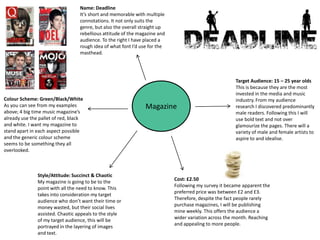
1. Name: Deadline
It’s short and memorable with multiple
connotations. It not only suits the
genre, but also the overall straight up
rebellious attitude of the magazine and
audience. To the right I have placed a
rough idea of what font I’d use for the
masthead.
Target Audience: 15 – 25 year olds
This is because they are the most
invested in the media and music
Colour Scheme: Green/Black/White industry. From my audience
As you can see from my examples Magazine research I discovered predominantly
above; 4 big time music magazine’s male readers. Following this I will
already use the pallet of red, black use bold text and not over
and white. I want my magazine to glamourize the pages. There will a
stand apart in each aspect possible variety of male and female artists to
and the generic colour scheme aspire to and idealise.
seems to be something they all
overlooked.
Style/Attitude: Succinct & Chaotic
Cost: £2.50
My magazine is going to be to the
Following my survey it became apparent the
point with all the need to know. This
preferred price was between £2 and £3.
takes into consideration my target
Therefore, despite the fact people rarely
audience who don’t want their time or
purchase magazines, I will be publishing
money wasted, but their social lives
mine weekly. This offers the audience a
assisted. Chaotic appeals to the style
wider variation across the month. Reaching
of my target audience, this will be
and appealing to more people.
portrayed in the layering of images
and text.