Download as PDF, PPTX


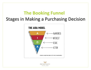


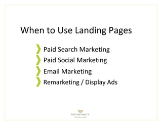
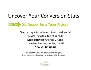

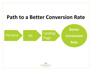
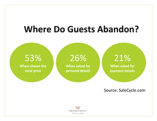


This document discusses how design can improve website conversion rates. It covers the stages of the purchasing decision process, the importance of landing pages, and tools for measuring design effectiveness. Key points that can reduce abandonment and improve conversion include minimizing form fields, clearly displaying prices, offering guarantees, and retargeting past visitors through ads and email. Design should focus on usability, match visitor goals, and guide users through the purchasing funnel to the call to action.


