
Recommended
More Related Content
Similar to Sandisk
Similar to Sandisk (20)
More from Gillian Pitzer
More from Gillian Pitzer (20)
Recently uploaded
Recently uploaded (20)
Sandisk
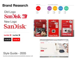
- 1. Brand Research Old Logo New Logo http://www.multimedialab.be/doc/tech/chartes/SanDisk_Guidelines_7.pdf Style Guide - 2005
- 2. Target Market SanDisk has different items meant for different target markets. Some, such as USB drives and SD cards are meant for home use by students and professionals. Others, such as massive storage systems, are designed for businesses. For the purpose of this project, I will be focussing on their “home use” section of products, geared towards students and professionals. https://www.sandisk.com/
- 3. POV SanDisk is a company that seems fairly dedicated with moving towards the future in terms of technology1. This, however, is not consistent with their packaging or logo. SanDisk packaging is often over-sized in comparison to the size of their products, which isn’t environmentally friendly or progressive. They’ve also only updated their logo once since the company was founded in 1988, and it looks outdated. These issues must be fixed.
- 4. Brand Character SanDisk is an old brand trying to look young. Their website is updated and looks fresh and clean, but their logo and packaging need work. It almost feels like the brand is scared to lose old customers through change, hence the same bold 80’s logo. The brand is like an old man trying to ride a skateboard, but switching to a cane in front of his friends.
- 5. Brand Changes Scared Confident Outdated Progressive Classic Contemporary Wasteful Green Typical Extraordinary Utilitarian Aesthetic
- 6. New Brand Character SanDisk should be a company that appeals to people of all ages. Upon asking my roommates, they said they all used SanDisk products but thought the company itself was aesthetically outdated. My goal is to bring SanDisk’s look from 1988 to 2018, to match the quality of its products.