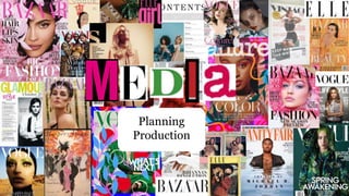
3. Research for product 1…
- When researching ‘young women’s health and lifestyle magazines’, I
was shocked at the lack of under 25’s represented on the front covers
of these magazines. Popular content such as ‘Women’s Own’ and
‘Women’s health’ provided mostly millennial women.
- This is why I decided to incorporate mental health and wellness into
my AZURE magazine. Not only do I believe young women need more
beneficial content within their magazines but also, young women
deserve the care and consideration of a informative, rewarding read.
- I decided to go against the usual content seen in my research, I took
inspiration from magazines such as ‘TEEN Mindfulness’ and
‘Cosmopolitan’ to include a more youthful, colourful and positive
approach.
4. Research for product 1…
- This particular front cover caught my eye. I
enjoy the pastel colour palette as well as the
confident posing of the model. I feel this is an
empowering and tasteful approach to the
representation of women in the media, (I am
ignoring the fact this model isn’t in my target
audience age).
- Additionally, the typography is informative and
contains catchy sell-lines. The content is mostly
positive and uplifting, while offering helpful
tips. I would like to incorporate this in my
magazine.
5. Don’t want… Do want…
Ignoring the lack of a real
image, I really enjoy the
typography of this magazine as
well as the colour pallet used.
The positive language connects
the reader to the magazine
while allowing the consumer to
really think about their own
minds and happiness.
I appreciate the quality of the
image and the green theme is
aesthetically pleasing. However
I’m not a fan of the
stereotypical slogans here. Not
only does Vogue limit it’s target
audience by sparking the
materialistic viewpoint of life
itself, but also, I think this cover
looks rather boring and
simplistic in terms of capturing
the attention of young women
6. Mock up of product 1…
AZURE
CONTENTS
May 2023
Marina’s Story
Skin is in!
Interact
Confidence
PAGE
14
TUNE
IN
25
PAGE
60
PAGE
A
Scan the QR code to
read more…
We ask the nation’s young
adults, what gives you
confidence?
LOGO
Comment to
improve on…
~my contents
needs more
information on
it, more stories
and pages to go
to, also needs a
QR code~
Comment to
improve on…
~the black
background
might not be
the best
choice, I may
opt for a light
pink to make
my image
stand out~
7. Layout
inspiration for
product 1…
• I enjoy the simplicity of the
contents as well as the large, clear
numbers and images included.
This will make it easier for my
readers to identity the page their
drawn to. I feel this page looks
modern, fresh and tasteful for
young readers to feel engaged and
inspired by.
• The different shades pf pink In
the cover are aesthetically pleasing
and stereotypically target a female
audience.
• I like the fact there's lots of
catchy sell-lines and the overall
mise-en-scene connotes a positive,
girlie energy which I feel my
young, female readers will connect
to and enjoy.
9. Research for product 2…
• As seen previously, when researching men’s mental health magazine,
there seems to be a majority of physical health provided rather than
mental wellness. Which I believe needs to change.
• Many idealised images of toned, muscly men are placed on these
front covers which may be harmful to many men’s self image and
result in them comparing themselves to these images often portrayed
in the media.
• Men’s suicides consistently account for 1/3 of all suicides in the UK
so I think it’s the responsibility of large media corporations to
enforce positive and helpful messages in order to connect with the
male target audience and make a difference.
10. Inspiration for
product 2 …
• ‘Men’s Health’ is where I’m taking most of my inspiration
from. I like the colour scheme and the central image. It gives
off a positive vibe and I enjoy the informative slogans.
• The contents layout here (left) is very unique. I like the vintage
cinema style typography and the structured lines. I feel the
overall mise-en-scene of this contents page is old school yet
illustrates a modern twist on popular media. I feel my target
audience will enjoy this style as it is clear, aesthetic and
enjoyable to view.
11. Don’t want… Do want…
This magazine portrays an
inviting image and informative
slogans which is what I’d like to
incorporate into my media
product. I like the pale blues
and yellows which creates a
light-hearted theme which is
great for my mental wellness
focus for AZURE.
This looks very professional
however the bland colours and
boring expression on James
Cordons face does not associate
with the 16 to 25 audience I
aim to target. I dislike the
slogans, none of them are
particularly eye capturing.
12. Magazine name ideas
- Name:
- Azure (favourite so far, means ‘bright and blue in colour like a
cloudless sky).
- Berserk (means ‘out of control’)
- Huzzah (express approval or delight)
- Syzygy (opposition, my second favourite)
13. AZURE
I personally adore this cover name. AZURE
symbolises positive energy, a clear blue sky is
something the majority of people appreciate- I
believe that idea will reflect in my magazine and
most people will enjoy the beneficial aspects of my
media.
In addition to this, AZURE has a second meaning
(according to source on the left). Butterflies are very
symbolic to me. They represent transformation and
new beginnings which I believe symbolise the
inspirational messages in my magazine as well as the
opportunity to transform as a student.
I used a lot of natural imagery in my photos, I utilized
flowers and tended to not apply makeup to my
models. The word AZURE associates with natural
imagery so I think it’s a great name to reflect the
contents of my magazine.