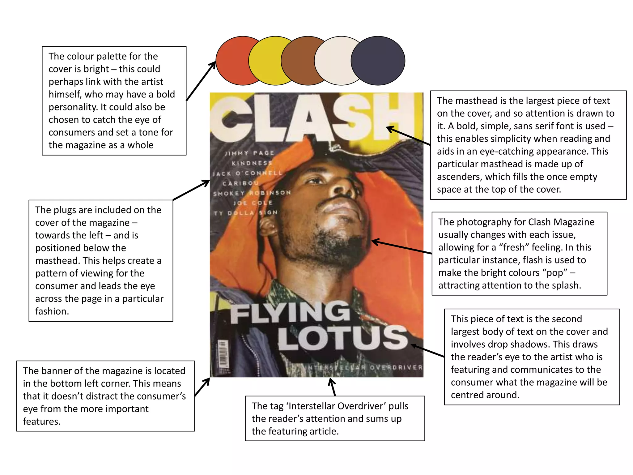
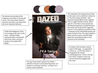
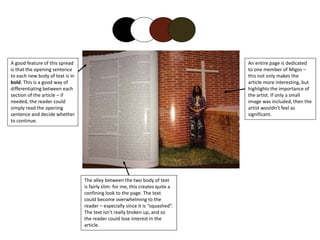
The document provides an analysis of the design elements used across the covers and interior pages of three music magazines: Clash, Dazed, and Fader. It examines the layout, typography, imagery and other stylistic choices made for the mastheads, covers, contents pages, and articles. Key points of comparison highlighted include the use of color palettes, grid structures, image sizes, and formatting of body text. The document aims to understand design conventions and how different magazines approach visual storytelling.