
Recommended
Recommended
More Related Content
What's hot
What's hot (13)
Viewers also liked
Viewers also liked (10)
Similar to Explode conftalk - v2 ppt
Similar to Explode conftalk - v2 ppt (20)
Recently uploaded
Recently uploaded (20)
Explode conftalk - v2 ppt
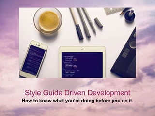
- 1. Style Guide Driven Development How to know what you’re doing before you do it.
- 2. I’m Emily. I’m a ‘Dev-Signer’ @ RaceRosterI’m also a furniture upcycler, Harry Potter enthusiast, cat owner and avid food eater. www.emilywyss.com
- 3. The Problemo! • Web Applications are getting out of control • Redundant and bloated interfaces • Poorly organized css files • Lack of consistency in design elements
- 4. EXAMPLE: The Header Conundrum Header One Header One Subheader Header Two Header Two Subheader Header Three Header Three Subheader Header Four Header Four Subheader Header Five Header Five Subheader Header Six Header Six Subheader Header One Header Two Header Three Header Four Header Five Header Six Header One Header Two Header Three Header Four Header Five Header Six Header One Header Two Header Three Header Four Header Five Header Six Header One Header Two Header Three Header Four Header Five Header Six Header One Header Two Header Three Header Four Header Five Header Six ☺Header One ☺Header Two ☺Header Three ☺Header Four ☺Header Five ☺Header Six Header One Header Two Header Three Header Four Header Five Header Six Header One Header Two Header Three Header Four Header Five Header Six
- 5. How We’ll Fix’er • Kicking off a project • Style Tiles • Atomic Design Methodology • Technical Tools of the Trade • Front-End Architecture
- 6. Let’s Give This Some Meaning • This is Shirley • She believes she has fame-worthy cats • She’s sad because there is no ‘The CatBook’ • She wants to build it, and needs your help.
- 7. Style Tiles Present clients with interface choices without making the investment in multiple photoshop mockups.
- 8. Style Tiles • Created by Samantha Warren @samanthatoy • More specific than mood boards and less specific than mockups • Specific Set up Steps: 1. Listen 2. Interpret 3. Define a visual vocabulary 4. Iterate
- 9. Kicking It Off • Clients know what they want best • Elicit meaningful context by asking the right questions • Interpret what they mean and translate that into tech-talk
- 10. STEP 1: Huh? Questions towards the business: • How do you make money? • What struggles do you have? Questions about the audience: • What does your target audience care about? • How do people learn about your service currently? Application specific questions: • What fundamental issues do you want to solve with this application? • How does it figure into your business model?
- 11. STEP 2: Say Whaa? “Interpret how the adjectives and themes you discovered translate into design principles such as balance and emphasis. That will help you make choices about how to use the elements of design. The final goal is to provide the right subtle visual cues that guide human’s subconscious assumptions towards the desired adjectives and themes.” - Samantha Warren
- 12. STEP 3: The Visual Vocab.
- 13. STEP 4: Iterate. Iterate. Iterate.
- 14. STEP 4: Iterate. Iterate. Iterate.
- 16. Atoms!
- 17. Examples of Atoms for ‘The CatBook’
- 18. Molecules!
- 19. Examples of Molecules for ‘The CatBook’
- 20. Organisms!
- 21. Examples of Organisms for ‘The CatBook’
- 24. MOAR TOOLS!
- 25. The CatBook Architecture Folders, and files, and code! Oh My!
- 26. BEM <div class="top-nav">…</div> .top-nav { color: $brand-primary; } <a class="top-nav__link"></a> .top-nav__link { color: $white; } <a class="top-nav__link—active"></a> .top-nav__link—active { color: $secondary; }
- 27. File Structure
- 28. File Structure
- 29. Variables
- 30. Conclusion • You can have nice things. • They can even scale • Profit Credit where Credit it Due: http://getbem.com/naming/ http://bradfrost.com/blog/post/atomic-web-design/ http://styletil.es/ http://peteschuster.com/2015/06/style-guide-driven-development/ https://scotch.io/tutorials/aesthetic-sass-1-architecture-and-style-organization
Editor's Notes
- You’ve either faced this problem, don’t want to face this problem or are currently facing this problem It’s not uncommon as an application grows bigger Especially common when the front end was neglected in the early days of building an app
- So many unique interface elements that serve specific purpose 1 element can even have multiple implementations 6 header levels for each of the 6: header header with subhead header in every color header as link header with icon header on image header with background Left, center, right aligned header Not surprising it gets out of hand because you can have any combination of the above… Like a right aligned, purple header with a subhead and icon on a background.
- Front-End isn’t the afterthought anymore with front-end frameworks, templating libraries and css processing tools like Sass. It’s come into its own as an art. Design and front end code can’t exist independently I do both and that’s where my brain space is at, so here is my process for building out the design and the front-end Can also do this with your front end developer and your designer working together. I’m going to touch high-level on a lot of topics, but please reach out to me to discuss more in depth if you’d like!
- We will make a front-end application that is: Scaleable, modular, efficient, reusable Trust me, with a little finesse, it’s achievable.
- Style tiles are a concept created by Samantha Warren. Based on the website, style tiles fill the gap where mood boards are too vague, and mockups too precise. Style tiles have their own process I’ll break down for you. The goal is to not spend all your time and energy designing or building something that may be poorly received That way you can agree on a high-level look and feel for your application before getting too specific
- Before delving into design, you’ll have to have a conversation in order to find out the goals, and define a visual vocabulary based off that
- These are awesome questions from Andy Rutledge’s blog. In the case of The CatBook, the answers could be as follows: They make money from advertising and partnerships Struggles they have is becoming known by the cat loving community Target audience cares about showing off their pets, connecting with other pet owners and keeping up with the latest cat trends Their service doesn’t exist yet, but people would learn about it from current famous cats plugging it (hopefully!). Otherwise through organic growth, or google search. Shirley wants to solve the problem of no social media platform that serves cats exclusively Her website is her business
- The next step is to interpret.
- The elements of design are things like lines, colour, shapes, patterns and texture. The principals of design are things like balance, unity and rhythm. We can extract certain verbs and adjectives to create a visual vocabulary: The application should be playful, community building, captivating, informative, fun and aim to connect. Elements of design that would help convey that vibrant photography to show the souls of the animals A playful display type A bright colour theme Some natural textures Less strict edges and lines.
- Here are some examples of style-tiles They all pull out different adjectives into their visual vocabulary and try to convey that The First: The Second: The Third:
- Here are some examples of style-tiles They all pull out different adjectives into their visual vocabulary and try to convey that
- The next step in the process is to build out an asset library based off your final tile. There are different ways to tackle it, but we’re going to use an atomic approach. Atomic design is a technique invented by Brad Frost. He breaks down every element on a page into their most basic components or atoms and scales up from there.
- In the world, all things are made of atoms. It’s our absolute smallest functioning element. In design, we also have atoms. These are absolute lowest design elements that still hold a meaning. For example, these elements could be: a label a button an input They can also include more abstract elements like: colours fonts or even animations There you can see a teeny, tiny little periodic table of elements. It contains low level HTML semantic elements
- Molecules are a grouping of atoms that make up a compound. They take the atoms and turn them into something useful. If you take your label, input and button and put them together, you can have a search bar, for example, and that would be a molecule. Molecules should be simple. The philosophy is they should do only 1 thing and do it well.
- Organisms are how we do more complicated things without losing our gosh darn minds! We CAN have nice things :D Organisms are a grouping of molecules that build up a relatively complex, distinct section of an interface. For example, a few buttons, a header, an image, a drop down menu and our search bar could make up a navigation bar. That navigation bar would be considered an organism.
- Building up organisms from atoms and molecules encourages you to create standalone, portable and reusable components.
- This is a little bit outside the scope of what we’re talking about but important to know but atomic design also has templates and pages Templates are putting your organisms together to form a layout, kind of like a wireframe. You know what organisms/assets you have to build from, which means you have a lot of consistency and scaleability right from the get go. Template = put it all together with real content and high fidelity so that you have a deliverable the client can see.
- Atomic design is not only a very popular design method Should also closely mimic your front-end architecture. It’s effective and modular, encourages consistency and ultimately allows your applications to scale. I usually use my absolute most favourite spreadsheet that lists out common patterns and elements across different styleguides and boilerplates. This is a pretty thorough list of all the elements (atoms, molecules, organisms, etc.) you’re going to have to account for in your design and front-end environment.
- Now onto building your asset library, I don’t actually like doing this part in any sort of graphic editing program. I jump directly into code for this. It’s more efficient for me and I feel like with the proper setup, you can easily make global adjustments if the direction shifts. You can do low-fidelity wireframes to create a balanced layout and get approval in a graphic editing program, but I like to create my high-fidelity mockup in the code. If you don’t think that workflow would work in your workplace, I still encourage you to create and perfect your asset library in code, and then recreate the final elements in your graphic editing program so you can copy and paste them to create your mockups. As a side note, some of my favourite graphic editing programs for wireframes and high-fidelity mockups are balsamiq and sketch, respectively. Sketch is nice, because you can even use your CSS to create your elements so they are really nice and matchy matchy across the different media. Theoretically, once your asset library is effectively defined, it shouldn’t take any longer than a high-fidelity graphic mockup to do it in the code, but it’s more concrete and actionable. Web applications are not static pages. They are so alive and dynamic that presenting a client or stakeholder with a static photoshop mockup really can’t do it justice. Static designs just don’t scale the way they need to. It’s just not efficient to create a photoshop file for a dashboard that needs to move and grow and shift based on what data is fed into it. But, like I said, different organizations have different needs and either method is correct!
- So, in terms of organizing our front-end architecture I break my Sass up into the different components that make up the style guide It’s also important to note that the style-guide and application should share the same css files to make sure they are both maintained if changes need to happen. This way, it’s also easy for me to know where everything lives because it’s all in one place! I use BEM naming methodology which stands for block element modifier.
- A block is a standalone element that has meaning on it’s own. It doesn’t have any dependencies on anything else on the page. So in the example of our navigation, the block would be the containing parent div. You give it a name that can contain letters, dashes and digits. For example: .top-nav. Elements are parts of the block and have no standalone meaning. Within a block, elements are semantically equal. In the nav, an element would be a link, for example. The name you give it can contain, letters, digits and dashes as well, but is appended off the block with two underscores. Modifiers are flags on blocks or elements. They are used to change the original behaviour, appearance or state. In the nav, a modifier would be a link that is active. The name you give it can, again, contain letters, digits and dashes, and can be appended off the block or the element by two dashes. For example, .top-nav__link--active. It’s also important to note that a Modifier is an extra class name which you add to a block/element DOM node. Add modifier classes only to blocks/elements they modify, and keep the original class. If you want to define an element based on a modified block, you’d list the block with its modifier, and nest the block element within that.
- As you can see, there is only one Sass file at the root level main.scss. All the other files are divided into appropriate folders and prefixed with an underscore (_) to tell Sass they are partial .scss files that shouldn’t be compiled to .css files. I use a manifest file to collect all the partials from a folder and then I put those manifests in the main. I like having them in manifests because I can specifically set the order of my imports (which is important). My cover, for example, has a button in it, so we need those to exist.
- Your base file holds all your boilerplate stuff and some typography Utilities hold all your helpers and elements you would use throughout your project, colours, typography, borders and radius, vertical rhythm. These are kind of like the containers of your global settings, and let’s say your font stack or colour red changes, you do it in one place! You also set up some of your atoms here. Components holds your smaller level elements, atoms and molecules of your app. Next, you’d have the layout files. These incorporate the organisms of your application. You can have a page specific code, i.e.: specific background images or patterns for specific pages. Can also not be partials if you want smaller files to load If you are working on a large site with multiple themes having a themes/ folder can make sense. You can stuff all your theme/design related styles in there. This is definitely project-specific so be sure to include it only if you feel the need. Finally, you’d have a vendors folder to hold code that’s not yours and you probably don’t want to touch. You can have a sub folder within there that overrides some of your vendor files, so you don’t have to touch them directly Main.scss lives at the root and
- You set up all your variable containers in 1 place and then you have them available to you throughout. For example, I’ve set up my brand-colours in the variables file. Then you can see, I’ve looped through them all to create utility classes such as font-colours and background-colours you can apply to DOM elements directly.