Powerpoint for Jedis - Tips and mind tricks to persuade in 5 minutes or less
•Download as PPTX, PDF•
1 like•956 views

Powerpoint is a force of great power which can be used for good or evil It is probably the most misused in business, we’ve all felt our life slipping away while watching bad powerpoint. This presentation shows how you can use the Force for good, to persuade in five minutes or less.

Recommended
Recommended
More Related Content
Viewers also liked
Viewers also liked (20)
Similar to Powerpoint for Jedis - Tips and mind tricks to persuade in 5 minutes or less
Similar to Powerpoint for Jedis - Tips and mind tricks to persuade in 5 minutes or less (20)
More from Luke Bilton
Recently uploaded
Recently uploaded (20)
Powerpoint for Jedis - Tips and mind tricks to persuade in 5 minutes or less
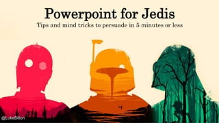
- 1. Powerpoint for Jedis Tips and mind tricks to persuade in 5 minutes or less @LukeBilton
- 3. The world’s most shocking slide Why repeat same information?
- 4. A cluttered hot mess Who made this logo up? Why all these logos? What is the message? What does this shape signify? Why repeat the same information? Why repeat the same information? The world’s most shocking slide
- 5. My best-ever presentation I actually sold something!
- 7. The Challenge Take your audience on a journey in 5 minutes 2. Identify audience’s problem Start where the Audience is and their problems 3-4 Take them a journey Supported by data and creativity Summarise the future-state and actions 1 You Establish your credibility in first 10 seconds 5. The goal
- 8. What are you trying to say? “A special effect is a tool, a means of telling a story. A special effect without a story is a pretty boring thing.” George Lucas
- 9. “Tell them what you are going to tell them, Tell them, then tell them what you told them.” Aristole (not Jar Jar Binks) Edit out everything that doesn’t move the narrative forward
- 10. Establish your authority like Darth Vader? @LukeBilton
- 11. Make a connection and get into the head of your audience The Jedi Way @LukeBilton
- 12. 8 Jedi Mind Tricks
- 13. 1. Headline/subject is important
- 16. Powerpoint for Jedis Tips and mind tricks to persuade in 5 minutes or less Most shared words in HubSpot headlines (via Buzzsumo)
- 17. 0 50 100 150 200 250 300 350 Management Essentials Powerpoint for Jedis +500% more views (but probably much worse training) What happened?
- 18. What happened? ‘Star Wars’ global interest (Google Trends MEXICO BRAZIL NETHERLANDS
- 19. Released as a Slideshare today to jump on #MayThe4thBeWithYou Let’s see what happens!
- 20. 65% of population are visual learners, Only 10% are auditory learners 2. Play on different learning styles
- 21. Alternate between visuals and data
- 22. 3. Visuals are 60,000x better than words
- 25. 4. Tell stories with data Is this number good? 2,000
- 26. 2,000 Time 1,200 +66% growth! 4. Tell stories with data
- 27. 1,800 2,000 Time 1,200 5,000 +66% But the market is growing +177% over the same period @LukeBilton 4. Tell stories with data
- 28. 0% 10% 20% 30% 40% 50% 60% 70% 80% 90% 100% 1 2 66% 40% We’ve lost a ¼ of the market! @LukeBilton 4. Tell stories with data
- 29. Active Twitter Users What is the story here? http://buzzsumo.com/blog/how-to-write-data-driven-stories-5-core-narratives/
- 30. What is the story here? http://buzzsumo.com/blog/how-to-write-data-driven-stories-5-core-narratives/
- 31. 5. The right diagram explains it all
- 33. 6. Update / Recycle Old Slides @LukeBilton 2012 2015 2016 2014
- 34. 7. Use a grid
- 35. 8. Make the design consistent @LukeBilton Rules used in this presentation Fonts: Headline in Rockwell, 44px, Copy in Helvetica, 20px Images are full bleed Page furniture including your Call to Action
- 36. 8. Make the design consistent @LukeBilton Rules used in this presentation Fonts: Headline in Rockwell, 44px, Copy in Helvetica, 20px Images are full bleed Page furniture including your Call to Action
- 37. End with a Summary (people like a summary) • Punch in and out like a Jedi. Make a connection, be short, and impactful • Keep focused on narrative, every slide should move story on. Cut the rest. • Keep words big and to a minimum. Don’t read the slides • Keep the brain firing by mixing up inspiring with practical tips, visuals with numbers • Use graphs to show explain data, diagrams to explain concepts • Recycle your work and others – if something is good, it is your duty to re-use • Use a consistent structure and grid • Think about the actionable takeaways and recap to drum in.
Editor's Notes
- Powerpoint is a force of great power which can be used for good or evil It is probably the most misused in business, we’ve all felt our life slipping away while watchingby bad powerpoint. My first few years in media were a bit like cringworthy I have made some truly awful presentations. With a shiny suit and business card, IPresented the wrong information to retail buyers without fact checking – and been called out on it. I have called rival magazine brands ‘paedophiles’ to Tescos, But by sheer bloodymindedness, by keep on doing it, I’ve now got some tricks that work. I don’t want to hear about Keynote or (shudder) Pressi – the most confusing way of presenting information I’ve ever seen. Editors work in Word, Finance think in Excel, my confession is that I dream in Powerpoint. I use it as a notebook to throw down ideas, to mock up web designs, and have found it force for good in communicating and persuading internally and externally. Over the next 30 minutes I want to share some tips and mind tricks
- Compare the two. What makes one better than the other What are the differences? Bill Gates: Cluttered, busy, animations, too much Steve Jobs: Communicating, simply and with clarity
- This is probably the world’s most shocking slide Was the ‘Prism’ slide deck Edward Snowdon’s most shocking revelation?
- Why, why, why?
- As a contrast, I want to show you my best presentation, and no slides were involved. Story of this. We used to go into media agencies. This was a presentation to Nintendo team at MediaCom. We did really complicated, we thought very clever proposals and always got beaten by the simplicity of someone coming in after us to offer a‘cover wrap on Shortlist’ So this brief we started off with the usual complicated media plan with online, in print, on mobile, completely integrated 365. But then the day before we went in , I thought there’s got to be better way, and mocked up one of the ideas, which was is back cover. Printed it and actually stuck it on the magazine…. Job done, it actually booked
- Your presentation is a battle for attention Often, the more important the presentation, the less time you are given. I’ve had board strategy presentations where literally given 5 minutes to summarise what we’re doing over the next 12 months Sometimes as management meeting I will deliberately ask for 60 seconds as it puts me under pressure to make what I say more impactful, and people switch off.
- The challenge I want to set you is to take your audience on a journey in 5 minutes. Even if you have been given 30 minutes to talk, don’t feel like you have to fill that up. Shorter, more impactful time. You can see in the Jedi’s journey. You, the old Jedi, are trying to influence you Paduan to go and do amazing things, to blow up the Death Star.
- Persuasive powerpoint has a strong narrative Really really think about the narrative. For weeks, perhaps, if a conference presentation Take 2 hours to present well for 5 minutes Hone the message down. E.g. “I’m trying to say this is the opportunity we should focus on/invest in. The rest is noise” NOT “Look how clever I am”
- Jar Jar Binks a character universally hated by Star Wars fans was ‘disappeared’ Keep very focused On the train today I was still taking things out…. this quote from Aristole nearly went
- First 10 seconds you need to make an impact. To establish why the listener should listen. First impressions made in 10 seconds. You could do this the Darth Vader way…. Enforce your authority. Waffle on about your CV, your job title, size of your portfolio, What might be a better intro?
- The jedi way is to make you want to listen. At the start of this presentation I wanted to make a connection with you…. So I started by asking you questions, so you have a stake in it, and told a story which a) Story which set the scene for what was to follow in a human way so what” Hopefully it established that I have some credibility in this. Which is important. I’m not ramming job titles down your throat but showing that this approach is something worth listening to, has unlocked media budgets Why would you listen to you? c) Starts to role model the right way to do it
- So we’ve got a tight, focused narrative, that starts with a short story. Here are 8 tricks you can employ Why are lists good? Gives a structure… “it’s not going to last all day”. Feels like you are getting value… “I will get 8 things” Good technique for this kind of presentation where trying to share lots of things. Scene setting + list
- This is Upworth’s editorial process….. Write 25 headlines
- 1. Address a training need. Better powerpoint
- What resonates with your audience. Star Wars has been absolutely huge over the last 6 months and is currently bigger than Trump and battling with God on google trends
- Then I added a subhead which is worth doing to more directly sell the benefits. Tips and Tricks What’s in it for me… Not just about making pretty slides, this is all about PERSUASION getting people to take action
- At a similar time some other training has gone on the hub. This is the difference in page views 3 days training, external trainer. Probably much better!
- People learn in different ways, should play on the senses to keep interest
- Alternate between different regions of the brain . e.g. Visual slide to a data slide. It is the powerpoint equivalent of varying how you speak In this example, my message here is ”Content is both creatinve and measurable”
- Visuals are 60,000 x better than words. Very important. Visuals of what? Not clipart! Something that brings it to life.
- Here’s a good tip for finding images for your presentations
- PNGs can be overlaid on a slide
- Source
- “Active Users: Facebook Continues to Outperform Twitter”
- What do these mean? What is the message? The right diagram can shape how you, your team, think. So spend time thinking about what your concepts actually looks like
- I was pleased to see this appearing on twitter – a diagram which sums up our role in an industry
- It’s not only easier, consistent messaging is a management technique. Much of my time at UBM can be told in a a series of funnel diagrams. It’s an over simiplification but hopefully it helps
- If time working with magazine designers taught me one thing, it’s line everything up. Makes a big difference
- Make it internally consistent If in doubt use HELVETICA 30pt
- Distracts Can be nice to keep elements standard