Download as PDF, PPTX

![3. What is information design?
Information design is the practice of presenting information in a way that fosters efficient
and effective understanding of it. The term has come to be used specifically for graphic
design for displaying information effectively, rather than just attractively or for artistic
expression. Information design is closely related to the field of data visualization and is
often taught as part of graphic design courses.[1] Tufte's writing is important in such fields
as information design and visual literacy, which deal with the visual communication of
information. He coined the word chartjunk to refer to useless, non-informative, or
information-obscuring elements of quantitative information displays. Tufte's other key
concepts include what he calls the lie factor, the data-ink ratio, and the data density of a
graphic.[10]
He uses the term "data-ink ratio" to argue against using excessive decoration in visual
displays of quantitative information.[11] In Visual Display, Tufte explains, "Sometimes
decoration can help editorialize about the substance of the graphic. But it is wrong to
distort the data measures—the ink locating values of numbers—in order to make an
editorial comment or fit a decorative scheme."[12] Tufte encourages the use of data-
rich illustrations that present all available data. When such illustrations are examined
closely, every data point has a value, but when they are looked at more generally, only
trends and patterns can be observed. Tufte suggests these macro/micro readings be
presented in the space of an eye-span, in the high resolution format of the printed page,
and at the unhurried pace of the viewer's leisure. Source: Wiki
https://www.youtube.com/watch?v=AdSZJzb-aX8](https://image.slidesharecdn.com/theareofchartv07-181221230447/85/Data-Visualization-Tips-4-320.jpg)
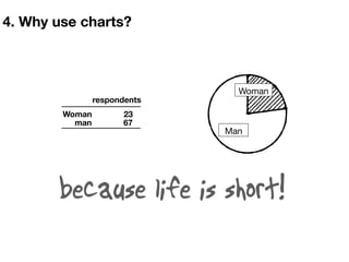
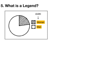
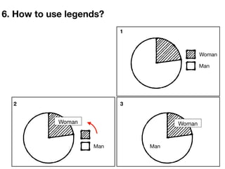
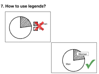
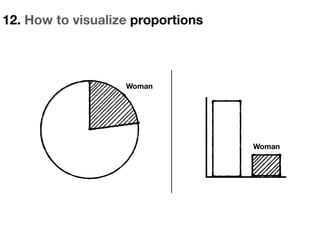
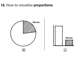
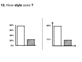
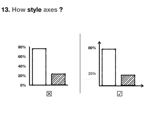
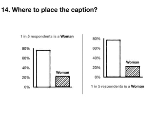
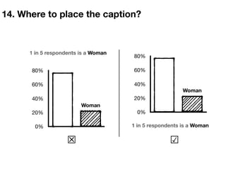
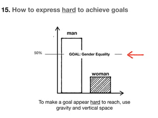
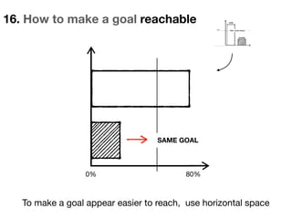
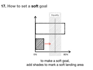
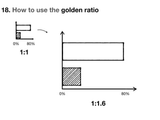
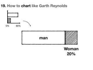
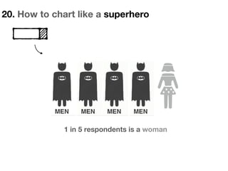
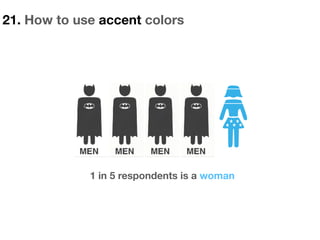
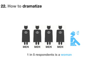
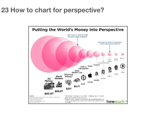
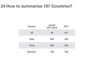
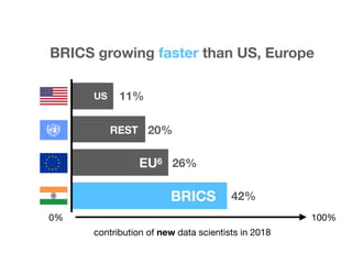
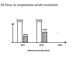
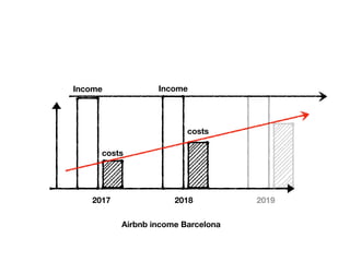
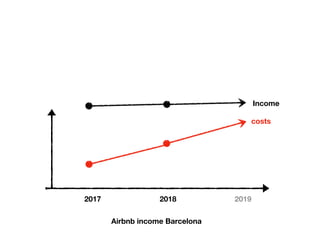
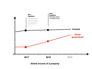
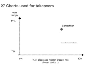
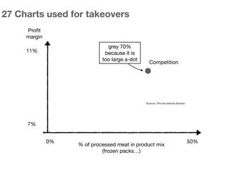
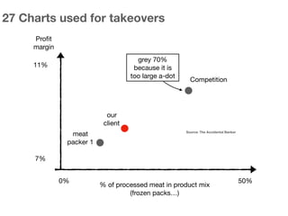
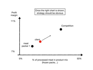
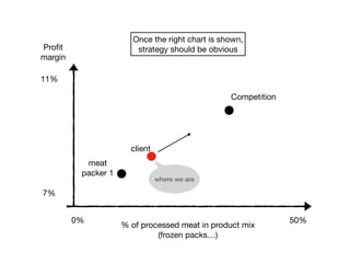
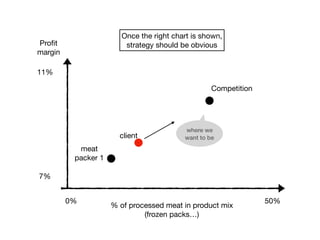

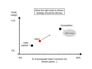


The document provides tips and best practices for using data visualization to tell stories and convey information effectively. It discusses key concepts like using legends and captions properly, visualizing proportions, styling axes, expressing goals and targets, and dramatizing charts to emphasize specific points. The tips are illustrated with examples of charts and diagrams. It concludes by discussing how charts can be used strategically for business goals like mergers and acquisitions planning.


