What do I feel I have learnt in the
progress from the school magazine to
my final production?
By Dominika Malina
Research And Planning
My skills have improved a lot since my school magazine production as I’ve done a lot of primary
and secondary research and covered some topics such as fashion and music genre in depth. For
example, I wanted to do a magazine based on dub step and this genre has a lot of sub-genres such
as drumstep, brostep, chillstep and trap. Then, I would need to research a lot about the subgenre
to find out what makes it special and what it sounds like. On the other hand, for fashion, I needed
to construct a survey for my target audience, which stated that they are into fashion and
technology. I researched fashion trends, and came up with my model’s outfit based on that
information, then I made another survey and asked my target audience if they think she is
fashionable to get a desirable feedback which was mostly positive.
I also researched my target audience and made sure my magazine was interesting for my viewers
in response. For instance, my audience liked fashion and technology, so I slightly based my
magazine on that by adding some topics that would be interesting for people who are in that
specific group of liking. For example, I've included a puff stating that the magazine comes with a
free CD, this means that my target audience are more likely to buy it because they like music of
that genre. I also included a lot of band and artist names on my front cover to appeal to as many
fans as possible.
In my music magazine production, I was interested in seeing what makes a professional magazine successful. Based on that
particular information, I tried to include a lot of graphics, eye catching font, Image, and even a Logo. In my school magazine, I
didn’t research or use any professional school magazines for inspiration or reference, therefore I lacked some common knowledge
of magazine layout and production initially. I realised how research can be incredibly important as it can make my outcome a lot
better than it would’ve been if I wouldn't research as many things as I have for my music magazine.
I’ve also learned to complete work faster more efficiently before the deadline, managing my time sufficiently throughout the
production time. For example, I was a lot slower on Photoshop when I did my school magazine as I didn’t know any shortcuts and I
didn’t use any macs before. Additionally, I’ve learned to lay out a magazine better and take professional photographs of a model
in a studio by researching what type of lighting has to be placed in the studio and where. Planning the photo-shoot included a lot
of things, such as the clothing, emotion and pose of the model, the person itself and even paperwork.
Construction Front Cover
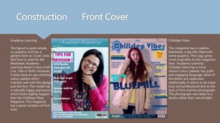
Academy Learning:
The layout is quite simple,
no graphics and has a
generic font on Cover Lines.
Senf font is used for the
Masthead. Academy
Learning doesn’t have a Sell
Line, Title or Puffs. However,
it does have an eye-catching
colour palette which
matches well with the design
and the font. The model has
a naturally happy expression
which looks slightly happier
than the Chillstep Vibes
Magazine. This magazine
has a good variation of font
sizes.
Chillstep Vibes:
This magazine has a creative
Masthead, a big title tilted with
some graphics. The Logo gives
more originality to this magazine
than “Academy Learning”.
Chillstep Vibes has a more
vibrant colour palette, has puffs
and engaging language. Most of
the letters are uppercase.
Additionally, It seems to be more
busy and professional due to the
type of font and the photograph.
The photograph was taken in a
studio rather than natural light.
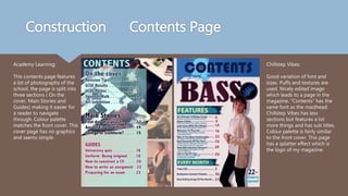
Construction Contents Page
Academy Learning:
This contents page features
a lot of photographs of the
school, the page is split into
three sections ( On the
cover, Main Stories and
Guides) making it easier for
a reader to navigate
through. Colour palette
matches the front cover. This
cover page has no graphics
and seems simple.
Chillstep Vibes:
Good variation of font and
sizes. Puffs and textures are
used. Nicely edited image
which leads to a page in the
magazine. “Contents” has the
same font as the masthead.
Chillstep Vibes has less
sections but features a lot
more things and has sub titles.
Colour palette is fairly similar
to the front cover. This page
has a splatter effect which is
the logo of my magazine.

What do i feel i have learnt in

  • 1.
    What do Ifeel I have learnt in the progress from the school magazine to my final production? By Dominika Malina
  • 2.
    Research And Planning Myskills have improved a lot since my school magazine production as I’ve done a lot of primary and secondary research and covered some topics such as fashion and music genre in depth. For example, I wanted to do a magazine based on dub step and this genre has a lot of sub-genres such as drumstep, brostep, chillstep and trap. Then, I would need to research a lot about the subgenre to find out what makes it special and what it sounds like. On the other hand, for fashion, I needed to construct a survey for my target audience, which stated that they are into fashion and technology. I researched fashion trends, and came up with my model’s outfit based on that information, then I made another survey and asked my target audience if they think she is fashionable to get a desirable feedback which was mostly positive. I also researched my target audience and made sure my magazine was interesting for my viewers in response. For instance, my audience liked fashion and technology, so I slightly based my magazine on that by adding some topics that would be interesting for people who are in that specific group of liking. For example, I've included a puff stating that the magazine comes with a free CD, this means that my target audience are more likely to buy it because they like music of that genre. I also included a lot of band and artist names on my front cover to appeal to as many fans as possible.
  • 3.
    In my musicmagazine production, I was interested in seeing what makes a professional magazine successful. Based on that particular information, I tried to include a lot of graphics, eye catching font, Image, and even a Logo. In my school magazine, I didn’t research or use any professional school magazines for inspiration or reference, therefore I lacked some common knowledge of magazine layout and production initially. I realised how research can be incredibly important as it can make my outcome a lot better than it would’ve been if I wouldn't research as many things as I have for my music magazine. I’ve also learned to complete work faster more efficiently before the deadline, managing my time sufficiently throughout the production time. For example, I was a lot slower on Photoshop when I did my school magazine as I didn’t know any shortcuts and I didn’t use any macs before. Additionally, I’ve learned to lay out a magazine better and take professional photographs of a model in a studio by researching what type of lighting has to be placed in the studio and where. Planning the photo-shoot included a lot of things, such as the clothing, emotion and pose of the model, the person itself and even paperwork.
  • 4.
    Construction Front Cover AcademyLearning: The layout is quite simple, no graphics and has a generic font on Cover Lines. Senf font is used for the Masthead. Academy Learning doesn’t have a Sell Line, Title or Puffs. However, it does have an eye-catching colour palette which matches well with the design and the font. The model has a naturally happy expression which looks slightly happier than the Chillstep Vibes Magazine. This magazine has a good variation of font sizes. Chillstep Vibes: This magazine has a creative Masthead, a big title tilted with some graphics. The Logo gives more originality to this magazine than “Academy Learning”. Chillstep Vibes has a more vibrant colour palette, has puffs and engaging language. Most of the letters are uppercase. Additionally, It seems to be more busy and professional due to the type of font and the photograph. The photograph was taken in a studio rather than natural light.
  • 5.
    Construction Contents Page AcademyLearning: This contents page features a lot of photographs of the school, the page is split into three sections ( On the cover, Main Stories and Guides) making it easier for a reader to navigate through. Colour palette matches the front cover. This cover page has no graphics and seems simple. Chillstep Vibes: Good variation of font and sizes. Puffs and textures are used. Nicely edited image which leads to a page in the magazine. “Contents” has the same font as the masthead. Chillstep Vibes has less sections but features a lot more things and has sub titles. Colour palette is fairly similar to the front cover. This page has a splatter effect which is the logo of my magazine.