This document provides references for research related to craft, art, design, and critical theory. It includes over 50 sources such as books, journal articles, websites, images and more covering topics like the arts and crafts movement, craftsmanship, contemporary crafts, critical theorists like Marx and Baudrillard, and street artists who create chalk art. The references cover a wide range of materials from the 19th century to present day and would be useful for research in art, design, craft or critical theory.
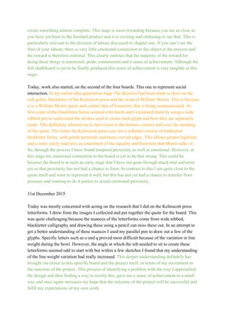
![Frayling,C., 2011. Reprint. On Craftsmanship: Towards a New Bauhaus. London: Oberon
Books Ltd.
Gauntlet, D. 2011., Making is Connecting The Social Meaning of Creativity, from DIY and
Knitting to YouTube and web 2.0. Cambridge: Polity Press
Racz, I., 2009. Contemporary Crafts. Oxford: Berg.
Douglas, D., and Halper,V. eds., 2009. Choosing Craft, the artist's viewpoint. Chapel Hill:
The University of North Carolina Press.
Dormer, P. ed., 1997. The Culture of Craft. Manchester: Manchester University Press.
McGovern, U., 2008. Lost Crafts Rediscovering traditional Skills. Edinburgh: Chambers
Harrap Publishers Ltd.
Ruskin, J., and Links, J.G. ed. 1960 [1851]. The Stones of Venice. Cambridge: Da Capo
Press.
The Arty Factory., 2015. William Morris The Arts and Crafts Movement. [online] Availible at:
<www.artyfactory.com/art_appreciation/graphic_designers/william_morris.html> [Accessed
15th October 2015].
Cox, J., 1998. An Introduction To Marx’s Theory of Alienation. [online] Available at:
<pubs.socialistreviewindex.org.uk/isj79/cox.htm> [Accessed 30th October 2015].
Marx, K., 2008 [1867]. Capital: A New Abridgement (D, McLellan. ed.) Abridged. Oxford:
Oxford University Press.
Ollman, B., 1978. Alienation Marx’s Conception of Man in Capitalist Society. 2nd ed.
Cambridge: Cambridge University Press.
Lunn, E., 1984. Marxism and Modernism; an Historical Study of Lukacs, Brecht, Benjamin
and Adorno. Reprint. Berkeley: University of California Press.
Fischer, E. and Marek, F., 1997. How to Read Karl Marx. New Edition.Translated from
German by A. Bostock. New York: Monthly Review Press.
Marx, K., 2000 [1844]. Marx. Economic and Philosophic Manuscripts of 1844. Translated
from German by M. Mulligan. [online] Availible at:
<https://www.marxists.org/archive/marx/works/1844/manuscripts/preface.htm> [Accessed
2nd November 2015].](https://image.slidesharecdn.com/cop03referencelist-2-160112183232/85/Cop03-referencelist-2-1-320.jpg)
![Frayling,C., 2011. Reprint. On Craftsmanship: Towards a New Bauhaus. London: Oberon
Books Ltd.
Gauntlet, D. 2011., Making is Connecting The Social Meaning of Creativity, from DIY and
Knitting to YouTube and web 2.0. Cambridge: Polity Press
Racz, I., 2009. Contemporary Crafts. Oxford: Berg.
Douglas, D., and Halper,V. eds., 2009. Choosing Craft, the artist's viewpoint. Chapel Hill:
The University of North Carolina Press.
Dormer, P. ed., 1997. The Culture of Craft. Manchester: Manchester University Press.
McGovern, U., 2008. Lost Crafts Rediscovering traditional Skills. Edinburgh: Chambers
Harrap Publishers Ltd.
Ruskin, J., and Links, J.G. ed. 1960 [1851]. The Stones of Venice. Cambridge: Da Capo
Press.
The Arty Factory., 2015. William Morris The Arts and Crafts Movement. [online] Availible at:
<www.artyfactory.com/art_appreciation/graphic_designers/william_morris.html> [Accessed
15th October 2015].
Cox, J., 1998. An Introduction To Marx’s Theory of Alienation. [online] Available at:
<pubs.socialistreviewindex.org.uk/isj79/cox.htm> [Accessed 30th October 2015].
Marx, K., 2008 [1867]. Capital: A New Abridgement (D, McLellan. ed.) Abridged. Oxford:
Oxford University Press.
Ollman, B., 1978. Alienation Marx’s Conception of Man in Capitalist Society. 2nd ed.
Cambridge: Cambridge University Press.
Lunn, E., 1984. Marxism and Modernism; an Historical Study of Lukacs, Brecht, Benjamin
and Adorno. Reprint. Berkeley: University of California Press.
Fischer, E. and Marek, F., 1997. How to Read Karl Marx. New Edition.Translated from
German by A. Bostock. New York: Monthly Review Press.
Marx, K., 2000 [1844]. Marx. Economic and Philosophic Manuscripts of 1844. Translated
from German by M. Mulligan. [online] Availible at:
<https://www.marxists.org/archive/marx/works/1844/manuscripts/preface.htm> [Accessed
2nd November 2015].](https://image.slidesharecdn.com/cop03referencelist-2-160112183232/75/Cop03-referencelist-2-1-2048.jpg)
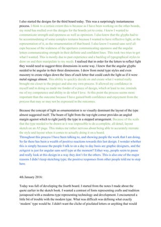
![(d) Felluga, D., 2011. Modules on Baudrillard: On Simulation : Introductory Guide to Critical
Theory. [online] Available at:
<https://www.cla.purdue.edu/english/theory/marxism/modules/marxfetishism.html>
[Accessed 15th November].
Fisher, S., 2011.Guy Debord / Society of the Spectacle – summary: "Unity and Division
within Appearance". [online] Availible at:
<http://culturalstudiesnow.blogspot.co.uk/2011/05/guydebordsocietyofspectaclesummary
_1357.html> [Accessed 5th November 2015].
Al, S. and Krupar, S., 2011. Notes on the Society of the Spectacle/Brand. In: C. Crysler, S.
Cairns, and H. Heynen. eds. 2013. The SAGE Handbook of Architectural Theory. Thousand
Oaks, CA: SAGE Publications. Ch.14.
Kaplan, R. L., 2012. Between Mass Society and Revolutionary Praxis: The Contradictions of
Guy Debord’s Society of the Spectacle. European Journal of Cultural Studies. [ejournal]
15(4) Abstract only. Available through: European Journal of Cultural Studies Archive
website. <http://ecs.sagepub.com/content/15/4/457.abstract> [Accessed 7th November
2015].
Oxford University Press., 2015. Oxford Dictionaries. [Online] Oxford: Oxford University
Press. Availible through:
<http://www.oxforddictionaries.com/definition/english/weltanschauung> [Accessed 15th
November 2015].
Baudrillard, J., 1981. Simulacra and Simulations. In: M. Poster, ed. 1988. Jean Baudrillard,
Selected Writings. Stanford, Stanford University Press. pp.166184.
Debord, G., 2006 [1967]. The Society of the Spectacle. Translated from French by D.
NicholsonSmith. 3rd ed. Cambridge, Massachusetts, and London, England, Gallimard.
(a) Felluga, D., 2011. Modules on Baudrillard: On Simulation : Introductory Guide to Critical
Theory. [online] Availible at:
<http://www.purdue.edu/guidetotheory/postmodernism/modules/baudrillardsimulation.html>.
[Accessed 8th November 2015].
Massumi, B.,1987?. Realer than Real, The Simulation According to Deleuze and Guattari.
[pdf] Brian Massumi. Availible at:
<http://www.brianmassumi.com/textes/REALER%20THAN%20REAL.pdf> [Accessed 8th
November 2015].
(b) Felluga, D., 2011. Modules on Jameson: On Pastiche: Introductory Guide to Critical
Theory. [Online] Available at:](https://image.slidesharecdn.com/cop03referencelist-2-160112183232/85/Cop03-referencelist-2-2-320.jpg)
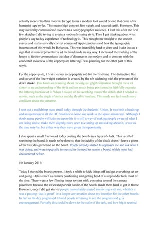
![<https://www.cla.purdue.edu/english/theory/postmodernism/modules/jamesonpastiche.html>
[Accessed 13th November 2015].
Duvall, J. N., 2012. Troping History: Modernist Residue in Jameson’s Pastiche and
Hutcheon’s Parody. [pdf] Availible at: <http://www.sunypress.edu/pdf/60465.pdf> [Accessed
13th November 2015].
Jameson, F. 1991 [1984]. Postmodernism, or The Cultural Logic of Late Capitalism. [pdf]
Availible at: <http://www.sok.bz/web/media/video/JamesonPostmodernism.pdf> [Accessed
13th November 2015].
(c) Felluga, D., 2011. Modules on Hutcheon: On Parody: Introductory Guide to critical
Theory. [Online] Availible at:
<https://www.cla.purdue.edu/english/theory/postmodernism/modules/hutcheonparody.html>
[Accessed 14th November 2015].
Hutcheon, L., 1987. The Politics of Postmodernism: Parody and History. [pdf] University of
Minnesota Press. Available at:
<http://people.ds.cam.ac.uk/paa25/Papers/PoMo_files/Linda%20Hutcheon.pdf>[Accessed
14th November 2015].
Lily & Val,. 2013. Behind the Chalk at Lily & Val How Valerie McKeehan's Chalk Art Comes
to Life. [video online]. Avialible at: <https://vimeo.com/77309273> [Accessed 24th November
2015].
Lily & Val,. 2015. About Lily & Val, Our Little Story. [online] Availible at:
<http://lilyandval.com/pages/aboutus> [Accessed 24th November 2015].
Buzbee, L., 2014. Blackboard A Personal History of the Classroom. Minneapolis: Greywolf
Press.
Morris, W., 1878. The Decorative Arts Their Relation to Modern Life and Progress, An
Address Delivered Before the Trades’ Guild of Learning, of London Primary Source Edition.
Cambridge: Press of John Wilson & Son.
Lupton, E., 2004. 2nd ed. Thinking With Type A Critical Guide for Designers, Writers, Editors
& Students. New York: Princeton Architectural Press.
Greenhalgh, P., 1997. The Progress of Captain Ludd. In P. Dormer, ed. 1997. The Culture of
Craft. Manchester: Manchester University Press.
Rees, H., 1997. Patterns of Making: Thinking and Making in Industrial Design. In P. Dormer,
ed. 1997. The Culture of Craft. Manchester: Manchester University Press.](https://image.slidesharecdn.com/cop03referencelist-2-160112183232/85/Cop03-referencelist-2-3-320.jpg)
![Dormer, P., 1997. Craft and the Turning Test for Practical Thinking. In P. Dormer, ed. 1997.
The Culture of Craft. Manchester: Manchester University Press.
Hickley, G., 1997. Craft Within a Consuming Society. In P. Dormer, ed. 1997. The culture of
Craft. Manchester: Manchester University Press.
Csikszentmihalyi, M. and Nakamura, J., 2001? The Concept of Flow. [pdf]. Available at:
<http://myweb.stedwards.edu/michaelo/2349/paper1/ConceptOfFlow.pdf> Accessed: 7th
December 2015.
Image references
Fig.1
Tanamachi Studios, n.d. Andaz 5th Ave Installation. [Image Online] Availible at:
<http://tanamachistudio.com/chalk/oooptarh1n8hu8tvj97kvgop55jhvo> [Accessed 24th
November 2015].
(Andaz 5th Ave Installation, n.d.)](https://image.slidesharecdn.com/cop03referencelist-2-160112183232/85/Cop03-referencelist-2-4-320.jpg)
![Fig.2
Tanamachi Studios, Ryan Feerer, n.d. AbiHaus Installation. [Image Online] Availible at:
<http://tanamachistudio.com/chalk/w06v3ilie0grrkcmv151xk2mtawqte> [Accessed 24th
November 2015].
(AbiHaus Installation, n.d.)](https://image.slidesharecdn.com/cop03referencelist-2-160112183232/85/Cop03-referencelist-2-5-320.jpg)
![Fig.3
Lauren Hom, n.d. Mountain/Ital Signs. [Image Online] Available at:
<http://homsweethom.com/filter/chalk/WillLetterForLunch> [Accessed 24th November
2015].
(Mountain/Ital Signs, n.d.)](https://image.slidesharecdn.com/cop03referencelist-2-160112183232/85/Cop03-referencelist-2-6-320.jpg)
![Fig.4
Lauren Hom, n.d. Welcome/Docklands Signs. [Image Online] Available at:
<http://homsweethom.com/filter/chalk/WillLetterForLunch> [Accessed 24th November
2015].
(Welcome/Docklands Signs, n.d.)
Fig. 5
Hom, L., 2015. Wichcraft Mural. [Image Online] Available at: . Accessed: 8th December
2015.
(Wichcraft Mural, 2015)](https://image.slidesharecdn.com/cop03referencelist-2-160112183232/85/Cop03-referencelist-2-7-320.jpg)
![Fig. 6
Hom, L., 2015. Namastay In Bed All Day. [Image Online] Available at: . Accessed 8th
December 2015.
(Namastay In Bed All Day, 2015)](https://image.slidesharecdn.com/cop03referencelist-2-160112183232/85/Cop03-referencelist-2-8-320.jpg)
![Fig.7
Hom, L., 2015. Inking Letters. [Image Online] Available at: . Accessed 8th December 2015.
(Inking Letters, 2015) (Namastay In Bed All Day, 2015)](https://image.slidesharecdn.com/cop03referencelist-2-160112183232/85/Cop03-referencelist-2-9-320.jpg)
![Fig.8
Mckeehan, V., 2015. Luke’s 2:9 Scripture. [Image Online] Available at:
<http://lilyandval.com/collections/whatsnew/products/luke29scriptureprint> Accessed:
8th December 2015.
(Luke’s 2:9 Scripture, 2015)
Appendices](https://image.slidesharecdn.com/cop03referencelist-2-160112183232/85/Cop03-referencelist-2-10-320.jpg)
![Appendix A:
Phylecia Sutherland. 2015. Phylecia Sutherland Reflects on Her Work. Interviewed by...Beth
Taylor. [Electronic Correspondence] Location N/A, 19th November 2015.
1. Would you define what you do as craft? Why?
Yes, letterpress is a craft because it takes it takes skill. Not anyone can jump on
a press and expect things to be beautifully printed. Letterpress is craft that is
learned over time and takes a lot of practice, and the older the press the more
skill it may take.
2. What made you choose to create things yourself for a living?
Mostly I ventured out not due to my creativity, but my need to work for myself.
I don’t do well with being ‘boxed’ in my ideas and creativity limited or stifled
by the agenda of others. Maybe that is because I am creative?
3. Would you say a crafted object such as what you produce has increased in
value in this digital age?
Absolutely. Letterpress itself has had waves of popularity, but those who
choose letterpress know it’s value are willing to pay for it. It is a handcrafted,
slow process and as all things that are handcrafted and tailored to its customer,
you get what you pay for.
4.Why do you think this is?
In terms of stationery, I think many people long to be able to hold things in
their hand, a handwritten card in the mail is always more valuable and more
cherished than an email. Then moving on from just something solid, people
want to see something special. They want to be wowed, see that something has
been created by a human. Letterpress gives that extra bit of specialness that
digital printing does not have.
5. Have you found an increase in demand for your work as digital advances
continue?](https://image.slidesharecdn.com/cop03referencelist-2-160112183232/85/Cop03-referencelist-2-11-320.jpg)