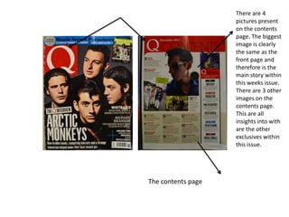
1. There are 4
pictures present
on the contents
page. The biggest
image is clearly
the same as the
front page and
therefore is the
main story within
this weeks issue.
There are 3 other
images on the
contents page.
This are all
insights into with
are the other
exclusives within
this issue.
The contents page
2. NME Magazine
This is the front cover from a NME issue. They
have clearly included a bright bold title letting
all the readers know straight away that this
magazine is NME. They have stuck to a colour
scheme of yellow and red which is clearly
followed out throughout the rest of the
magazine and images of the main story. The
main image on the page are of the main story
on the libertines. Their outfits also correspond
with the colour scheme used. There is a clear
main story, as it is highlighted by the bold
yellow background and the change in font and
size. There are also side stories, stating the
exclusives and features in smaller and less eyecatching fonts. They have used a design feature
to make the page look as if it has been torn out
of paper. There again is a clear price and
barcode indicating how much the magazine will
cost. There is also another clear indication to
what the story will tell by a short pull line across
the centre of the page luring in the audience
once again.
3. Q Magazine
This is the front cover of Q magazine which
you can clearly tell by the massive Q logo at
the right top hand corner. There is a clear
photograph that takes up the whole page. It is
an image of the four members of the band The
Arctic Monkeys. You can clearly tell from the
image that Alex Turner the person centered in
the image is the main leader of the group as
he is the only looking down the camera with
eye contact with the audience when the other
3 members are looking away. There is a clear
difference between the text size. The main
story is in big bold white writing clearly
indicating it is the main story. There are also
smaller stories on the right hand side in
smaller writing indicating they are smaller
stories. To lure audience readers in the front
page has been completed by a short sentence
explaining what each story has to offer and
what people are expected to see. There is also
a clear price and barcode letting the audience
know how much it will cost.
4. NME Magazine
This is a front cover from NME magazine which
you can clearly tell as there is the statement
NME bold title in the top left hand corner.
There is also a very clear main story. The text
nearly covers the whole of the front page
clearly indicating that it is the main story. The
other stories are written in smaller text and do
not cover as much print space. All of the
stories are written and coloured within the
colour scheme of red, white, black and yellow.
Everything is written in very bold and basic
type font, which makes things easy to read and
easy to notice on a self compared to other
magazines. There is an image on the main page
which relates to one of the stories inside, but
does not clearly relate to the main story of the
issue and the writing of the main story is
nearly double the size of the image. Commonly
there is a barcode and price indicating how
much this issue will cost.
5. Conclusion
I have realised from my research that there are a few vital
things I need to include on my front page. Firstly I have
realised that I need to include a bold eye-catching title so
people know exactly what my magazine is. I also need to
ensure that my main story has a bigger cover line than
the rest of my stories ensuring that consumers know
what is the most important story of the issue. I also need
to include a barcode and price to ensure people know
how much they will be charged for my magazine. I also
need to ensure I stick to a clear colour scheme, so that
my magazine will stand out in comparison to other
peoples on the self. I also need a clear house style so that
people can clearly tell my magazine has fluency.