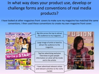
1. In what way does your product use, develop or challenge forms and conventions of real media products? I have looked at other magazines front covers to make sure my magazine has matched the same conventions. I then used these conventions to create my own magazine front cover. Big title across the top to attract the audience to my magazine. Large image of artist or band to attract the audience to the magazine. Tag line advertising exclusive interviews to give people information on what will be inside and in the article. I have advertised relevant artists and relevant activities to the niche market
2. I have developed some of the conventions of the front cover to better fit my niche market and to make it unique and different from anything currently in the market this will then make people want to read it over other magazines. In my magazine I have used a more mellow colour scheme because although they don't stand out as much they attract an older age range rather than younger teens I have also just focused on one artist for the front cover to focus peoples attention.
3. I have looked at other magazines contents pages to make sure my magazine has matched the same conventions. I then used these conventions to create my own contents for a magazine. Large title across the top to let readers know that this is the contents page. Picture of front cover annotated so that readers know where to find articles that have been advertised. Clearly labelled page numbers and information about what is on that page. Included pictures of artists to make the page look more attractive and clearly shown the page number so readers can find it. I have split the contents into sections to make it easier to read and easier for the audience to find what their looking for.
4. I have looked at double page spreads in other magazines to make sure my magazine has matched the same conventions. I then used these conventions to create my own double page spread for my magazine. Big title spreading across the top of both pages, in a bold colour to contrast the background Large picture covering most of the left hand page to catch peoples eye and make them interested in reading the article. Introduction to the article to give readers an insight in to what the full articles about. Other pictures that show the band in a more natural feeling.
5. I have developed some of the conventions of other contents pages to better fit my niche market and to make it unique and different from anything currently in the market. I have gone for a softer colour scheme as to reflect the genre of the bad. I have added in quotations from the article as to make the article more eye catching and by putting quotes it interests people in to reading the rest. I have put the images on one page as to not disruption the reading of the article.