
Recommended
Recommended
More Related Content
What's hot
What's hot (12)
Viewers also liked
Viewers also liked (13)
Similar to Qcl 15-v4 [challenge-no-4]_[scmld]_[ketan,parag,simranjit]
Similar to Qcl 15-v4 [challenge-no-4]_[scmld]_[ketan,parag,simranjit] (12)
Recently uploaded
Recently uploaded (20)
Qcl 15-v4 [challenge-no-4]_[scmld]_[ketan,parag,simranjit]
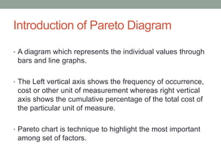
- 1. Introduction of Pareto Diagram • A diagram which represents the individual values through bars and line graphs. • The Left vertical axis shows the frequency of occurrence, cost or other unit of measurement whereas right vertical axis shows the cumulative percentage of the total cost of the particular unit of measure. • Pareto chart is technique to highlight the most important among set of factors.
- 2. Pareto Diagram 0.00 10.00 20.00 30.00 40.00 50.00 60.00 70.00 80.00 90.00 100.00 0 50 100 150 200 250 300 Boredom Unforceen Issue Pedagogy of the teacher Duration Of The Lecture Fatigue Count Cumulative Percentage
- 3. Stratification of symptoms of the problem • Duration of the lecture • Boredom - Interest of the students in the subject • Fatigue • Pedagogy of the teacher • Unforeseen issues • - Relationship • Health issues of students
- 4. Lessons learned by team • Reason for less attendance- Pareto diagram showed the main reason for bunking lectures is the student’s interest factor in the particular subject. • Pedagogy of the teacher- This diagram represented that pedagogy of the teacher also one of the main factor for absenteeism in the class