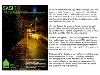
1. On the left hand side of this page is the final design that I have
decided to go for As you can see I stuck to the original design
idea that I came up with in my flat plans. The title at the top
with the tagline, a statistic about homelessness underneath
that. Information about the charity in the bottom right and the
charities logo in the bottom left.
I felt that this was the neatest style that I could go for and I
wanted to keep it simplistic whilst remaining effective. The
colour scheme that I went for was primarily the same as what I
said that it would be in the flat plan design area.
I stuck to mostly greens. I used the colour grab tool to ensure
that I had the same tone of green as the SASH logo. I thought
that perhaps I would use more blues and whites in the colour
scheme but I decided to stick mostly to the green with some
sparse usage of white in the bottom right for information as it
proved relatively easy to read.
The imagery that I decided to use is different to what I wanted
to use in the original flat plans. I changed my mind once I
found this great picture and I felt that it got the message
across without having to have a homeless person in it. I feel
that this helped me to steer away from the negative stigma
that is attached with homelessness.