1. Aldi ‘’Like brands only cheaper ‘’ campaign:
RadioAd: https://www.youtube.com/watch?v=IbwkhUD4IUg
TV Ad:https://www.youtube.com/watch?v=tR9arN2J8lk
Aldi’s “like brands only cheaper” is a radio, TV and image advert campaign representing the company as
affordable for customers but still being good quality products. UK consumers voted it their favourite campaign of
the 2010s in Marketing Week’s poll with YouGov Omnibus. I think these adverts are aimed at the domestic middle
aged and older UK families and retired persons. The campaign’s USP is the fact that the company sell equally good
quality products to the known brand’s version. They strongly represent this USP through using seemingly ordinary
and relatable people to talk about the product, it conveys the advert as trustworthy and reliable. The use of
similar aged people (e.g. old lady with the tea and gin) shows this and helps to engage the audience. I think the
average audience would be E, D, C2 and C1 on the NRS social demographic scale as A and B audiences probably
would not be customers of Aldi. Their products and store is represented seriously but also partly humorous with
the use of a wide range of different characters in their videos. The adverts are filmed and made in a way that is
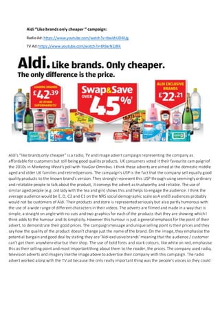
simple, a straight on angle with no cuts and two graphics for each of the products that they are showing which I
think adds to the humour and its simplicity. However this humour is just a general emphasis for the point of their
advert, to demonstrate their good prices. The campaign message and unique selling point is their prices and they
say how the quality of the product doesn’t change just the name of the brand. On the image, they emphasise the
potential bargain and good deal by stating they are ‘Aldi exclusive brands’ meaning that the audience / customer
can’t get them anywhere else but their shop. The use of bold fonts and stark colours, like white on red, emphasise
this as their selling point and most important thing about them to the reader, the prices. The company used radio,
television adverts and imagery like the image above to advertise their company with this campaign. The radio
advert worked along with the TV ad because the only really important thing was the people’s voices so they could
get their point across over radio advertising also. Imagery advertising worked well also as the simplicity of
showing products, with their slogan, and then the prices in bold colours stands out to the audience as it looks
genuine and not set up in my opinion.
2. Radio Advert:
The advert uses a comedic narration talking of an unnamed ‘big brand’ and how it
tastes just like their own Aldi’s version.
They have a used a rather friendly deep male voice as their speaker and he suits the
comedic tone perfectly.
This advert adds to the campaign because it is short and snappy but informs the
listener of the key points of their campaign: They can match brands, it tastes just as
good, and you can buy it at Aldi etc.
The use of the older voice helps to reach the intended audience as they are of a
similar age
The narrator has a quite a refined tone to his voice, perhaps more upper class and this
reflects in his way of speaking. This probably helps to engage with the intended
audience of older generations and therefore more susceptible to them.
It is similar to the TV advert as it has only been slightly adapted with the use of visual
representation of the character talking and the setting around them in the video.
I think the campaign may have been successful as a short ad is usually more
memorable, especially when it’s simple with just a person’s voice. It may have
encouraged more people to try their shop and its products.
TV Advert:
The TV advert for this campaign I think is probably the most prominent and effective
advert out of their 3, radio, print and TV.
The advert brings a visual representation of the product and a graphic one of the
prices that they offer.
I think it’s more effective and important as audiences and people in general tend to
remember visual representations better (e.g. an image of the product, text, bold
colours etc.)
When they see actual people holding and talking about the products they would
subconsciously be more open to it than radio which is just someone’s voice.
I think they also reach the intended audience as the humour better matches that age
audience in my opinion, not critical/sexual humour which would perhaps better
appeal to a younger audience etc.
The advert uses no music and the only audio is the voice of the character and
background noise (e.g. the fireplace)
I think this better isolates and gets across the point Aldi are trying to convey to the
audience. The use of one or two cuts and straight shots reinforces this and helps to
make it more realistic looking.
Print Advert:
The print advert adds to the campaign it is easier to advertise with than the radio and
TV as you can put it up outside, where people drive past, outside their shop etc.
It can also be put up very large so the text is bold and readable, the red and white text
helps to emphasise the main thing they want to convey, the prices.
3. The advert is very simple, just a white background with black title then the prices
displayed in red boxes with a multitude of products lined up at the bottom.
The vibrant images of the products clearly show what they are and people can read
brand names clearly when comparing products along with the prices.
The simplicity definitely reflects the target audience with the bolt text etc.
The adverts link well as they are both advertising the same campaign, they use the
same ‘Aldi’ font in the TV ad etc.
Regulatory Bodies:
ASA – Advertising Standards Authority:
1962
Chief Executive – Guy Parker
NGO
Self-regulatory organisation of the advertising industry in the UK
They are a non-statutory organisation and so cannot enforce legislation
However its code of advertising practice broadly reflects legislation often
Often cover complaints over ads e.g. radio, TV, press, ads on the internet etc.
ASA will carry out assessments and rulings into companies like Aldi, this is especially
important as the adverts contain food and specific comparison prices. ASA have carried out
rulings to ensure that what the company is stating is reliable and meets requirements.
ASA have BCAP code rules that apply to advertising and broadcasting, rule 13 applies for
food, food supplements and associated health or nutrition claims so will apply to Aldi. Rule 3
may apply too as it involves the topic of misleading advertising and Aldi make some strong
claims in their ads so these need to be reliable. According to BCAP it’s also important to make
sure what you’re advertising are not any health derogative products like alcohol or tobacco,
Aldi does not do this they advertise things like soap, shampoo and tea.
Aldi did receive some backlash from brands complaining that it was disparaging to their
brand, one example was Heinz. Aldi however made sure to make it clear that they were
simply comparative not derogative towards these brands.
OFCOM – The Office of Communications:
Telecommunications company
Current CEO: Sharon White (Mar 2015 - )
UK government approved regulatory and competition authority for the broadcasting,
telecommunications and postal industries of the UK
They have wide ranging powers across the television, radio, telecoms and postal
sectors
They quote that they: ‘’ make sure people get the best from their broadband, home
phone and mobile services, as well as keeping an eye on TV and radio. ‘’
4. They oversee the Royal Mail making sure they deliver the right amount of times and
that it’s kept at an affordable and uniform price throughout the UK.
If Aldi follow all the rules and regulations which they have, they should not have
received any complaints and OFCOM would not need to get involved.