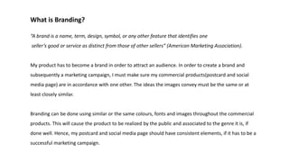
1. What is Branding?
“A brand is a name, term, design, symbol, or any other feature that identifies one
seller’s good or service as distinct from those of other sellers” (American Marketing Association).
My product has to become a brand in order to attract an audience. In order to create a brand and
subsequently a marketing campaign, I must make sure my commercial products(postcard and social
media page) are in accordance with one other. The ideas the images convey must be the same or at
least closely similar.
Branding can be done using similar or the same colours, fonts and images throughout the commercial
products. This will cause the product to be realized by the public and associated to the genre it is, if
done well. Hence, my postcard and social media page should have consistent elements, if it has to be a
successful marketing campaign.
2. Font
The font I used for the film and the postcard are different. This might seem like going
against the branding of the film, but many movies have done this before. It is necessary
only for the font used in the commercial product. As long as the font in the commercial
products are consistent, the public will associate it with the film. An example of a film
which has a different title card in its advertisements and the film is ‘The Avengers(2012)’.
The Poster The title card in the film
3. The font is used for the movie is ‘XXII Scratch’ and the font used for the postcard is
‘Plat Nomor’. I felt like the latter was more suitable for advertising as the scratchy
font was too messy for something meant to look subtle. I used different fonts for
the director’s credit and the review, so that it would be more interesting and every
element would look unique.
Plat Nomor was used as it looked like it was somehow subtle and bold at the same
time, which related to my short film. I used a part of the postcard as the Instagram
page’s profile picture. The consistency across the Instagram page and the postcard
help with the branding.
4. Colour Palette
There is no fixed colour palette in my film. But one characteristic is that it goes from
neutral to a cold blue towards the end, reinforcing the cold, twisted nature of the film. This
atmosphere was what I had in mind when I made the postcard and the reviews for the
Instagram page.
For the postcard, I added a dark blue overlay with a reduced opacity. This made it look
darker and murkier. For both the reviews and the back of the postcard, I used a dark blue
background. This creates a consistent image across both commercial products and the
artistic product.
Aside from this, I used white texts in all of the products, clashing against a dark colour.
These similarities help the audience associate the colour palette to the film.
5. Images
The image I used for the postcard ad is that of a foot holding a door open. This
might not feature directly in the short film, but it represents a concept that is the
same as my movie: death. This image also ties to the title of the short Behind
Closed Doors, as it mysteriously hides what is behind the door.
I published a part of the postcard ad on the social media page too, as to create a
clearer image of the brand that it was to the public. The Behind the Scenes image I
posted did not involve any of the cast or crew members having any kind of fun, so
the serious tone of the brand was maintained and not ruined.