👙 Kolkata Call Girls Sonagachi 💫💫7001035870 Model escorts Service
3 magazine analysis
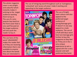
1. The whole magazine
cover is very bright
and colourful which
instantly makes it
enticing to the target
audience wanting
them to buy it.
The use of a very
popular boy band on
the front cover that is
very well focused on
the target audience
will also push the
reader to buy it.
The use here of the
word ‘UNLEASHED’
makes the reader feel
as if they are receiving
information that is not
available to anyone
else about the bands
they are interested in.
The use of intriguing word throughout such as ‘outrageous’,
‘unleashed’ and ‘access all areas’ make it exciting and
appealing to the target audience.
The use of bright
neon colours will also
appeal to the
preferred target
audience of
young/teenage girls.
IT doesn't in any way
appeal to a male
audience. The use of
a Puff with Buzz word
here lure teenage girls
further to buy the
magazine as they feel
as if they are in for a
very unique
experience to win a
signed shirt for a very
popular and well
publicised boy band.
2. The magazines
contents page is
slightly confusing to
look at on a first
glance but the more
you study it the easier
it becomes to
navigate.
The use of an smaller
image of the cover
page in the contents
makes it easier for the
reader to see which
article it was that they
wanted to read
further about in the
magazine.
The use here of different types of fonts here again makes it have a
cheaper, less classy look about it, but this does appeal to their
younger, girly target audience who are known to have a smaller
attention span so are not too worried about the style but more
about the images and contents about their favourite bands/artists.
This contents page
does not carry a very
good house style, this
I will take into account
when planning my
own magazine, its a
bit wobbly and all
over the place with
images popping out of
nowhere confusing
the reader and
distracting them from
what they are looking
at/for. It does have a
lot going on but in
turn does show that
the magazine has a lot
of celebrity gossip
and content.
3. This double page spread has a very fun, upbeat and young feel to it. This then entices
the readers to read further in to the magazine to find out more about all the latest
gossip and celebrity news. I will take this into account when designing my own
magaine as it gives it a good feel and will be fun for the readers to enjoy.
It is a page in
which fans can
write in with
pictures of
them with
celebrities and
musicians and
artists. This is
then again
further
publicity for
the musicians,
advertising
them further
to the industry
and their
progressions.
The use again
of the artists
that were
advertised on
the cover
page again
appeals to
their target
audience of
young and
teenage girls.
There is no apparent house style to this page again which shows a lot of
inconsistency throughout the magazine.
I will take this into context when presenting the double page spread in my
own magazine as I feel as if it is un-profesional but does have a young
feel.
4. The whole magazine
cover is very boring
colours that are
associated mainly
with rock and punk
music genres. It
straight away shows
an atmosphere that
would appeal more to
an older target
audience far different
to ‘Top of the Pops’.
The style is very
different to that I
would like to used for
my magazine, it is to
dark and aggressive
looking to appeal to
the kind of genre I
plan to work on.
The use here of a well
known band of the
genre will immediately
entice the reader into
wanting to consider
buying the magazine.
The use of the cover
line ‘BITE BACK’ is
then reflected in the
picture of the dogs.
The cover has an
aggressive kind of feel
to it, this could be
intimidating to some
but is in turn very
appealing to their
planned target
audience.
These kind of colours do not really appeal to a female
audience unless they listen to this genre of music. The use of a
Puff with Buzz word here target the audience well, to receive
SIX free posters of different bands in their genre of music.
5. The magazines
contents page is very
bland to look at, but is
very informative and
very easy to navigate.
Although plain it does
give a more
sophisticated and
stylish look.
It carries a very
consistent house style
from the cover page.
Carrying across the
same colours, font
styles and layout and
design.
It contains celebrity
news instead of
gossip as this does
not appeal to their
older, more matured
target audience. I will
take this into account
when planning my
own magazine, I will
see if my target
audience are
interested more in
the gossip or the
information and will
focus on one of the
other in my magazine
The use here of repeating images from the cover page shows again consistency. I will
take this into account when designing my own contents page. I would like to follow a
similar style as it looks classier, slick and more sophisticated than other music
magazines. It is very well labelled with page numbers spread throughout the contents
page, its more appealing to their older, rock orientated and mature audience.
6. This double page spread has a very rock, mature and aggressive feel to it. This then
entices their targeted readers to read further in to the magazine to find out more their
bands/artists that they are interested in. I will take this into account when designing
my own magazine as it gives it a slightly darker feel that i planned to use in my own.
It is a page
in which
the band
members
are asked
personal
questions
by the
interviewer.
Their
answers of
this can
then
further
their
publicity in
the music
industry
These
artists
were
advertised
on the
cover
page.
There is again a very apparent and consistent house style to this page
again which shows a lot of sophistication throughout the magazine
although it is not essentially a sophisticated/smart magazine.
I will again take this into context when presenting my own double page
spread in my own magazine as I feel that it looks much smarter and
professional than other magazines that i have analysed.
7. The whole magazine
cover is very simplistic,
plain but in turn is very
enticing as its simplicity
is stylish.
The use straight away
of a very, very well
known musicians will
appeal to a much
larger audience. The
appeal here is also in
the name, with the
magazines name
comes a lot of
expectation. The style
is very different to that
I would like to used for
my magazine, but I
would like my
magazine to come
across with a smart,
slick and sophisticated
style like this one.
No Puff or Buzz
words are used on
this magazine as it
does have the right
kind of approach
that their target
audience expect
The use of the word
‘again!’ in the cover
line shows that he
may have been
already shown in this
magazine and may
come across in a
different light this
time round.
It would overall appeal to a much older target audience far
different to ‘Top of the Pops’. This magazines structure is very
masculine and plain. These kind of colours don’t really appeal
to a female audience unless they are tuned in to this magazine
and genre of music.
8. The magazines
contents page is very
plain and bland to
look at, but is
informative and
again very easy to
navigate. Although
plain it is slick and
easy to read from. It
carries a very
consistent house
style from the cover
page. Carrying across
the same colours,
font styles and
layout and design.
It does not contain
gossip but instead
information about
the bands, and their
progression in the
industry. The idea of
celebrity gossip does
not appeal to an
older, matured and
mainly male based
target audience
The contents page he does not show many repeating images from the cover. I will take
this into account when designing my contents page. I would like my contents page to
look fun and upbeat but smart, classy and sophisticated look. It is very well labelled but
slightly overbearing as a lot of information is instantly pushed in your face, its more
appealing to an older and more mature audience.
9. This double page spread has a very plain, chilled out feel. This appeals to their target
readers to continue further in to the magazine to find out more about the up to date
music of their genre. I will take this into account when designing my own magazine as i
would like it to have more fun, upbeat but classy feel for the readers to enjoy.
The use again
of the artists
that were
advertised on
the cover
page again
appeals to
their target
audience of
young and
teenage girls.
There is no apparent house style on this page that has been carried out through
the magazine over than the simplicity and plainness that is apparent on the cover
and contents page as well as this double spread. This shows an inconsistency.
I will take this into context when presenting the double page spread in my own
magazine.