Transcript: New from BookNet Canada for 2024: BNC BiblioShare - Tech Forum 2024
Front Cover
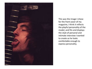
1. This was the image I chose
for the front cover of my
magazine, I think it reflects
the playful personality of the
model, and fits and displays
the style of personal and
intimate interview I wanted
to create as he looks
comfortable enough to
express personality.
2. I started off by adding the
mast head, positioned at the
top in a big text, making it
clear and very eye catching.
The font I used was from
DaFont.com called Seedy
Motel. I then added the main
cover line, which is just the
model’s name, for this I used
a font called Impact Label off
DaFont.com.
3. Next I positioned the main cover
line and the description that
went with it, I put then both at a
slight slant that matches the
models jawline, and the
description doesn’t give a way
too much as I wanted to gain
interest into the consumers
wanting to find out more. I
decided that the main
description should be in red,
fitting my colour scheme and
contrasting the masthead and
the main cover line title.
4. I then added a skyline, with a
white background that
contrasted to the rest of the
magazine, and included
names of artists that fit and
are in the Metal genre of the
magazine, and I also made the
description a bit of a darker
colour than it originally was.
5. I then added a couple of
cover lines, I added one
about and upcoming festival,
using the actual festivals font
and sign, with a matching
description with the same
colour of font, the other
cover line I left a plain black, I
moved the main cover line a
description more to the left
whilst still keeping it inline
with his jawline and I also
added a barcode.
6. This is my finished
magazine cover, the final
touches I added to the
magazine was an edition
number and date, under
the mast head and above
the barcode where I also
included the price. I also
added a puff advertising
that it was a poster special.