
Recommended
More Related Content
What's hot
What's hot (19)
Similar to Adele ‘21’
Similar to Adele ‘21’ (20)
Recently uploaded
Recently uploaded (20)
Adele ‘21’
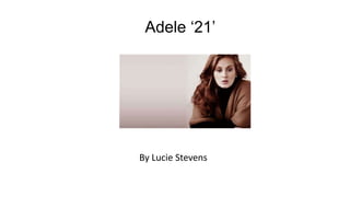
- 1. Adele ‘21’ By Lucie Stevens
- 2. This is the cover image for Adele’s album ‘21’ The photography for this album is in black and white suggesting that it contains slow ballads. This is very classy and targets a wide audience from young to old. The artist’s name is written in white against a black background which makes it stand out. The album name ‘21’ is also a kind of faded paler colour contrasting with the background. This shows that this is not as important as the artist but is still pretty important. The font used is also quite large and it is written in capital letters. The artist’s photograph is a close up of her face. This suggests a classy woman who does not need to take her clothes off or reveal her body to make her music. This suggests that her music is real and will appeal to a wide female audience. This also creates a sense of mystery about her. The facial expression of the artist on this front cover is one of thought and it is quite a sad expression which leads us to believe the music will be quite low tone. This album had rumours that it was written about her ex boyfriend who treated her badly. The digipak links in with ‘someone like you’ a song on the album.
- 3. This is the CD disk. This is a contrast to the rest of the digipak which is all in black and white. This is a bright green colour which highlights the pop side to the album. These are songs such as ‘rolling in the deep’ and ‘set fire to the rain’. Even though they have deep meanings through the lyrics the music is quite upbeat and this represents the different sides to Adele and can attract audiences. The album name ’21’ is written very boldly on the disk, and the font is sans serif which appears to be written with paint brush strokes.
- 4. This is the back cover of the digipak. This is in black and white again, as the digipak is throughout. The song names are written in white, against a black background. This has quite a dark and mysterious feel to it and hightlights the music and track list to show they are important. This digipak is unconventional because another portrait of Adele is on the back cover which is not usually on pop albums. This is, again, a close up of her face, however this time she has her eyes open, connecting with the audience, as if she is persuading them to buy the album. The conventional features of a barcode and the record label have been printed in small print at the bottom of the album. Black and white imagery makes the album look more sophisticated and classy and is consistent throughout, apart from the disk itself.