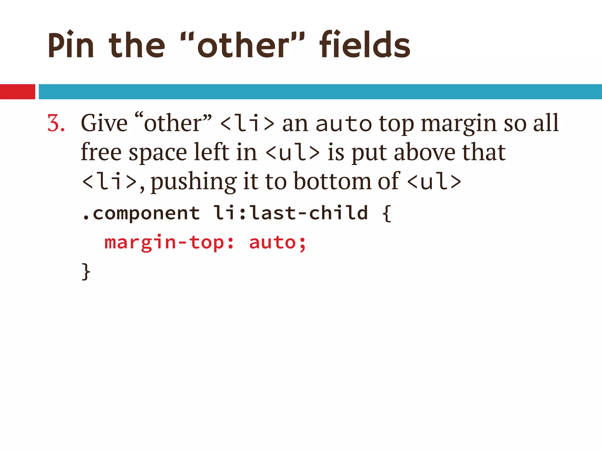
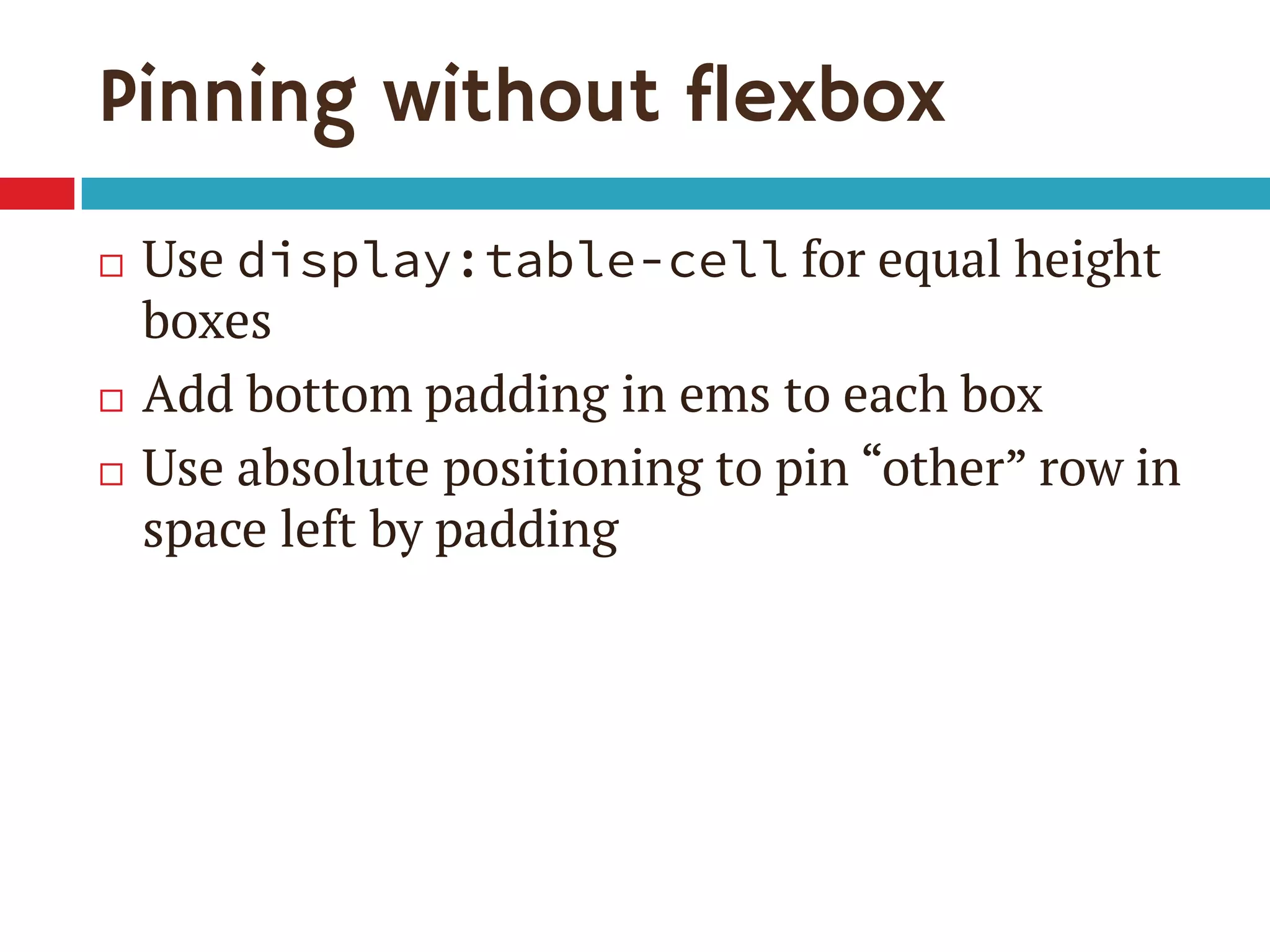
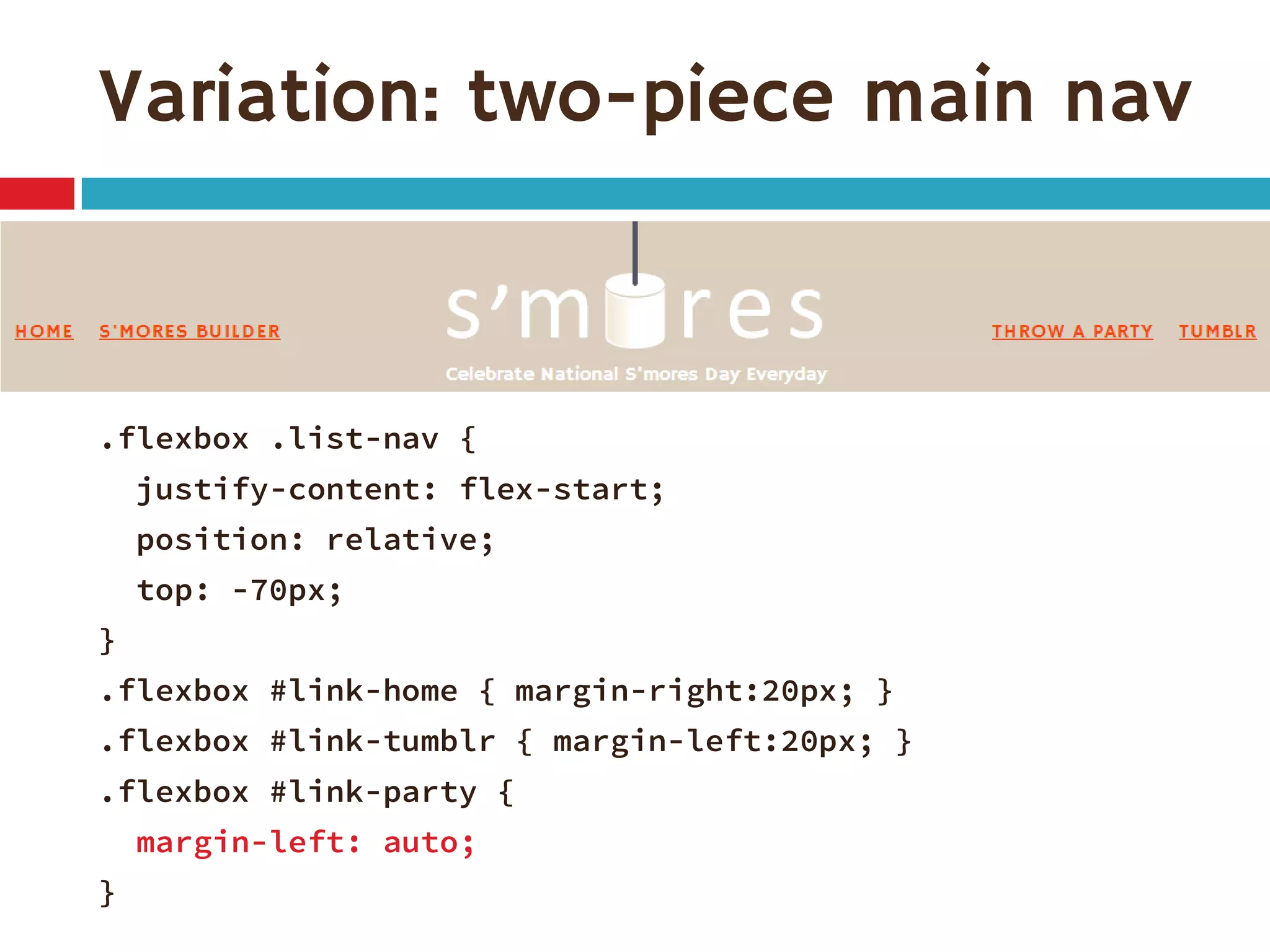
Download as PDF, PPTX

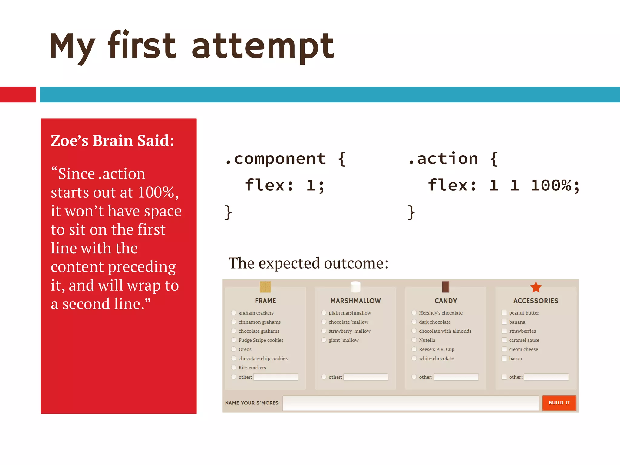
![Single-digit flex values
Common to see flex: 1 in demos
flex: [number] is equivalent to
flex: [number] 1 0px
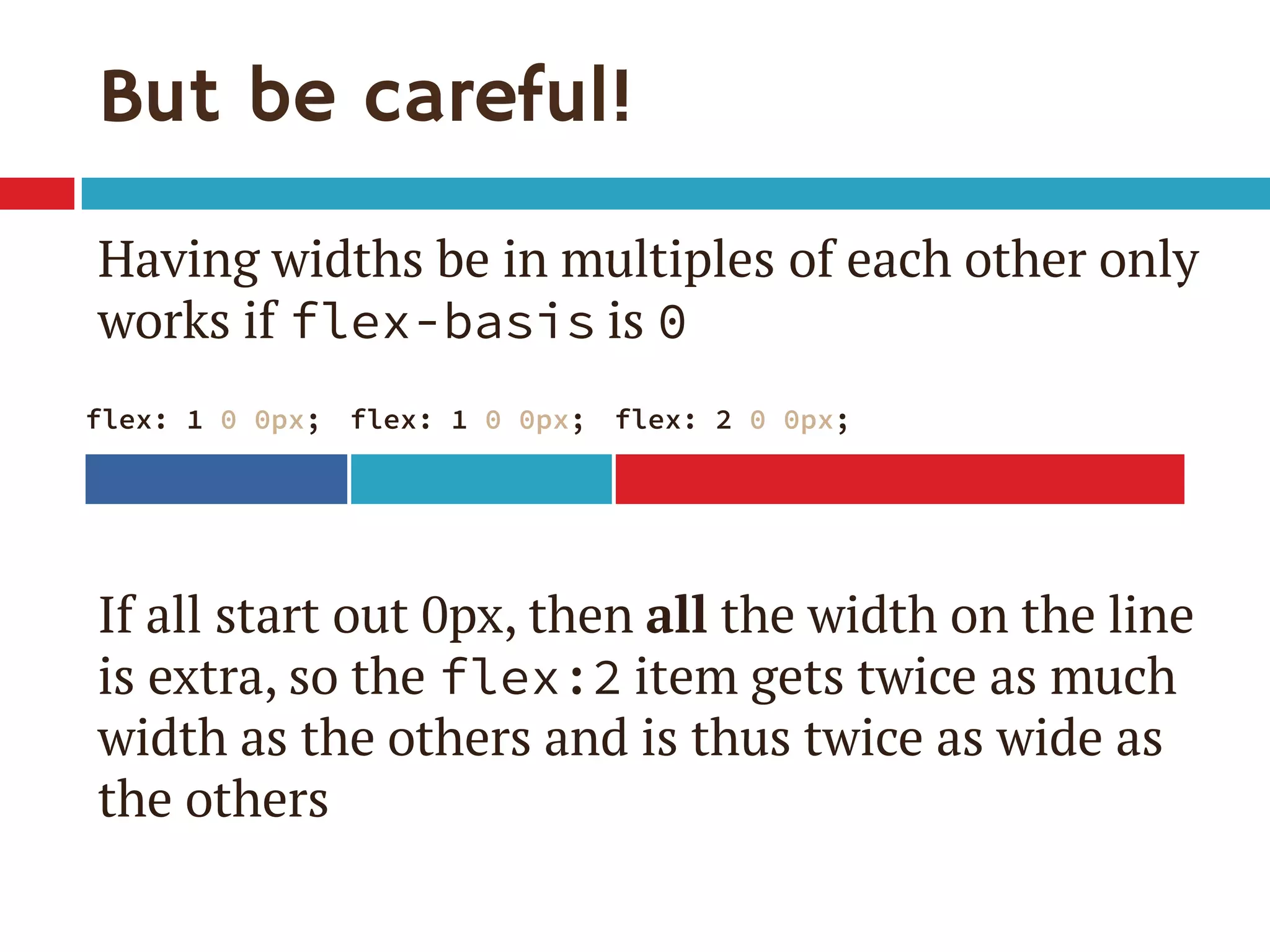
Be sure you really want flex-basis to be 0
When wrap on, essentially min-width
0px therefore means items can shrink to 0px
If everything can get down to 0px, nothing ever
has a reason to wrap](https://image.slidesharecdn.com/putting-flexbox-into-practiceblend-conf130907-130908160522-/75/Putting-Flexbox-into-Practice-30-2048.jpg)
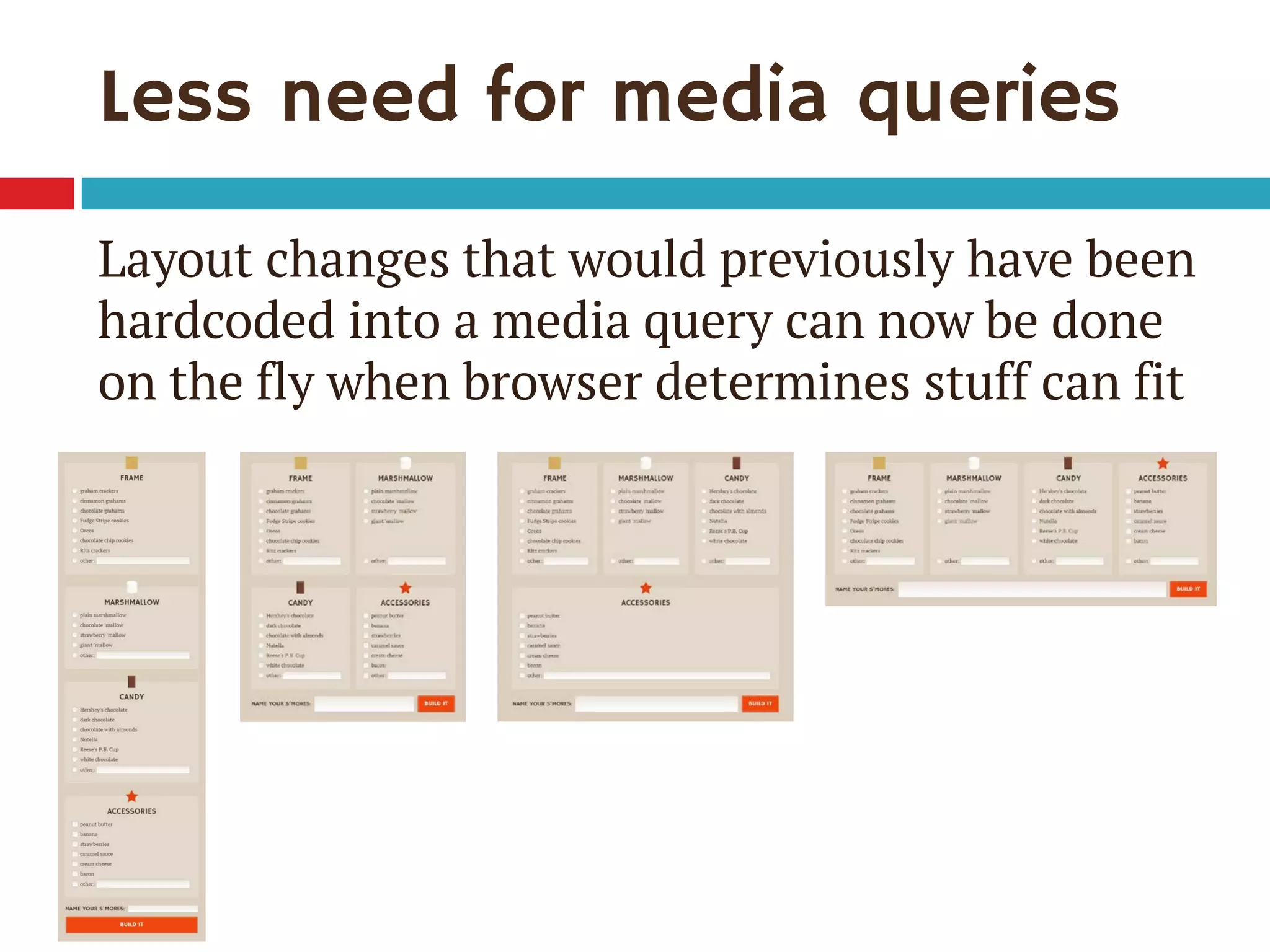
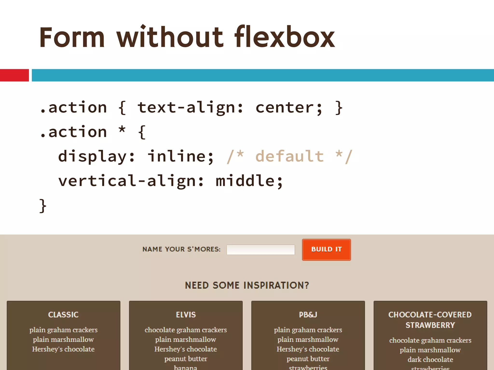
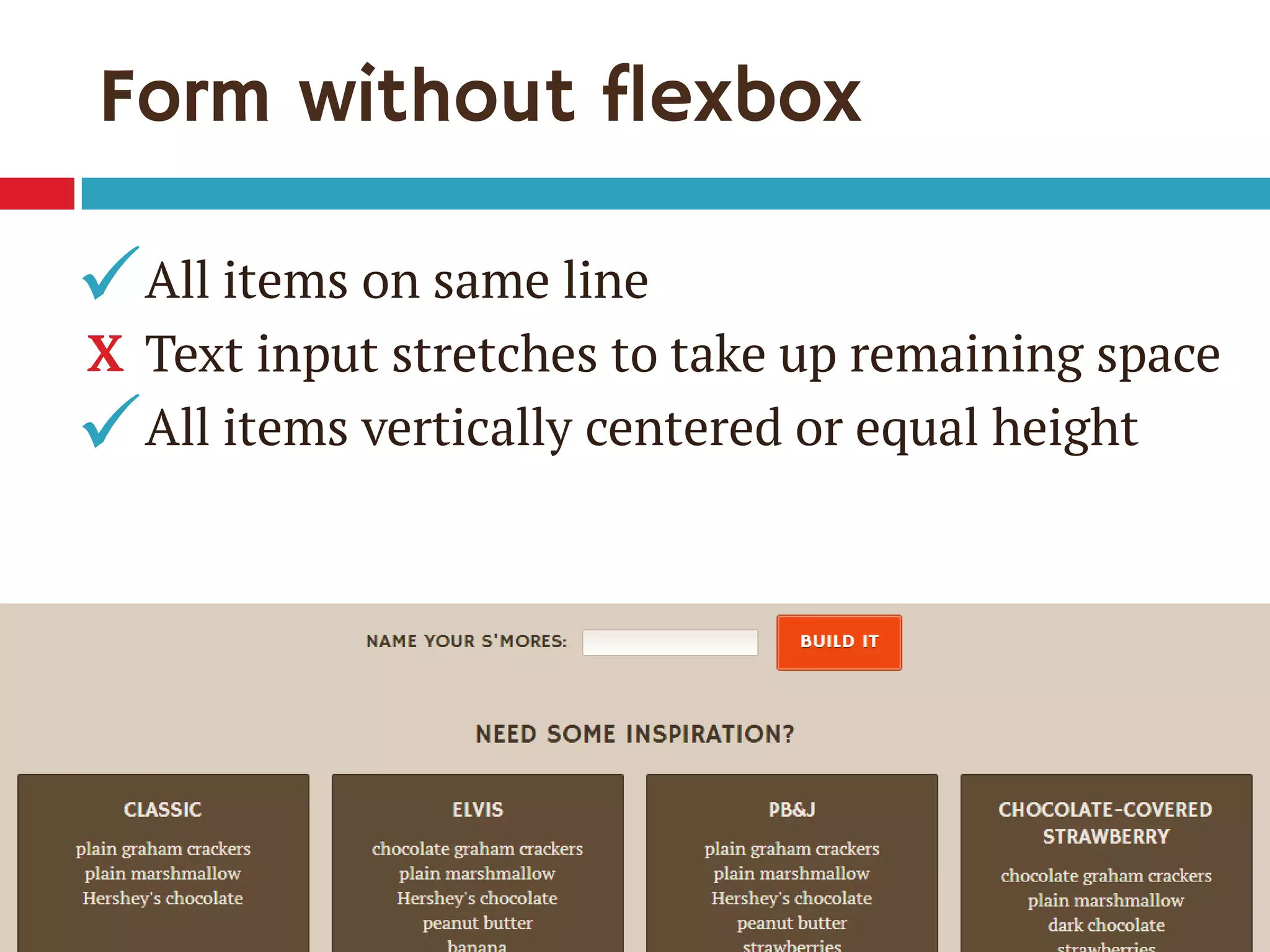
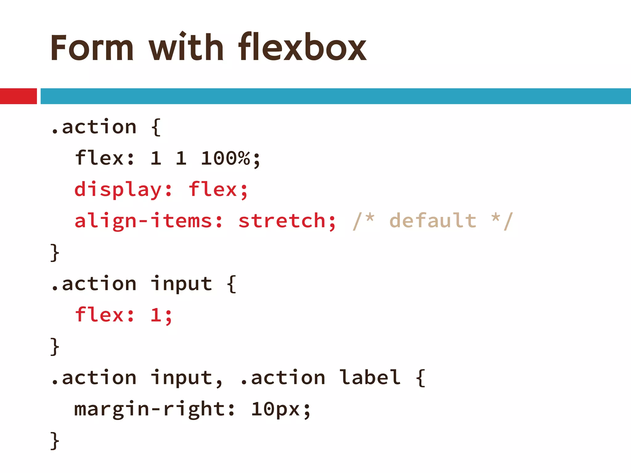
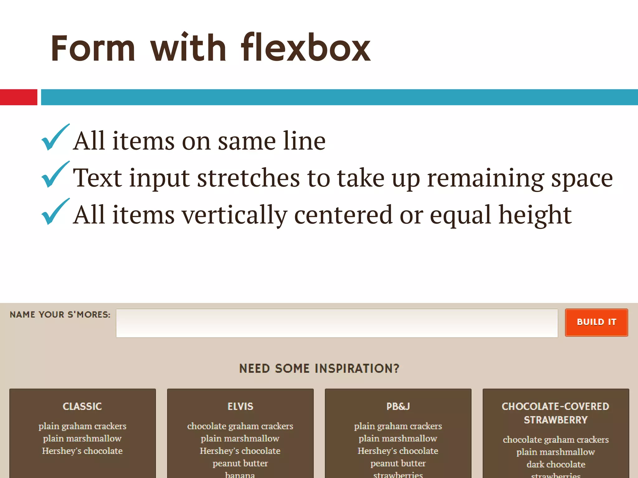
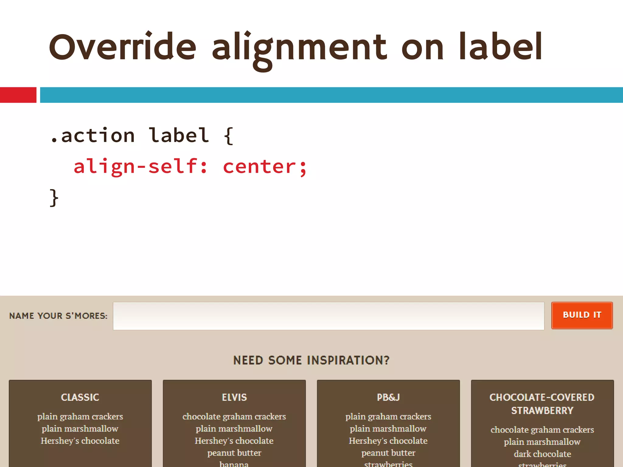
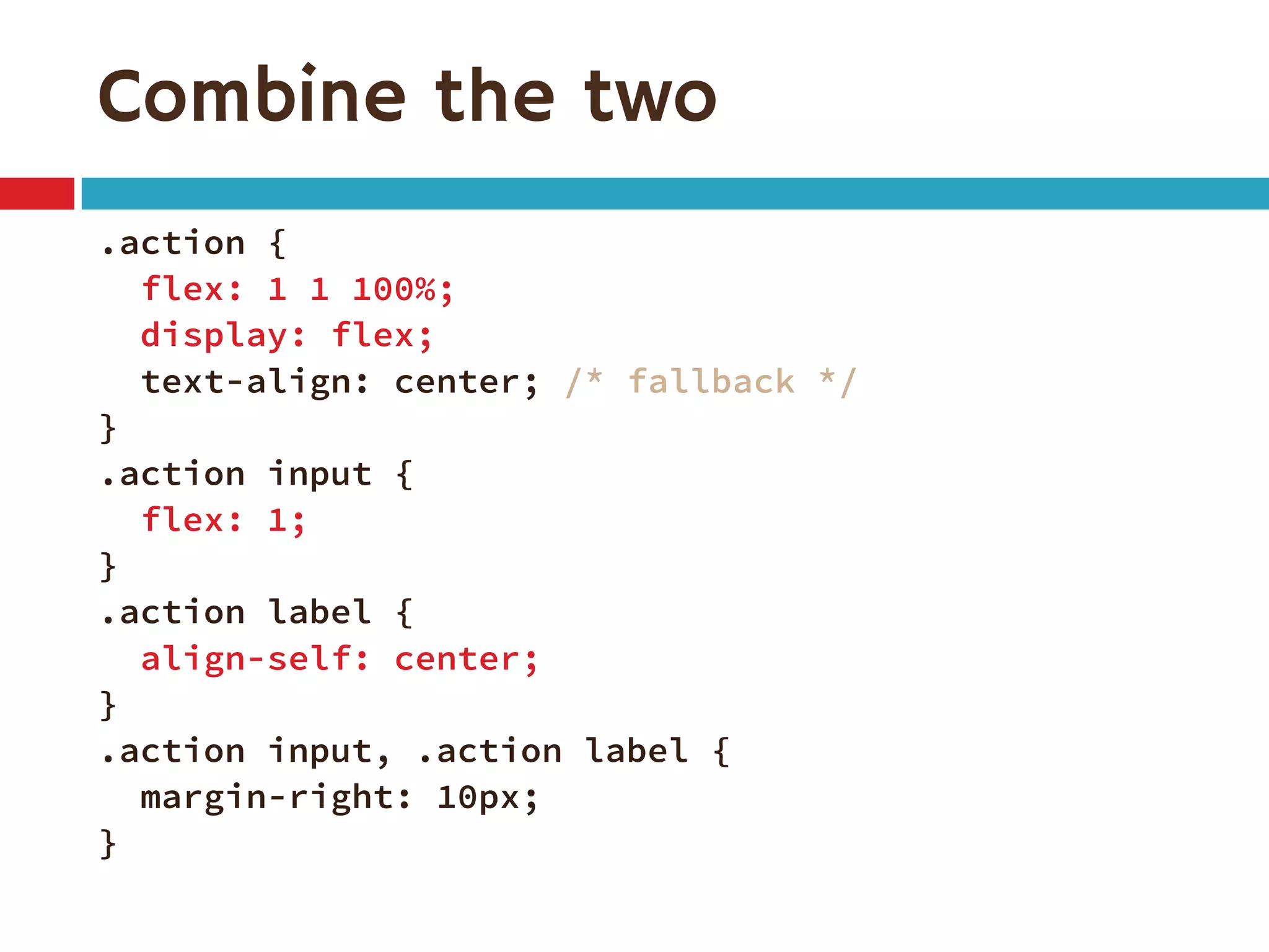
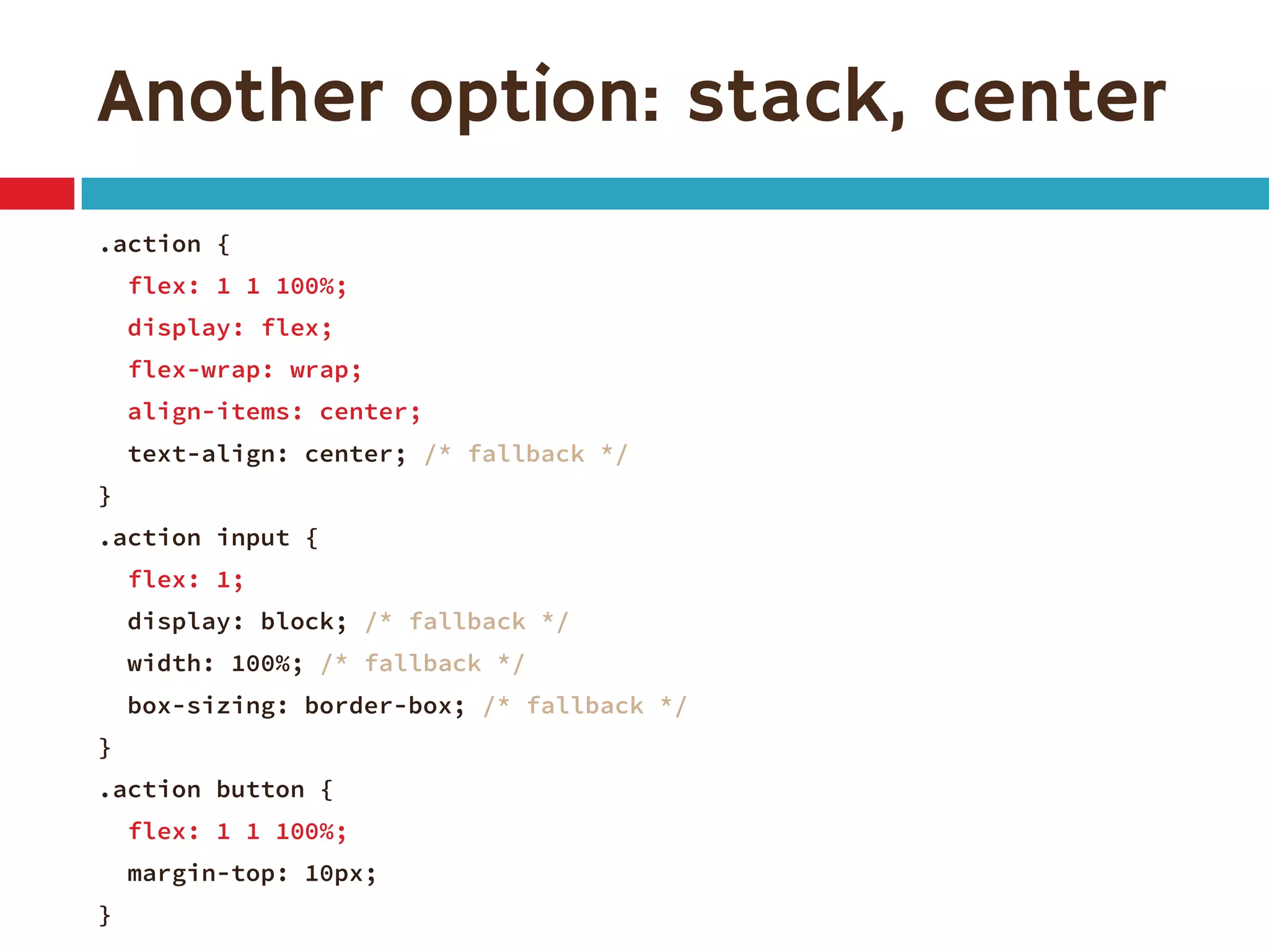
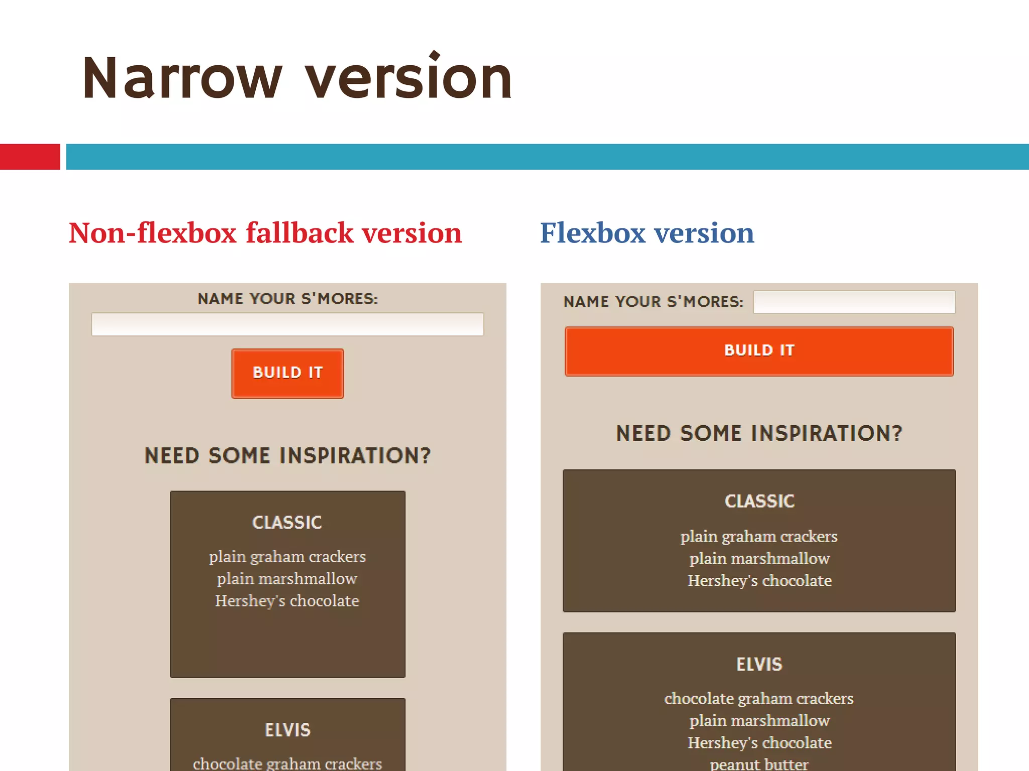
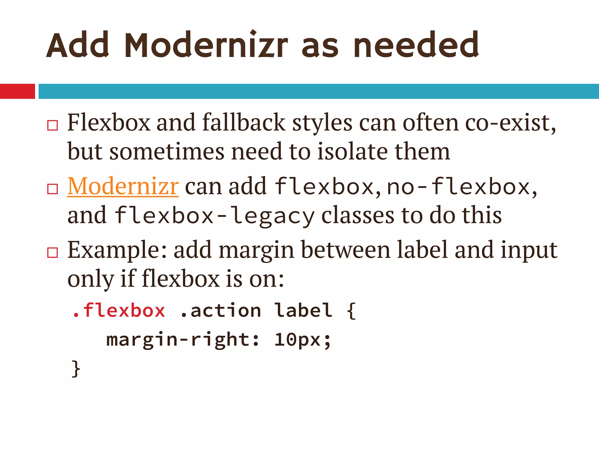
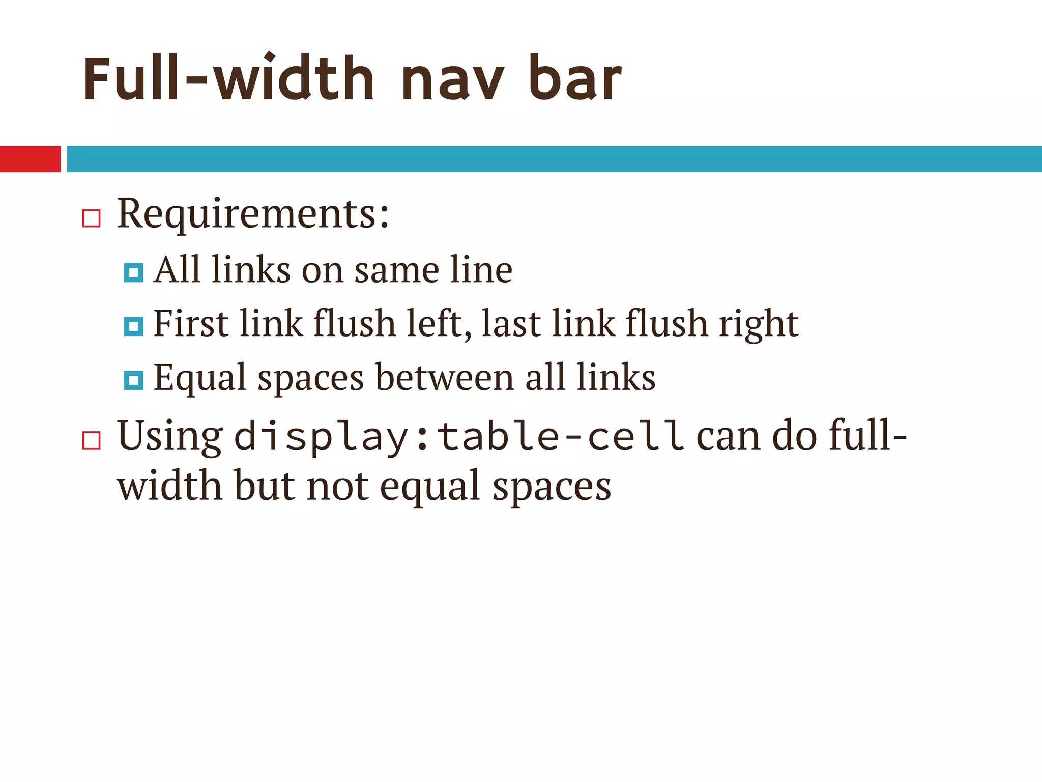
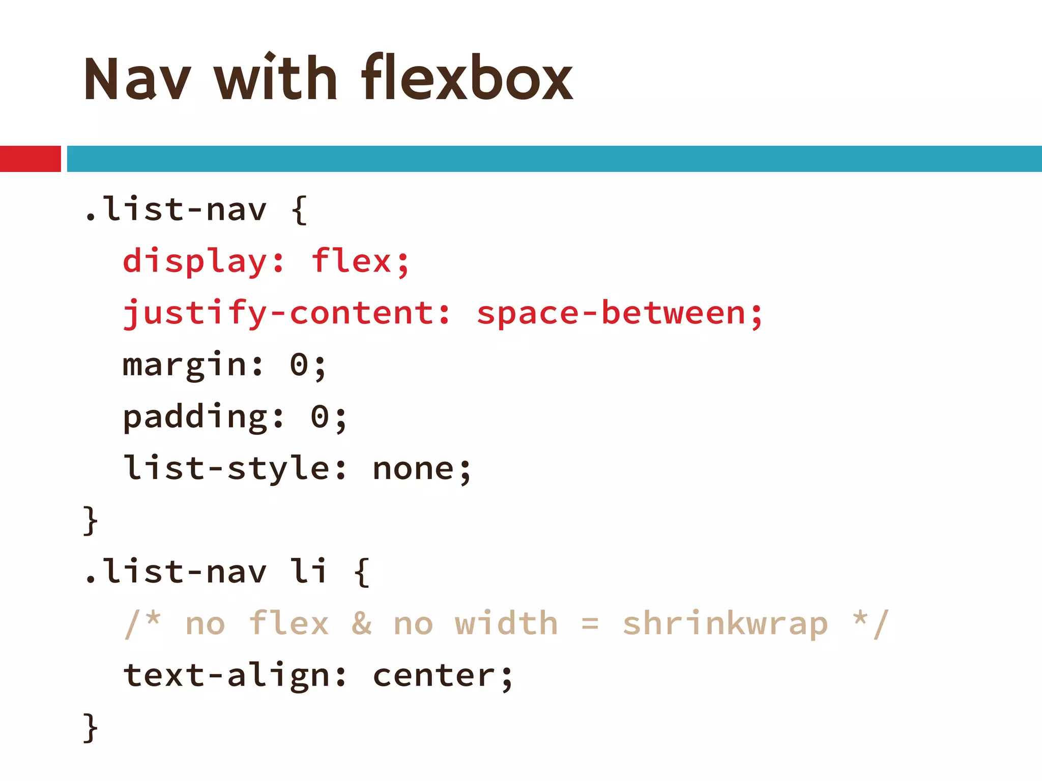
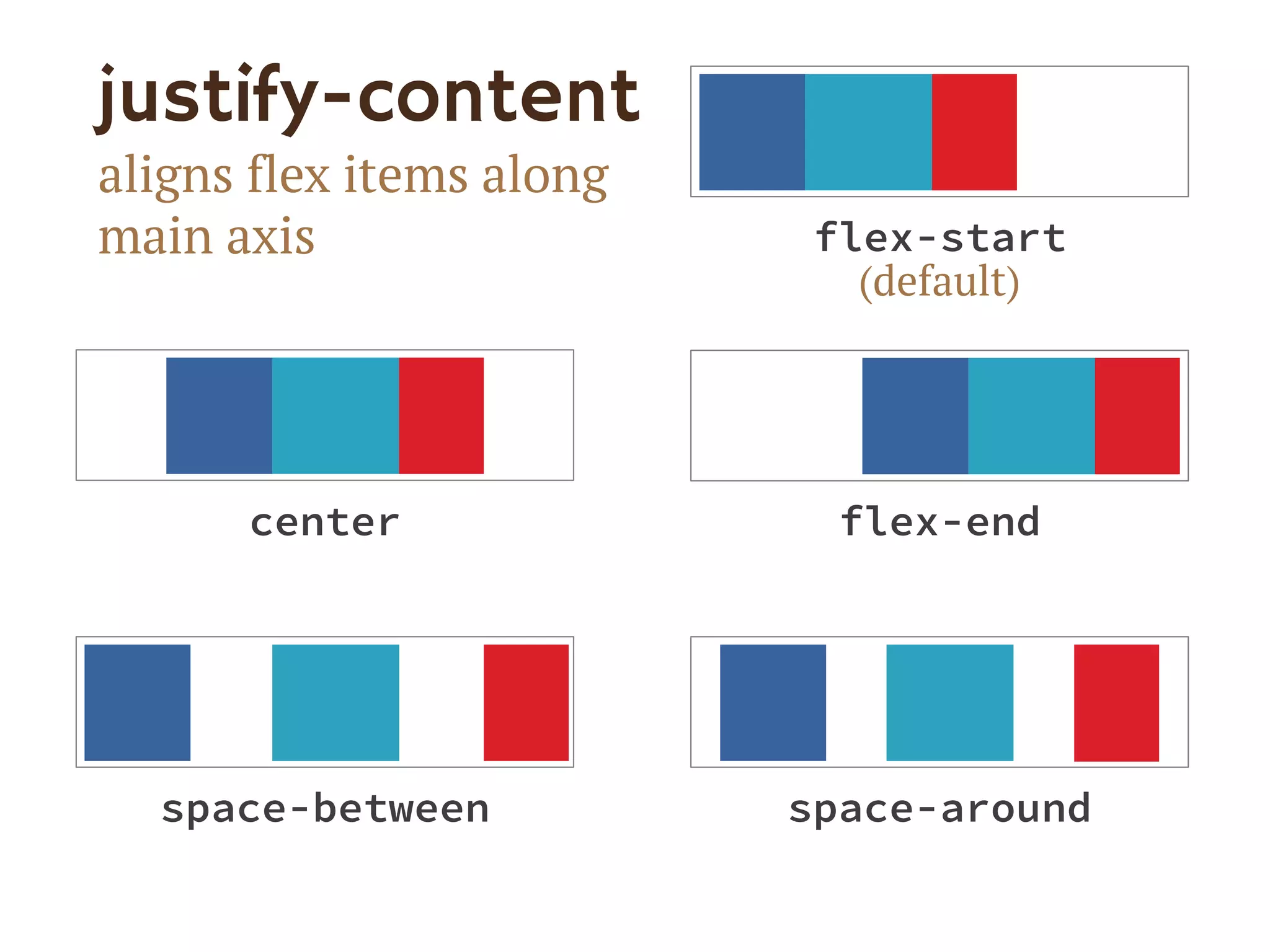
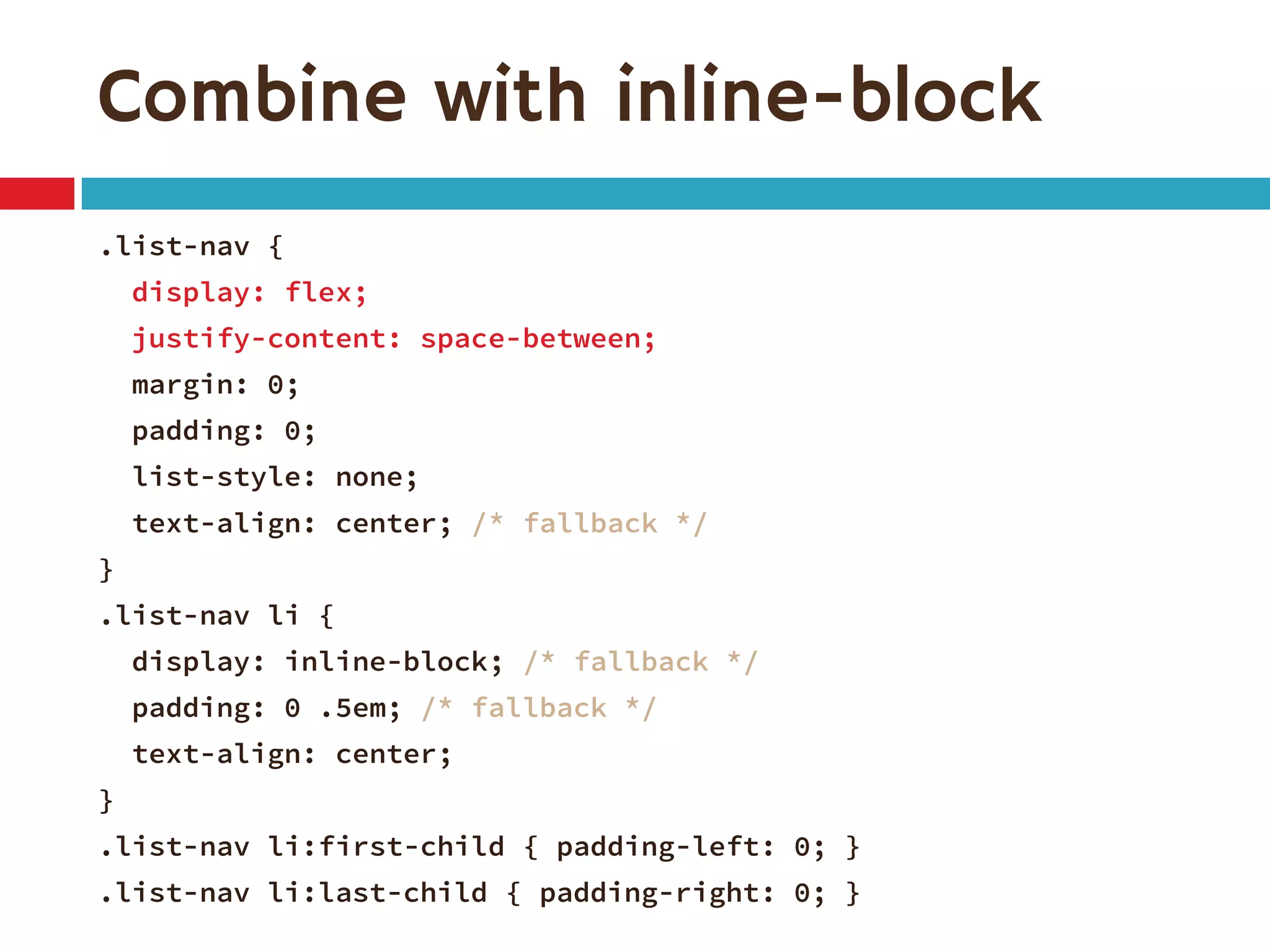
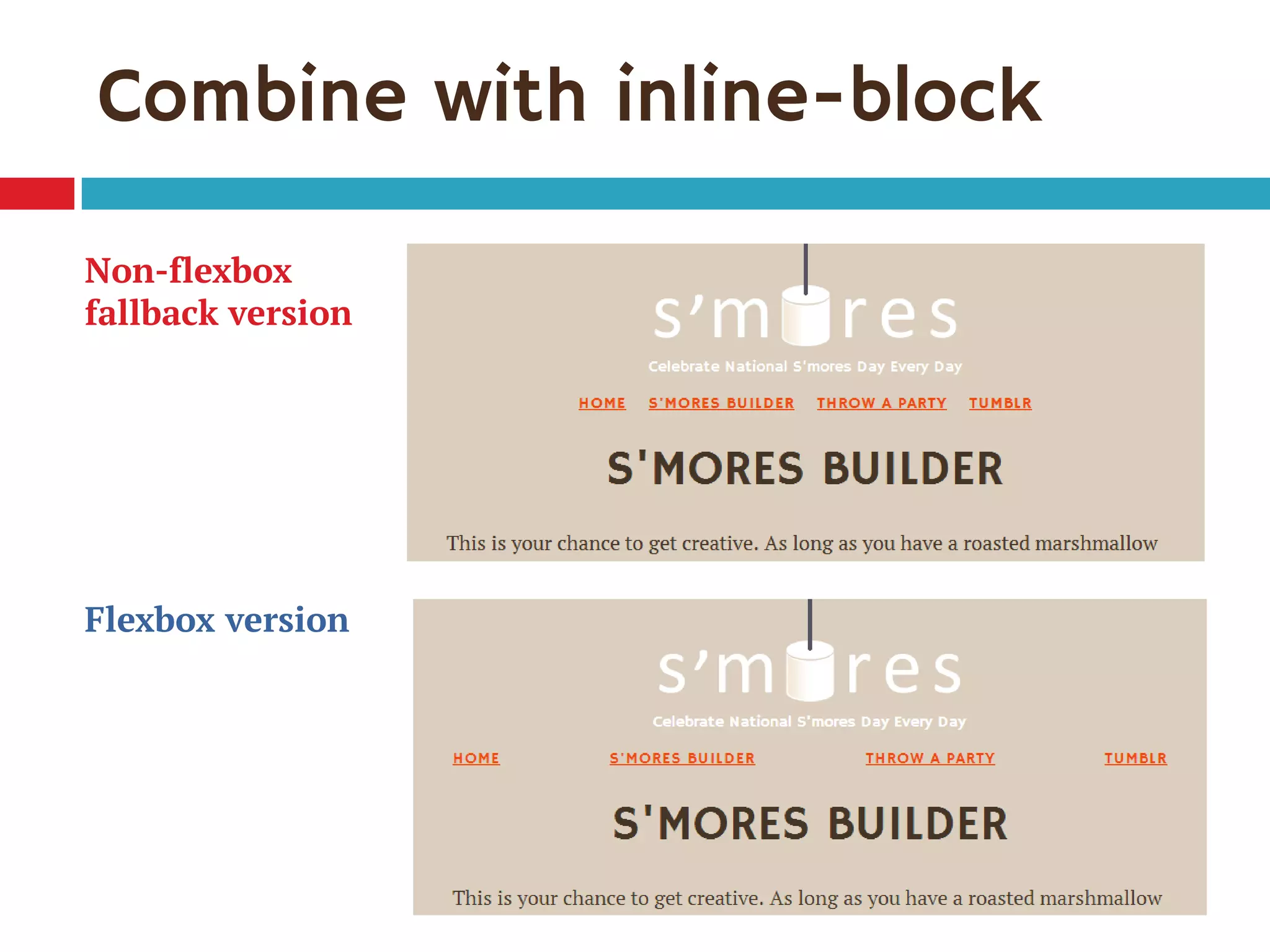
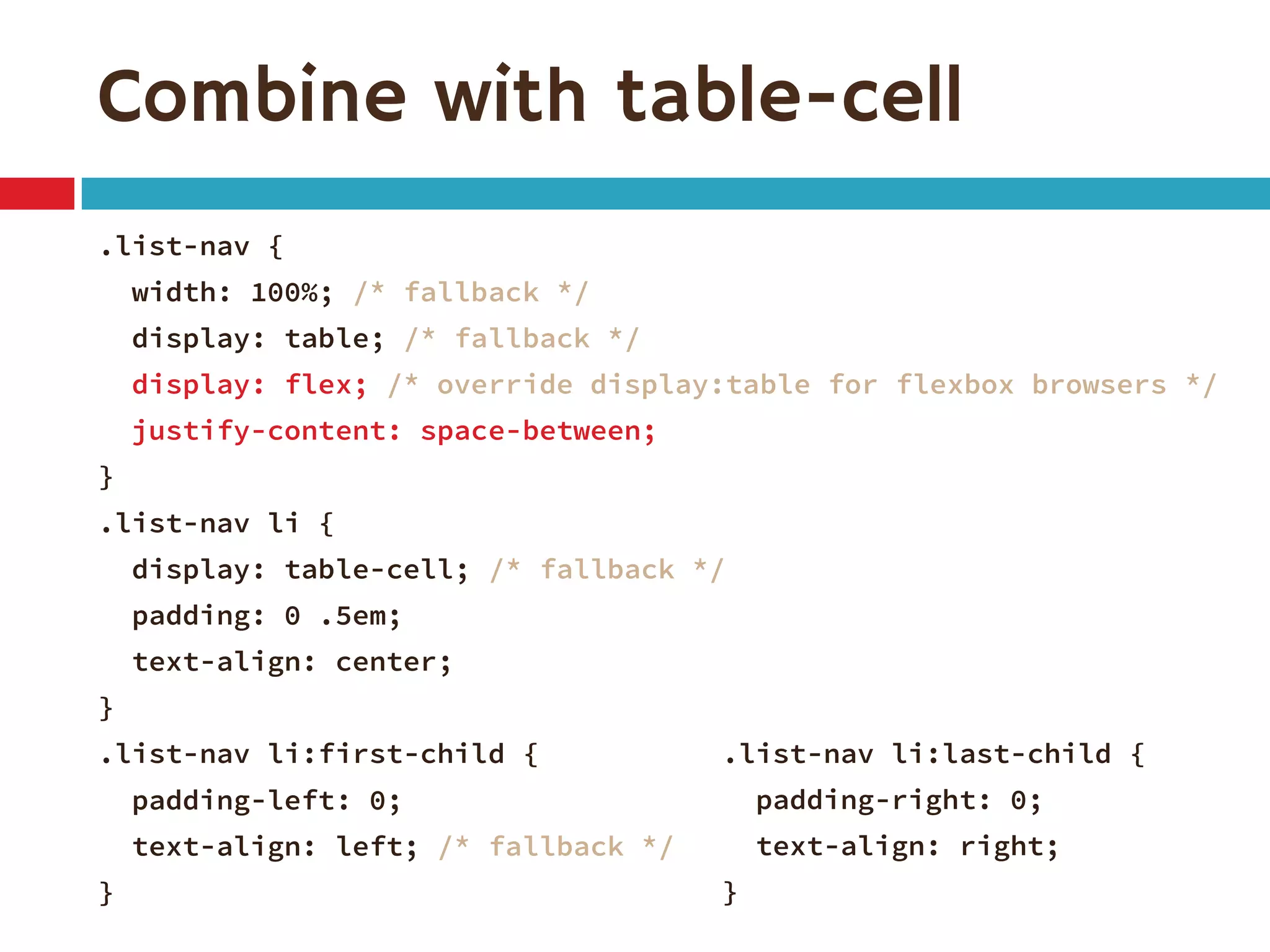
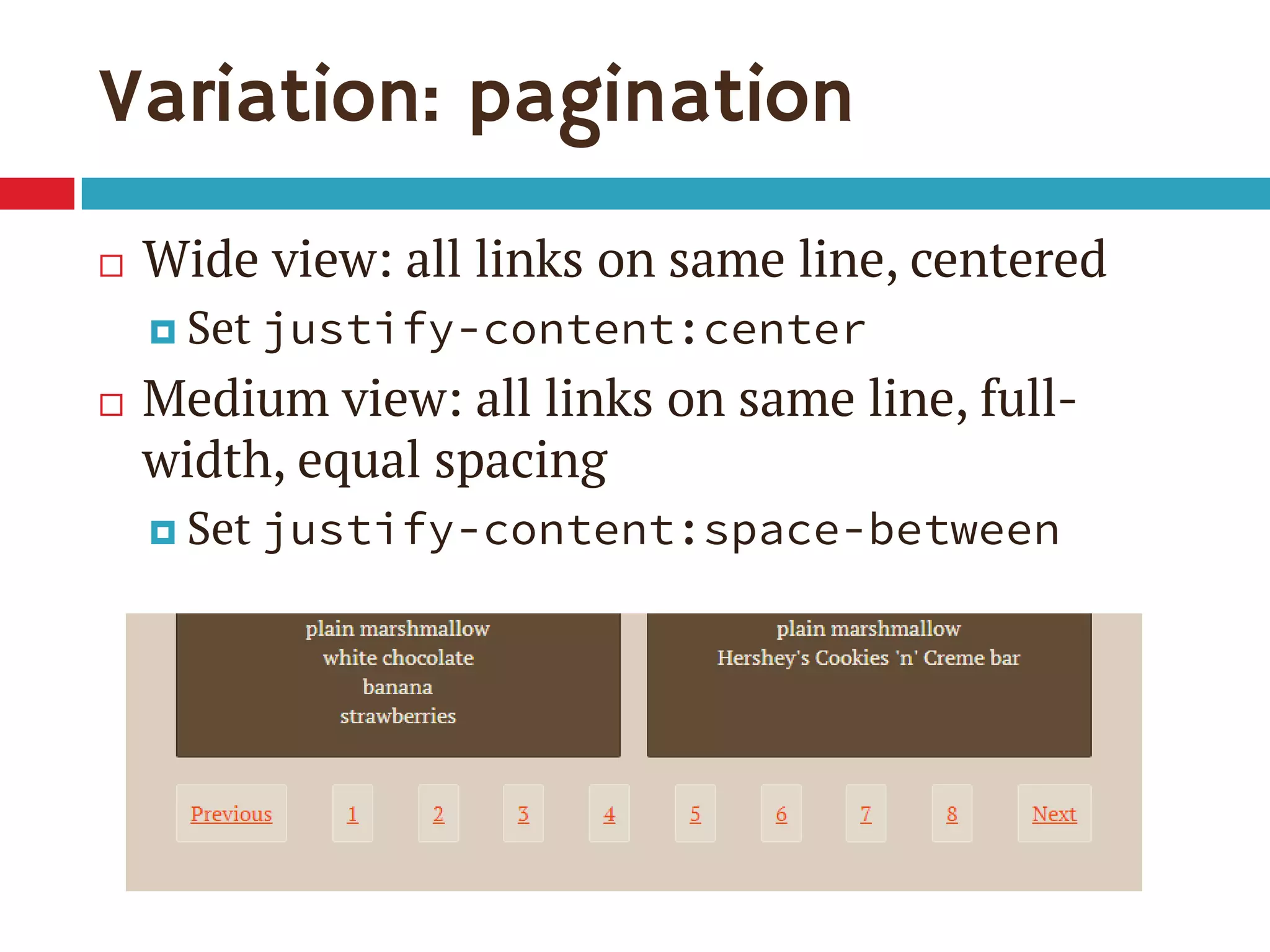
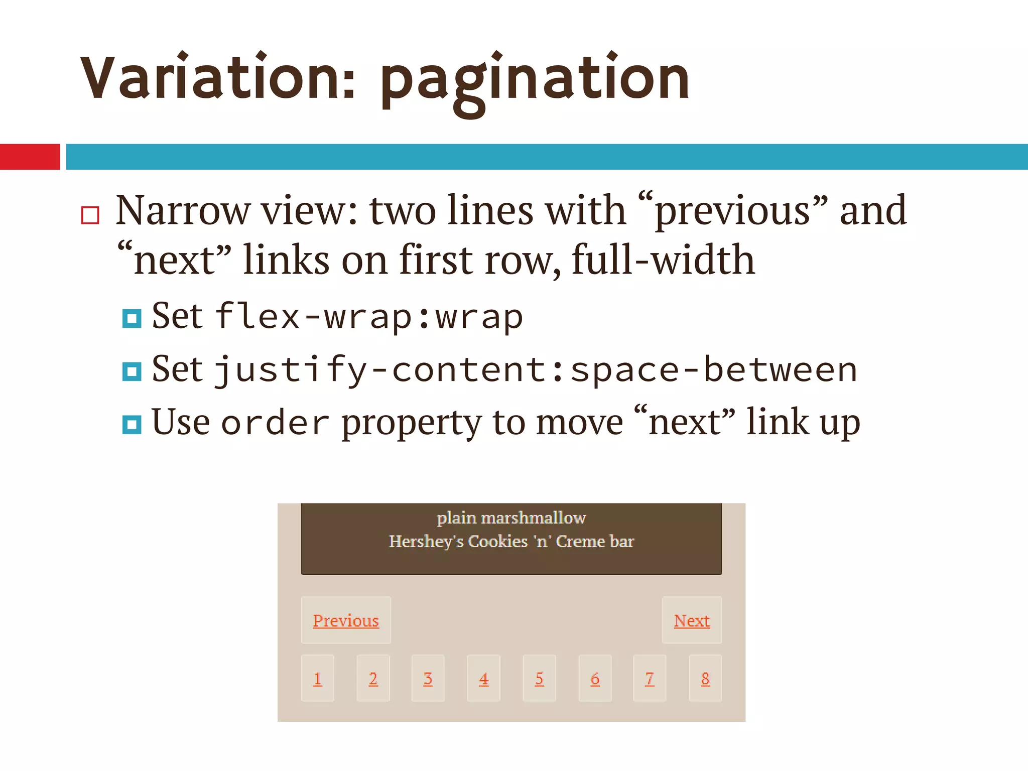
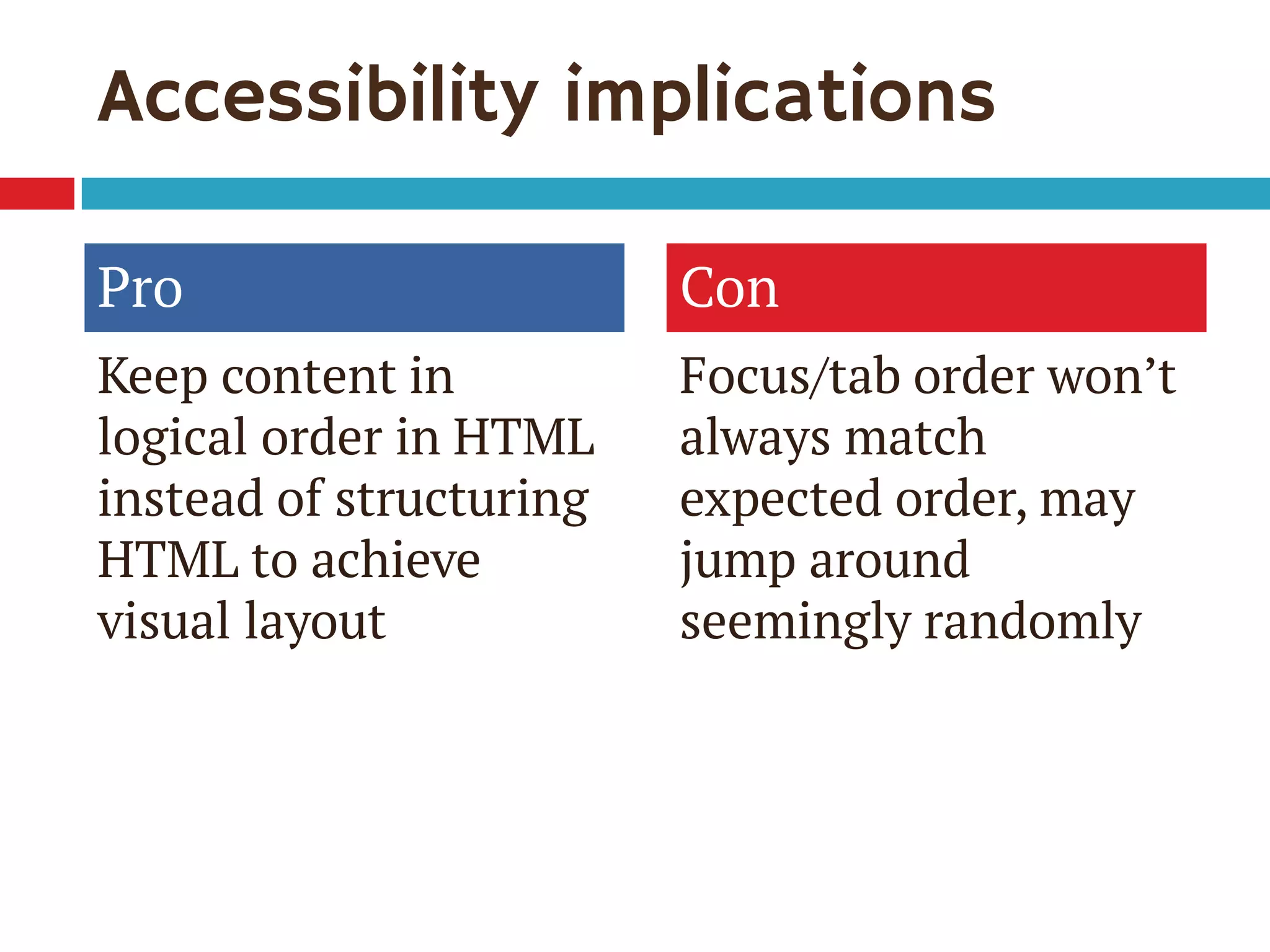
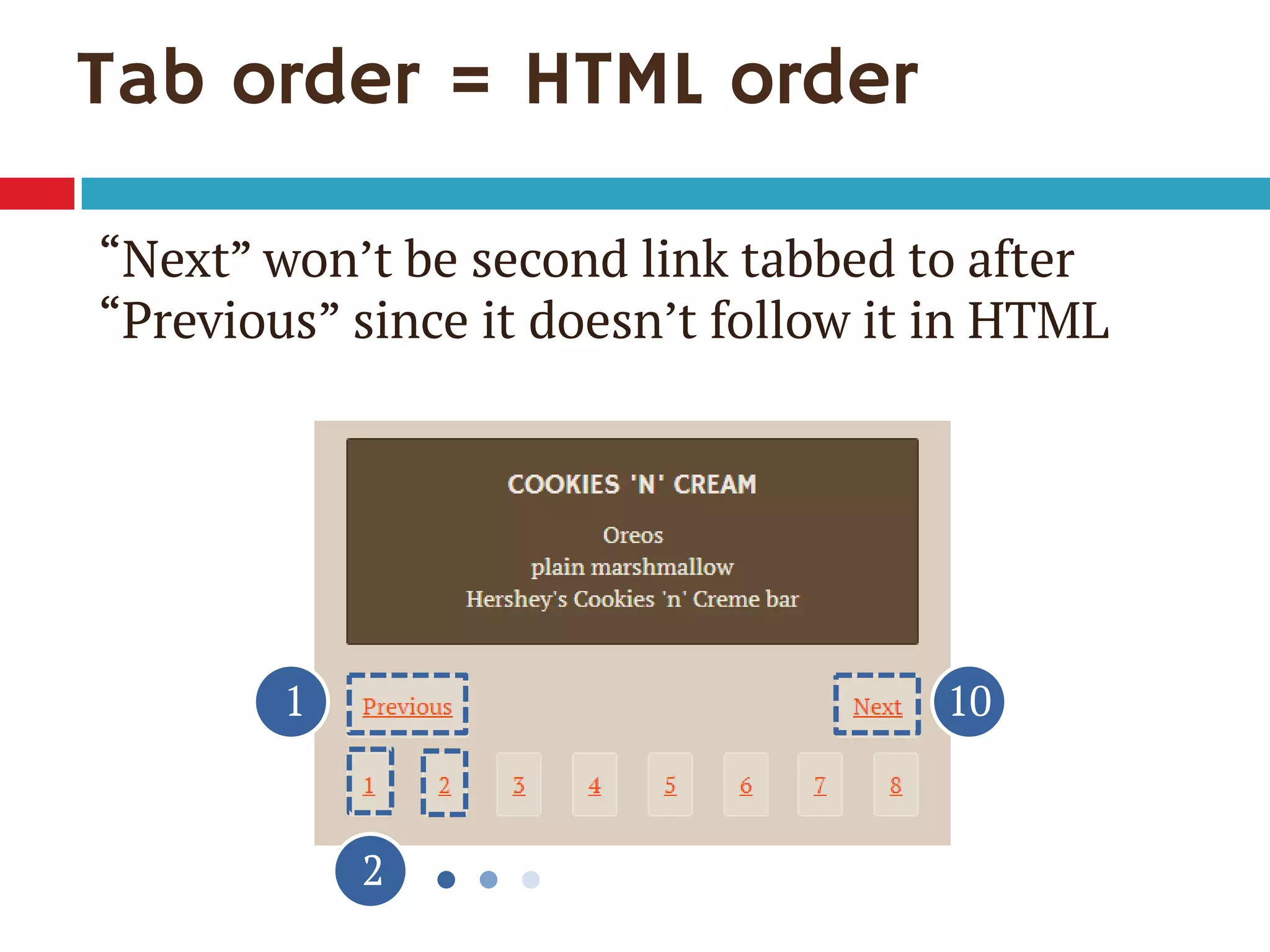
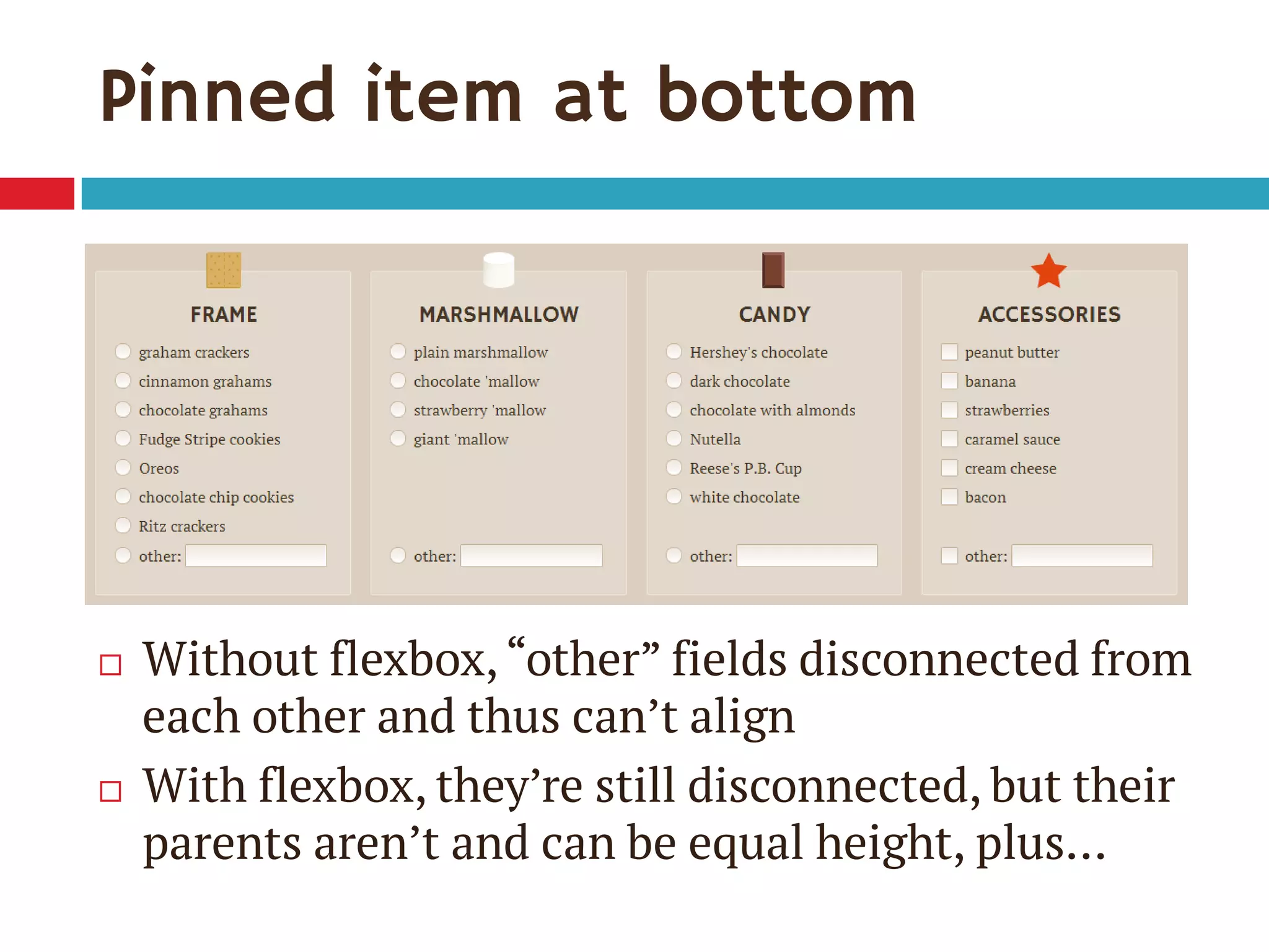

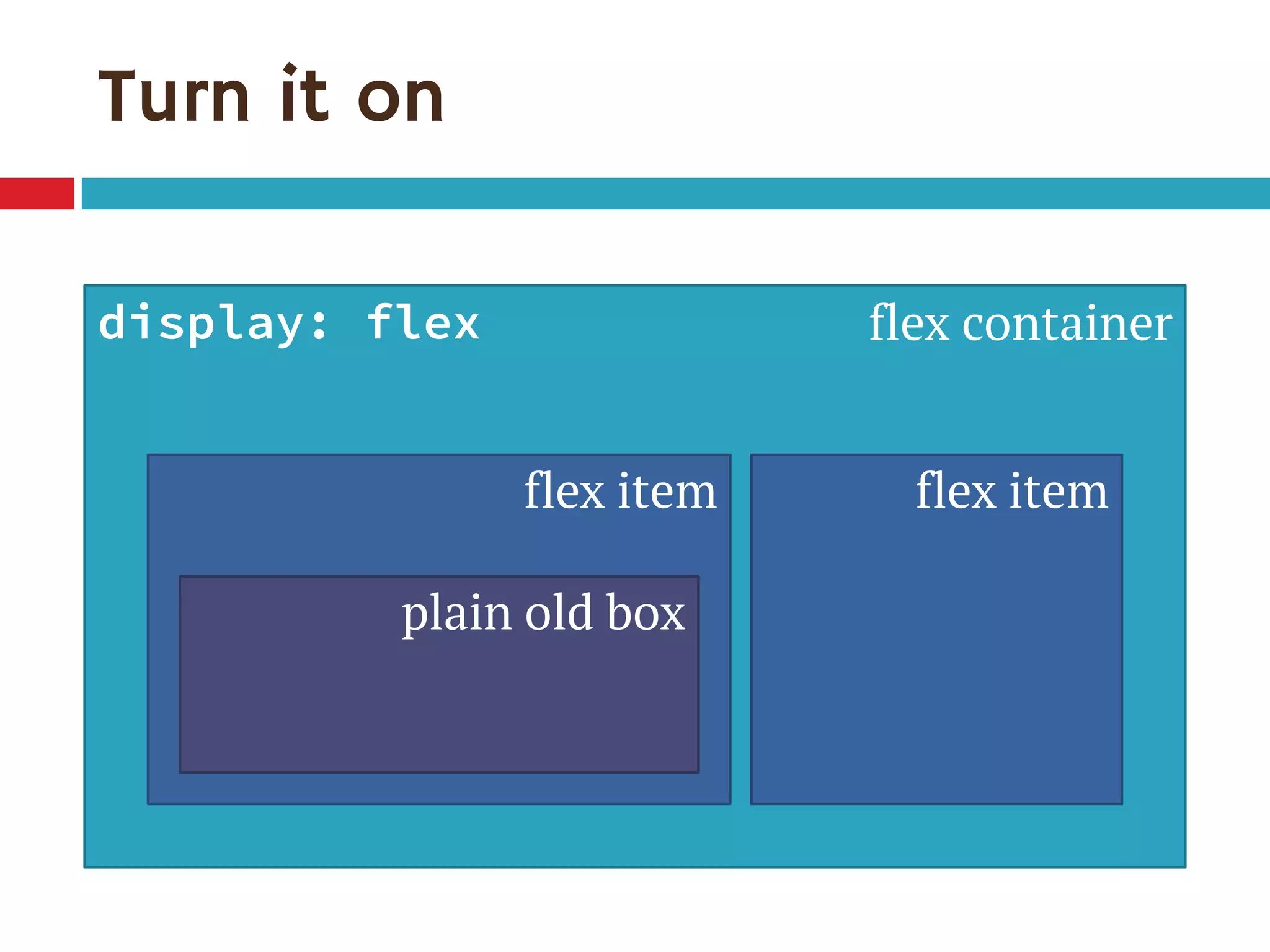
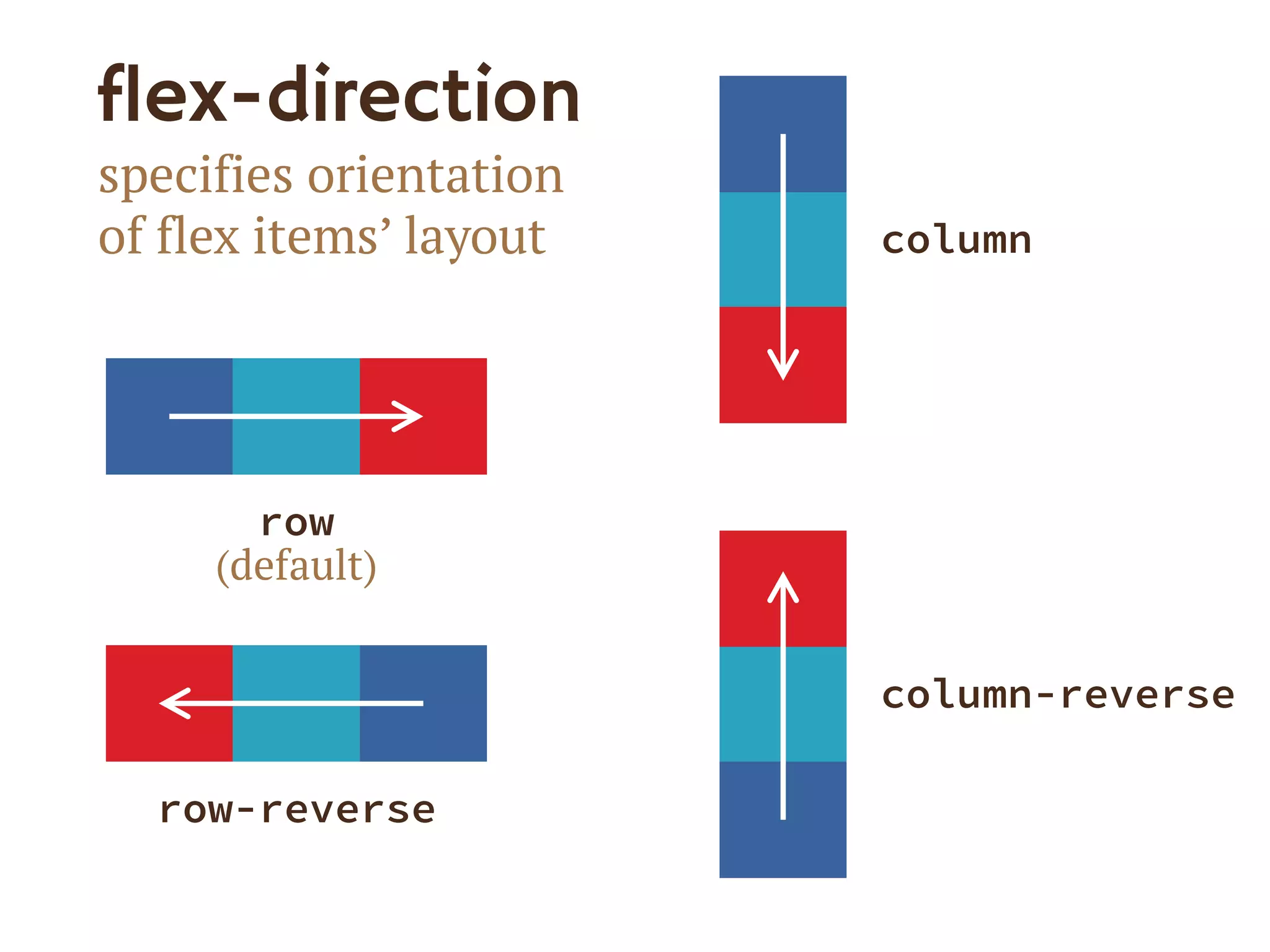
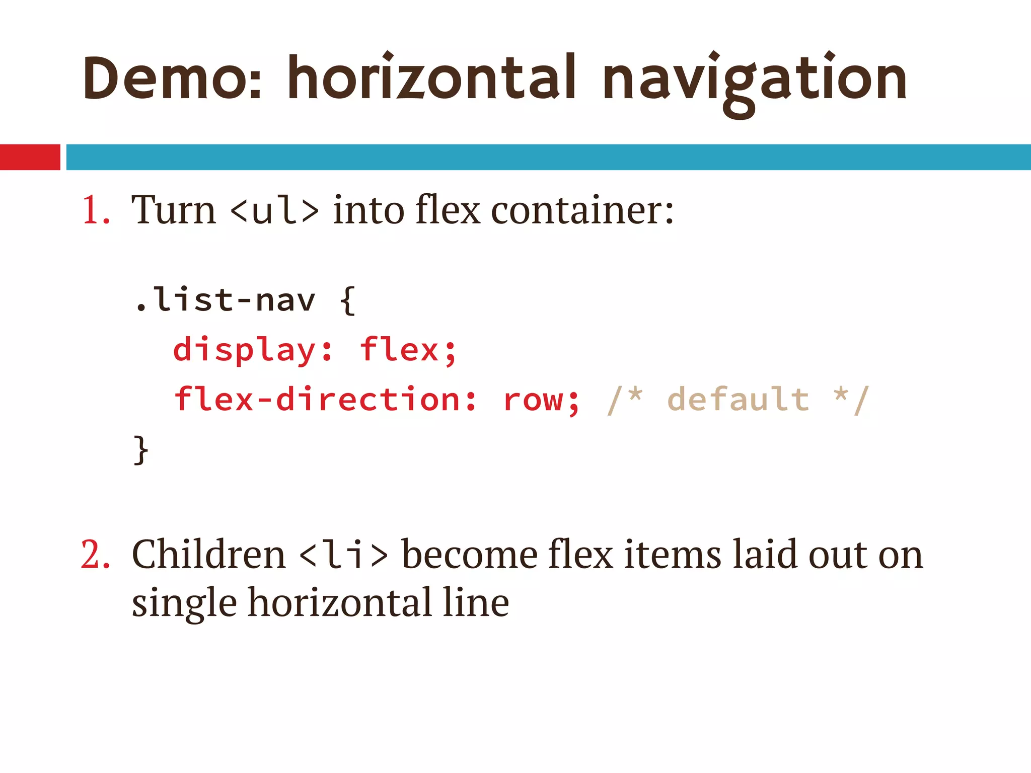
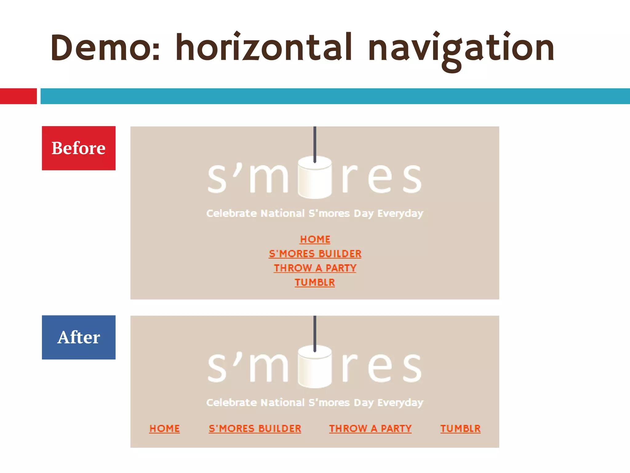
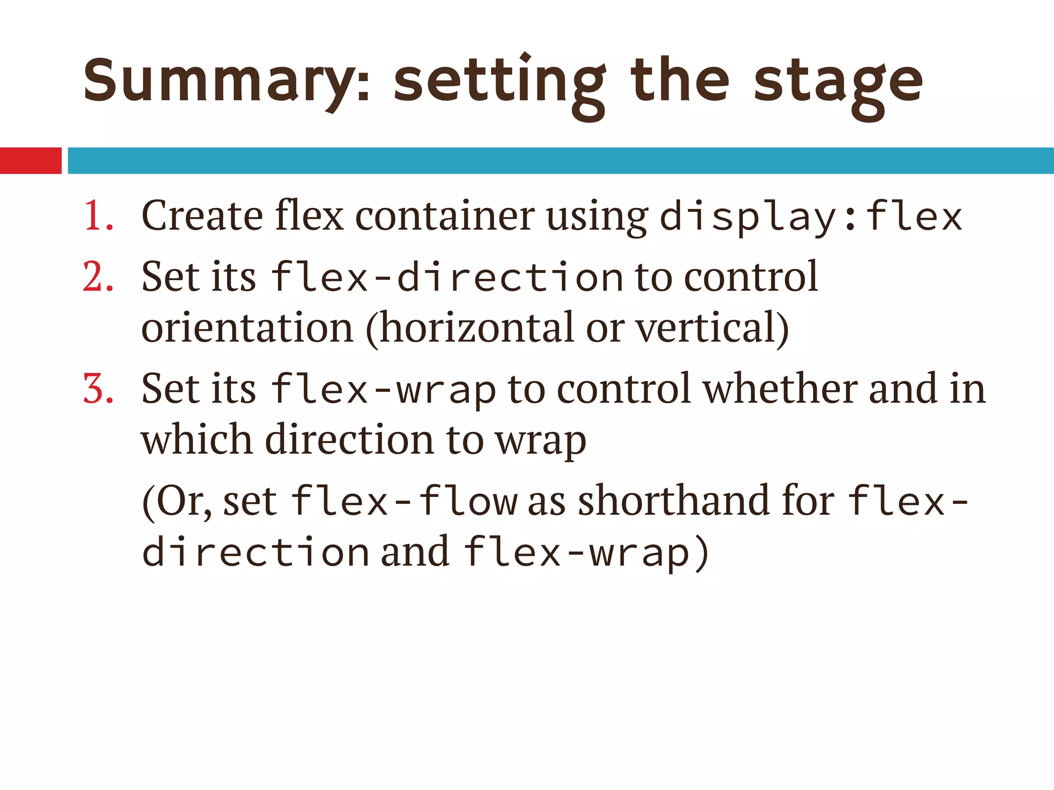
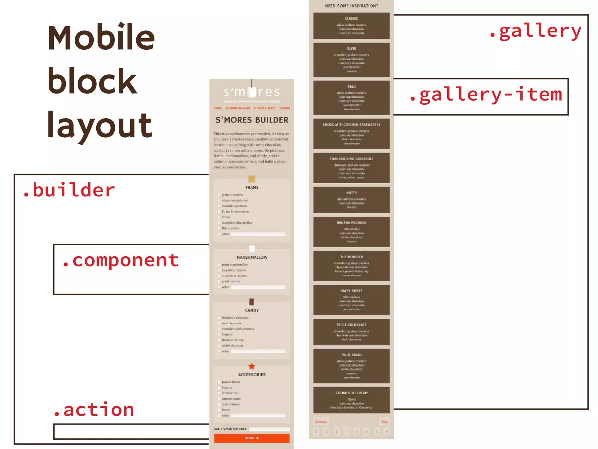
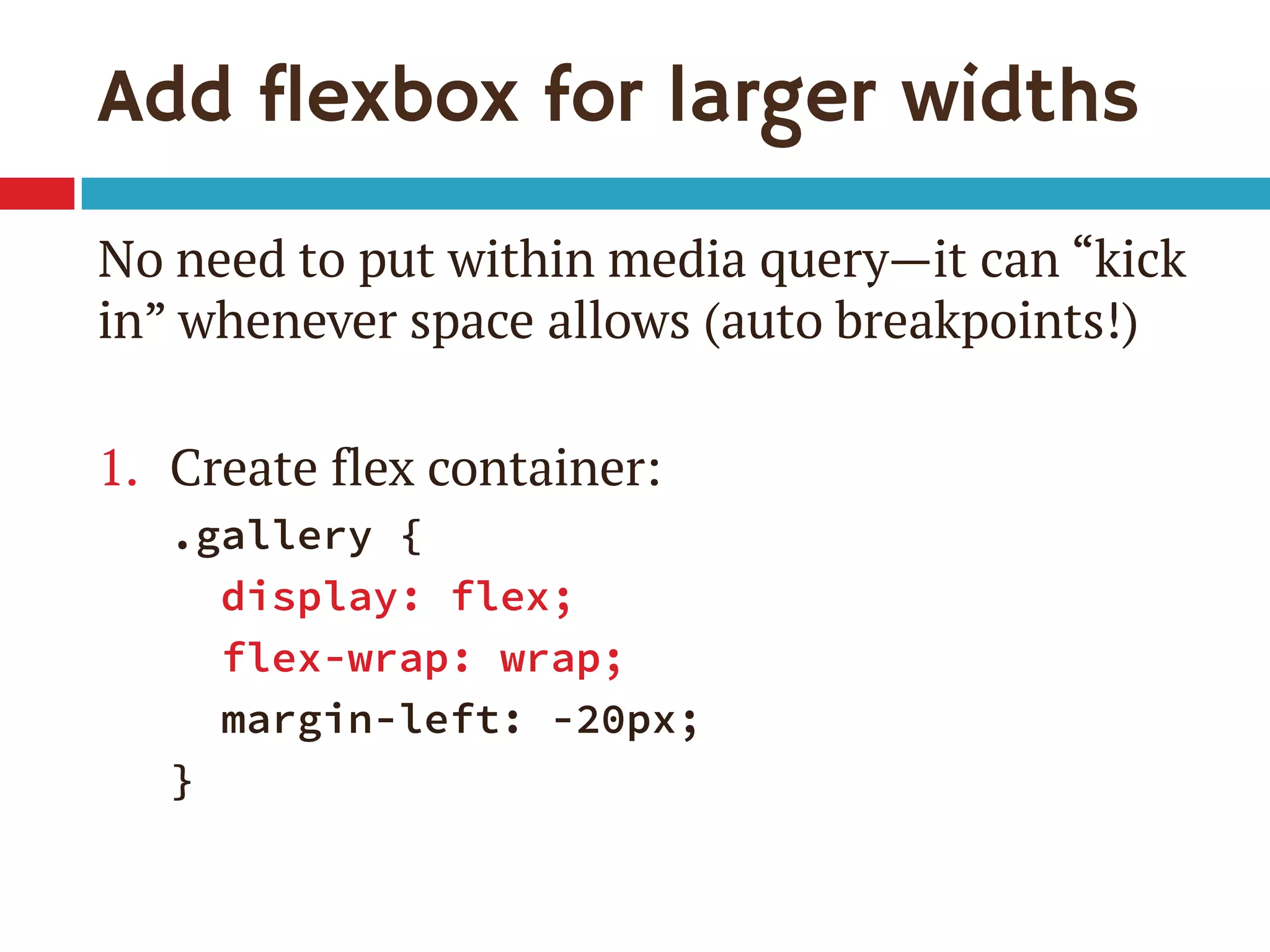
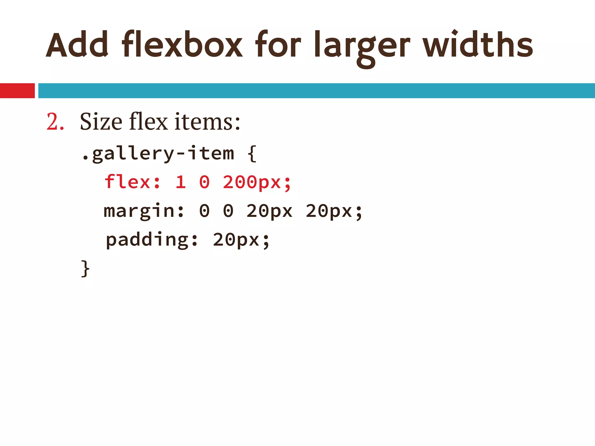
1. The document discusses the CSS Flexible Box Layout Module (flexbox) and how to implement it. 2. Flexbox allows items to be laid out flexibly on a page and makes it easier to create responsive page layouts without needing many media queries. 3. The document demonstrates how to use various flexbox properties like flex-direction, flex-wrap, justify-content, and order to create common layouts like navigation bars, forms, and grids.


![WinRAR Crack 7.13 Final Mac Keygen 2026 Download [Latest] Software.pptx](https://cdn.slidesharecdn.com/ss_thumbnails/software-251207185858-eb450678-thumbnail.jpg?width=640&height=640&fit=bounds)


![Moho Pro 14.4 Crack for MacOS Works Until 2050 [Latest] pptx](https://cdn.slidesharecdn.com/ss_thumbnails/softwareoverview-251207192639-797289c4-thumbnail.jpg?width=640&height=640&fit=bounds)

![PowerISO 9.2 Mac Crack + Serial Key Free Download 2026 [Latest] Software.pptx](https://cdn.slidesharecdn.com/ss_thumbnails/software-251207185653-5d5700e6-thumbnail.jpg?width=640&height=640&fit=bounds)


![AnyTrans for iOS 8.9.14.20251127 With Crack for MacOS [Latest] pptx](https://cdn.slidesharecdn.com/ss_thumbnails/softwareoverview-251207190907-2316965f-thumbnail.jpg?width=640&height=640&fit=bounds)