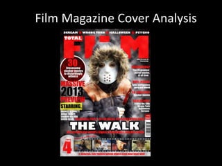
2. My choice of image was a medium shot. I chose this shot because this enables
audience's to identify the villains aggressive body language, retaining his knife. I also
recognised that on several film magazine covers medium shots are established of the
main character types. I also decided to use a medium shot because the villains facial
expression, is serious, menacing and holds a direct eye contact – which contributes to
mode of address which enables audience to identify the type of text.
3. In order to ensure, the language contributes
to typical horror language. I established text
such as; ‘4 menacing body horror movies
being made right now.’ This enables
audiences to identify the sub-genre as well
as stock themes. This type of text imposes
and attracts the target audience as which
therefore leads them to curiosity of wanting
to read the magazine. I created this banner
because it appears eye-catching which draws
the viewers attention.
I created the text above as this contributes the
sub-genre slasher of my trailer. This is an
attention grabbing text which connotes menace
and disturbance. This is typical slasher language
used in the horror genre to aim at its target
audience. For the circle banner I used several
blending options in order to create an attention
grabbing look - to contribute this to the
audience.
I chose to use the text ‘vulnerable people go for
walks but never return home. The purpose of
this is to foreshadow to audience's that
someone in my trailer goes for a walk and then
something disturbing happens to them.
I chose to establish film titles of slasher movies because this familiarises
audiences with the sub-genre ‘slasher’ that the my trailer falls into the
que of.
4. I chose to use the font ‘Gill Sans Ultra Bold’ for the masthead because this is a typical
font that conforms to Total Film’s font. As you can see above the similarity between
my font and total film fonts. I also used a red font because this is attention grabbing
and draws the readers attention into the magazine.
For the rest of my font, I also used ‘impact’ I used this font because I felt that text was
more visible and clear to read for my target audience. In order, to create an affective
look of my most important text. I used the blending options for the left-side third - I
felt that this enhanced and made my text stand out and appear attention grabbing.
5. I used a consistent colour scheme, such as red, white and black. I recognised that total
film and empire magazine front covers use a consistent colour scheme of a minimal of 3.
I used red and black because both colours signify; death, danger and demise. Both
colours conform to the horror genre. I also, kept my colour scheme consistent through
my circle banner for example, I ensured that my banner stood out in comparison to my
red colour scheme. I ensured that my colour scheme
conforms to the media language
of mise-en-scene for example, I
ensured the villains hoody would
be black so that this would
therefore conform to the colour
scheme.
Before taking my images, I considered
mise-en-scene I ensured that I would take
my image in high key lighting. I decided to
use high key lighting because when I
researched existing film magazine covers, I
identified that the images as well as front
covers were established in high key
lighting. This creates a sense of realism and
is the typical lighting established in a
magazine front cover.