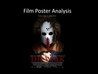
2. As you can see, I first took this image in
the woods in high key lighting. I then
edited this in photoshop in a system
called camera raw – which enabled me
to create an appropriate vignette and
control of how much of the vignette I
established. I then edited the image
further as I made the villains eyes dark
– to create an enigma and question
audience's who the hidden unknown
villain is?
For the background I decided to change this and create a vignette because this
foreshadows to audience sinister, evil acts will begin. Black signifies; menace, danger
and calamity I therefore changed the lighting/background in order to make the poster
as well as the villain appear, menacing and frightening.
3. I chose a close up shot to portray this in my poster because I felt that in order to make the
villain appear, menacing and frightening a close up shot - with the content of dark eyes creates
a feeling of terror of the unknown. With the content of a vignette established around the
poster makes the villain and poster appear sinister as black connotes; death, demise and
warning. I also chose a close up because this enables the audience to recognise the symbol
code – knife covered in blood which enables audience's to identify the sub-genre ‘slasher’.
My poster follows the conventions of scream by using the vignette as the background. The
colour scheme in scream is black, red and white, connoting murder and dismay. The use of
colour, camera shot and background is similar in my poster.
I chose to use the colour scheme, black red and white because these are typical colours
that are used in the horror genre – such as scream. Black and red
appear, imposing, menacing and frightening I therefore used this colour scheme to
contribute to horror codes and conventions.
4. In order to establish mise-en-scene I decided to use the hoody as a costume because this
clothing item appears; menacing, threatening and obscures the villains identity creating a
feeling of terror of the unknown – thus reinforcing thriller conventions. The hoody also
creates an enigma. I also chose to splatter fake blood over the knife to reinforce thriller
conventions - as blood signifies; danger and demise.
In order to follow the conventions of a real horror film poster, I ensured
my text appeared – visible, real and menacing. For example, ‘From The
Producers of The Texas chainsaw Massacre’ foreshadows the sub-genre of
the film ‘slasher’ as well as foreshadowing to audiences the film consists
of violent brutal acts – which are typical slasher conventions.
I also established the slogan ‘Evil Has A Destiny’, This connotes the villain
has the power to control what will happen – connoting his is in control and
power. Slogans are typical text used in film posters hinting the story.
5. The composition of my image and page is in
focus and control. The alignment of the page
is in focus of a close up surrounded by a
vignette. The similarity of the composition
can be seen in my film poster and scream.
For my title of my film I used the font –
castellar I used this font because it appears;
attention grabbing and draws the
audience's attention into the poster. I used
the blending options to enhance the title of
my film – I used the; drop shadow, colour
overlay, satin and stroke. This in turn made
my title font appear, striking and eye-
catching also enhancing the red font
connoting; evil, menace and danger.