
Recommended
More Related Content
What's hot
What's hot (19)
Similar to Q Magazine Cover Analysis - Cheryl Cole Rock Chick Image
Similar to Q Magazine Cover Analysis - Cheryl Cole Rock Chick Image (20)
More from reyganrudgley
Recently uploaded
Recently uploaded (20)
Q Magazine Cover Analysis - Cheryl Cole Rock Chick Image
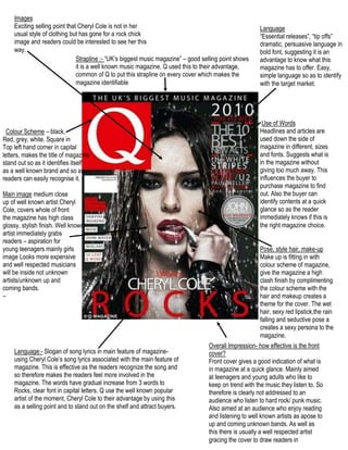
- 1. ImagesExciting selling point that Cheryl Cole is not in her usual style of clothing but has gone for a rock chick image and readers could be interested to see her this way. Language “Essential releases”, “tip offs” dramatic, persuasive language in bold font, suggesting it is an advantage to know what this magazine has to offer. Easy, simple language so as to identify with the target market. Strapline :- “UK’s biggest music magazine” – good selling point shows it is a well known music magazine, Q used this to their advantage, common of Q to put this strapline on every cover which makes the magazine identifiable 68580092075 Use of WordsHeadlines and articles are used down the side of magazine in different, sizes and fonts. Suggests what is in the magazine without giving too much away. This influences the buyer to purchase magazine to find out. Also the buyer can identify contents at a quick glance so as the reader immediately knows if this is the right magazine choice. Colour Scheme – black, Red, grey, white. Square in Top left hand corner in capital letters, makes the title of magazine stand out so as it identifies itself as a well known brand and so as readers can easily recognise it. Main image medium close up of well known artist Cheryl Cole, covers whole of front the magazine has high class glossy, stylish finish. Well known artist immediately grabs Pose, style hair, make-upMake up is fitting in with colour scheme of magazine, give the magazine a high clash finish by complimenting the colour scheme with the hair and makeup creates a theme for the cover. The wet hair, sexy red lipstick,the rain falling and seductive pose a creates a sexy persona to the magazine. readers – aspiration for young teenagers mainly girls image Looks more expensive and well respected musicians will be inside not unknown artists/unknown up and coming bands. – Overall Impression- how effective is the front cover? Front cover gives a good indication of what is in magazine at a quick glance. Mainly aimed at teenagers and young adults who like to keep on trend with the music they listen to. So therefore is clearly not addressed to an audience who listen to hard rock/ punk music. Also aimed at an audience who enjoy reading and listening to well known artists as apose to up and coming unknown bands. As well as this there is usually a well respected artist gracing the cover to draw readers in Language:- Slogan of song lyrics in main feature of magazine- using Cheryl Cole’s song lyrics associated with the main feature of magazine. This is effective as the readers recognize the song and so therefore makes the readers feel more involved in the magazine. The words have gradual increase from 3 words to Rocks, clear font in capital letters. Q use the well known popular artist of the moment, Cheryl Cole to their advantage by using this as a selling point and to stand out on the shelf and attract buyers.