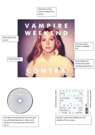
1. Bold white writing
stands out against the
picture
Mani subject very
central
Direct eye contact
Caught in headlights
look
Simple backdrop
Purple background
contrasts the yellow
clothing and blonde hair
Print draws the eye towards the centre, gives Barcode, simple white background, clear
you a feeling being drawn in. Album name typefaces, fits to a square.
stands out in the square box at the head of
the cd.
2. Title goes behind
head of subject
creates depth
Long writing mimics
the posture of the
subject.
Direct eye contact
and face direct to
the camera, strong
Colour of writing
contrasts the
background, white
writing on blue
background blue
writing on white
background. Main subject very
central
Red roses stand out against the white Similar to the front cover the typefaces
background. They each vary in how bold and strong. Red background links
much of the rose has been shown on to the red roses on the cd and white
the cd. writing links to the white background on
the cd. Bar code again.
3. Body not face onto
camera
Washed out colours
Direct eye contact
Rule of thirds;
middle of her face
on right third and Natural delicate
whole body falls colours and tones
into right third of green, white and
peach not bold reds
or purples
Informal balance to
the picture with the
writing to the left in
negative space and
the main subject on
the right side taking up
most of the image
balanceing the image
Black background makes the writing Background of the back cover similar to the
stand out. Typeface of the artists name light patterns from the front covers
mates the front cover. background. The writing is central, small
but clear.
4. Rule of thirds and band are of right third
which is pleasing to the eye draws your eye to
the band
Dynamic
lines
throughout
image
Writing framed by the Band members have been framed in one
pavement of the windows of the building
The dull grey background links to the colours used on the Picture on the back cover links to the theme
front cover with the whites blacks and greys of the street. of houses and shapes such as windows
The band’s name is at the top of the cd with the same type shown on the back. Song names all are
face used on the front cover and also the back cover. The divided by lines. Similar to another back
band name and album name divided by same line as the cover I’ve analysed there is the band’s name
line used to divide the song names on the back cover. and album name has been placed down the
These both show the consistency of the album. side of the back cover.
5. Artists name childish type face
which shows her personality or
characteristics
Yellow building contrasts the
blue sky and green landscaping
and she stands out in her red
dress
The artist and the house are both not facing camera
which gives a more relaxed feeling to the photo as it
isn’t all directed towards you
The background of the cd cover looks like a Type face of song names the same as the
homemade cake which links to the front album name on the front cover. Song name
cover of the album which is a quaint little are not aligned horizontally or vertically but
house and a dainty looking girl in a red dress. this demonstrates again the childish nature
to the artist.
6. Face of artist is blurred which
draws the attention to the area in
Writing of artist’s name is layered
focus which is a tape recorder
over the focused area which
which also includes the CD title.
creates depth in the image and
draws your eye into the photo.
Direct eye contact
Name of CD is
incorporated
into the image
Black background makes the white writing The same woman used on the back cover as
stand out. White line around the edge of the the front cover. Song names all down one
image frames the black. Same type face used side of the back cover. Similar colours are
on the front cover for the name as for the cd. used in both images on the front and back.