SlideShare a Scribd company logo
1 of 3
The image is a long shot, it is also in the middle of the
page and over two pages. This shows the importance
of the artist to the article. They are also set out in the
way you would expect a band to line up at a gig. They
are all wearing things that consist to colours similar to
the colour scheme of the page. The artists all look like
they are quite rocky and a very messy band and this is
shown in the clothes that they are wearing. There is
also smaller images located around the page. This
could be there to show all the different members play
their part to the band but the big image shows that
they need each other to make up the band.
The text is separated into the
columns. This makes the text look
controlled and makes it for the
user to read. The white writing is
also used as it is featured in the
colour scheme. The first word of
each paragraph is emphasised
because it in bold and written in
red whereas the rest of the font in
the paragraph is in white. This is a
good feature because the reader
will then be attracted to the
paragraph and will be more likely
to read it. Also the writing that is in
bigger letters looks like it is fading
away and looks dirty. This could be
used to show that type of music
they do is very old style of music.
Also the ‘DIRTY LITTLE’ part is
written in lettering that was used
in some legendary rock bands. This
could also be shown to link that
the music is old.
The headline of the text is also in bold and is
capital letters. This is used to show the
importance of the artist to the
interview/article. It is also used to make it look
sophisticated and appeal more to the reader
and attract the attention. The fact that the
name of the artist is spread out and bigger
shows that the artist is the main feature. The
headline of the article is also the name of one
of their hit singles.
The page has a lot of black and red
on it. There is also a little bit of
white but that only features on the
text. The colour scheme consists of
quite dark colours. The red is used
to represent danger and the black
is used to represent gothic/rock
music. This fits in with the
magazine type as the magazine is
aimed at people that listen to that
sort of music.
The image is a medium close up and takes up a whole
page and a little bit of the other page. This shows the
importance of the artist to the article. The image also
has a lack of colour and they all have the instrument
they play in their hands. They are also set out in the
way you would expect a band to line up at a gig. They
are all wearing the similar colours and are similar to
the colour scheme of the page. The artists all look like
they are quite rocky and a very messy band. This is
shown in the way they dress. Also the blue lines on
the page lead the persons eye to the image.
The text is separated into the
columns. This makes the text look
controlled and makes it for the
user to read. There is also a big L in
the background of the text and the
L represents the first letter of the
artists name. The black writing
could also link to the fact that the
colour scheme and page looks very
old and messy like
The headline of the text is also in bold and is
capital letters. This is used to show the
importance of the artist to the
interview/article. It is also used to make it look
sophisticated and appeal more to the reader
and attract the attention. The fact that the
name of the artist is spread out and bigger
shows that the artist is the main feature. The
artists name is also lacks colour just like the
image of the band.
The first letter of each paragraph is
emphasised because it bigger that
the rest of the letters and stands
out. However, this could be bad
because it may drag the readers
attention to the bit only so they
may not read all the article.
The page also looks old and like it
is very washed out. This could be
used to show that the style of
music they do is very grunge like
and the genre they do has a lot of
history as it is an old type of music.
There is also little bits of blue on
the page. The front person has
tape on his guitar and the blue
could show that they have broken
their instruments so are sticking
them together with the blue tape.
The image is a close up and takes up a whole page.
This shows the importance of the artist to the article.
The image also has a red light shining on him, he is
wearing glasses and looks like a serious person. The
person is also wearing a big chain which could show
that he is a wealthy powerful man. This could link to
the colour red of the J and the fact that it could have
the connotation of danger and power.
The text is separated into the
columns. This makes the text look
controlled and makes it for the
user to read. There is also a big L in
the background of the text and the
L represents the first letter of the
artists name.
The headline of the text is also in bold and is
spaced out. This is used to show the importance of
the artist to the interview/article. It is also used to
make it look sophisticated and appeal more to the
reader. The fact that the name of the artist is
spread out and bigger shows that the artist is the
main feature. The artists name is also written in red
just like the J and the colour on the image.
The first letter of each paragraph is
emphasised because it bigger that
the rest of the letters and stands
out. However, this could be bad
because it may drag the readers
attention to the bit only so they
may not read all the article.
There is a lot of red and black on
the pages. There is also a lot of
white over the two pages too.
These colours are used as they also
feature in the colour scheme of the
magazine Q.

More Related Content

What's hot (13)

Magazine analysis research
Magazine analysis researchMagazine analysis research
Magazine analysis research
 
Double Page Spread Analysis XXL
Double Page Spread Analysis XXLDouble Page Spread Analysis XXL
Double Page Spread Analysis XXL
 
Final magazine analysis
Final magazine analysisFinal magazine analysis
Final magazine analysis
 
Double page spread analysis xxl
Double page spread analysis xxlDouble page spread analysis xxl
Double page spread analysis xxl
 
Question 1
Question 1Question 1
Question 1
 
Question 1
Question 1Question 1
Question 1
 
Contents page analysis
Contents page analysisContents page analysis
Contents page analysis
 
Question 7
Question 7Question 7
Question 7
 
Audience feedback
Audience feedbackAudience feedback
Audience feedback
 
Analysing articles
Analysing articlesAnalysing articles
Analysing articles
 
Analysis of Contents Pages
Analysis of Contents PagesAnalysis of Contents Pages
Analysis of Contents Pages
 
Codes and conventions of a music magazine
Codes and conventions of a music magazineCodes and conventions of a music magazine
Codes and conventions of a music magazine
 
Dps Analysis
Dps AnalysisDps Analysis
Dps Analysis
 

Viewers also liked

Final contents page
Final contents pageFinal contents page
Final contents page
mickyb96
 
Front cover final dr4aft
Front cover final dr4aftFront cover final dr4aft
Front cover final dr4aft
mickyb96
 
Digipak front cover initial drafting
Digipak front cover initial draftingDigipak front cover initial drafting
Digipak front cover initial drafting
mickyb96
 
Double page spread
Double page spreadDouble page spread
Double page spread
mickyb96
 
First draft contents
First draft contentsFirst draft contents
First draft contents
mickyb96
 
AS G322 revision booklet pt2 (Film Industry)
AS G322 revision booklet pt2 (Film Industry)AS G322 revision booklet pt2 (Film Industry)
AS G322 revision booklet pt2 (Film Industry)
Belinda Raji
 

Viewers also liked (7)

Final contents page
Final contents pageFinal contents page
Final contents page
 
Front cover final dr4aft
Front cover final dr4aftFront cover final dr4aft
Front cover final dr4aft
 
Digipak front cover initial drafting
Digipak front cover initial draftingDigipak front cover initial drafting
Digipak front cover initial drafting
 
Pictures
PicturesPictures
Pictures
 
Double page spread
Double page spreadDouble page spread
Double page spread
 
First draft contents
First draft contentsFirst draft contents
First draft contents
 
AS G322 revision booklet pt2 (Film Industry)
AS G322 revision booklet pt2 (Film Industry)AS G322 revision booklet pt2 (Film Industry)
AS G322 revision booklet pt2 (Film Industry)
 

Similar to Double page spread (20)

Double Page Spread Analysis XXL
Double Page Spread Analysis XXLDouble Page Spread Analysis XXL
Double Page Spread Analysis XXL
 
Double Page Spread Analysis XXL
Double Page Spread Analysis XXLDouble Page Spread Analysis XXL
Double Page Spread Analysis XXL
 
Double Page Spread Analysis XXL
Double Page Spread Analysis XXLDouble Page Spread Analysis XXL
Double Page Spread Analysis XXL
 
Double Page Spread Analysis XXL
Double Page Spread Analysis XXLDouble Page Spread Analysis XXL
Double Page Spread Analysis XXL
 
Double Page Spread Analysis XXL
Double Page Spread Analysis XXLDouble Page Spread Analysis XXL
Double Page Spread Analysis XXL
 
Music magazines pp
Music magazines ppMusic magazines pp
Music magazines pp
 
Magazine cover
Magazine coverMagazine cover
Magazine cover
 
magazine analysis
magazine analysismagazine analysis
magazine analysis
 
Task 3
Task 3 Task 3
Task 3
 
Media magaine analysis
Media magaine analysisMedia magaine analysis
Media magaine analysis
 
Front cover analysis, kerrang!, mojo, q
Front cover analysis, kerrang!, mojo, qFront cover analysis, kerrang!, mojo, q
Front cover analysis, kerrang!, mojo, q
 
Magazine article analysis
Magazine article analysisMagazine article analysis
Magazine article analysis
 
Magazine analysis
Magazine analysisMagazine analysis
Magazine analysis
 
Magazine analysis
Magazine analysisMagazine analysis
Magazine analysis
 
Analysis of Double Page Spread
Analysis of Double Page SpreadAnalysis of Double Page Spread
Analysis of Double Page Spread
 
3. research(2) 5
3. research(2) 53. research(2) 5
3. research(2) 5
 
3. research(2) 2
3. research(2) 23. research(2) 2
3. research(2) 2
 
3. research(2) 6
3. research(2) 63. research(2) 6
3. research(2) 6
 
Double Page Spread Research
Double Page Spread ResearchDouble Page Spread Research
Double Page Spread Research
 
Industry analysis
Industry analysisIndustry analysis
Industry analysis
 

More from mickyb96

Digipak poster drafting
Digipak poster draftingDigipak poster drafting
Digipak poster drafting
mickyb96
 
Digipak inside drafting
Digipak inside draftingDigipak inside drafting
Digipak inside drafting
mickyb96
 
Digipak inside drafting
Digipak inside draftingDigipak inside drafting
Digipak inside drafting
mickyb96
 
Digipak side panel drafting
Digipak side panel draftingDigipak side panel drafting
Digipak side panel drafting
mickyb96
 
Digipak back cover further drafting
Digipak back cover further draftingDigipak back cover further drafting
Digipak back cover further drafting
mickyb96
 
Digipak back cover initial drafting
Digipak back cover initial draftingDigipak back cover initial drafting
Digipak back cover initial drafting
mickyb96
 
Digipak front cover further drafting
Digipak front cover further draftingDigipak front cover further drafting
Digipak front cover further drafting
mickyb96
 
Digipak back cover drafting
Digipak back cover draftingDigipak back cover drafting
Digipak back cover drafting
mickyb96
 
Digipak front cover drafting 3
Digipak front cover drafting 3Digipak front cover drafting 3
Digipak front cover drafting 3
mickyb96
 
Task 1 (1)
Task 1 (1)Task 1 (1)
Task 1 (1)
mickyb96
 
Task 1 (1)
Task 1 (1)Task 1 (1)
Task 1 (1)
mickyb96
 
Contents drafting
Contents draftingContents drafting
Contents drafting
mickyb96
 
Hierachy of typefaces put on blog
Hierachy of typefaces put on blogHierachy of typefaces put on blog
Hierachy of typefaces put on blog
mickyb96
 
Evaluation
EvaluationEvaluation
Evaluation
mickyb96
 
Front cover drafting
Front cover draftingFront cover drafting
Front cover drafting
mickyb96
 
Front cover drafting
Front cover draftingFront cover drafting
Front cover drafting
mickyb96
 
Front cover drafting 2
Front cover drafting 2Front cover drafting 2
Front cover drafting 2
mickyb96
 

More from mickyb96 (20)

Digipak poster drafting
Digipak poster draftingDigipak poster drafting
Digipak poster drafting
 
Digipak inside drafting
Digipak inside draftingDigipak inside drafting
Digipak inside drafting
 
Digipak inside drafting
Digipak inside draftingDigipak inside drafting
Digipak inside drafting
 
Digipak side panel drafting
Digipak side panel draftingDigipak side panel drafting
Digipak side panel drafting
 
Digipak back cover further drafting
Digipak back cover further draftingDigipak back cover further drafting
Digipak back cover further drafting
 
Digipak back cover initial drafting
Digipak back cover initial draftingDigipak back cover initial drafting
Digipak back cover initial drafting
 
Digipak front cover further drafting
Digipak front cover further draftingDigipak front cover further drafting
Digipak front cover further drafting
 
Digipak back cover drafting
Digipak back cover draftingDigipak back cover drafting
Digipak back cover drafting
 
Digipak front cover drafting 3
Digipak front cover drafting 3Digipak front cover drafting 3
Digipak front cover drafting 3
 
Task 1 (1)
Task 1 (1)Task 1 (1)
Task 1 (1)
 
Task 1 (1)
Task 1 (1)Task 1 (1)
Task 1 (1)
 
Task 1
Task 1Task 1
Task 1
 
Contents drafting
Contents draftingContents drafting
Contents drafting
 
Layout
LayoutLayout
Layout
 
Hierachy of typefaces put on blog
Hierachy of typefaces put on blogHierachy of typefaces put on blog
Hierachy of typefaces put on blog
 
Layout
LayoutLayout
Layout
 
Evaluation
EvaluationEvaluation
Evaluation
 
Front cover drafting
Front cover draftingFront cover drafting
Front cover drafting
 
Front cover drafting
Front cover draftingFront cover drafting
Front cover drafting
 
Front cover drafting 2
Front cover drafting 2Front cover drafting 2
Front cover drafting 2
 

Double page spread

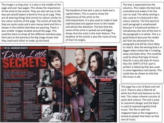
  • 1. The image is a long shot, it is also in the middle of the page and over two pages. This shows the importance of the artist to the article. They are also set out in the way you would expect a band to line up at a gig. They are all wearing things that consist to colours similar to the colour scheme of the page. The artists all look like they are quite rocky and a very messy band and this is shown in the clothes that they are wearing. There is also smaller images located around the page. This could be there to show all the different members play their part to the band but the big image shows that they need each other to make up the band. The text is separated into the columns. This makes the text look controlled and makes it for the user to read. The white writing is also used as it is featured in the colour scheme. The first word of each paragraph is emphasised because it in bold and written in red whereas the rest of the font in the paragraph is in white. This is a good feature because the reader will then be attracted to the paragraph and will be more likely to read it. Also the writing that is in bigger letters looks like it is fading away and looks dirty. This could be used to show that type of music they do is very old style of music. Also the ‘DIRTY LITTLE’ part is written in lettering that was used in some legendary rock bands. This could also be shown to link that the music is old. The headline of the text is also in bold and is capital letters. This is used to show the importance of the artist to the interview/article. It is also used to make it look sophisticated and appeal more to the reader and attract the attention. The fact that the name of the artist is spread out and bigger shows that the artist is the main feature. The headline of the article is also the name of one of their hit singles. The page has a lot of black and red on it. There is also a little bit of white but that only features on the text. The colour scheme consists of quite dark colours. The red is used to represent danger and the black is used to represent gothic/rock music. This fits in with the magazine type as the magazine is aimed at people that listen to that sort of music.
  • 2. The image is a medium close up and takes up a whole page and a little bit of the other page. This shows the importance of the artist to the article. The image also has a lack of colour and they all have the instrument they play in their hands. They are also set out in the way you would expect a band to line up at a gig. They are all wearing the similar colours and are similar to the colour scheme of the page. The artists all look like they are quite rocky and a very messy band. This is shown in the way they dress. Also the blue lines on the page lead the persons eye to the image. The text is separated into the columns. This makes the text look controlled and makes it for the user to read. There is also a big L in the background of the text and the L represents the first letter of the artists name. The black writing could also link to the fact that the colour scheme and page looks very old and messy like The headline of the text is also in bold and is capital letters. This is used to show the importance of the artist to the interview/article. It is also used to make it look sophisticated and appeal more to the reader and attract the attention. The fact that the name of the artist is spread out and bigger shows that the artist is the main feature. The artists name is also lacks colour just like the image of the band. The first letter of each paragraph is emphasised because it bigger that the rest of the letters and stands out. However, this could be bad because it may drag the readers attention to the bit only so they may not read all the article. The page also looks old and like it is very washed out. This could be used to show that the style of music they do is very grunge like and the genre they do has a lot of history as it is an old type of music. There is also little bits of blue on the page. The front person has tape on his guitar and the blue could show that they have broken their instruments so are sticking them together with the blue tape.
  • 3. The image is a close up and takes up a whole page. This shows the importance of the artist to the article. The image also has a red light shining on him, he is wearing glasses and looks like a serious person. The person is also wearing a big chain which could show that he is a wealthy powerful man. This could link to the colour red of the J and the fact that it could have the connotation of danger and power. The text is separated into the columns. This makes the text look controlled and makes it for the user to read. There is also a big L in the background of the text and the L represents the first letter of the artists name. The headline of the text is also in bold and is spaced out. This is used to show the importance of the artist to the interview/article. It is also used to make it look sophisticated and appeal more to the reader. The fact that the name of the artist is spread out and bigger shows that the artist is the main feature. The artists name is also written in red just like the J and the colour on the image. The first letter of each paragraph is emphasised because it bigger that the rest of the letters and stands out. However, this could be bad because it may drag the readers attention to the bit only so they may not read all the article. There is a lot of red and black on the pages. There is also a lot of white over the two pages too. These colours are used as they also feature in the colour scheme of the magazine Q.