Downloaded 3,347 times
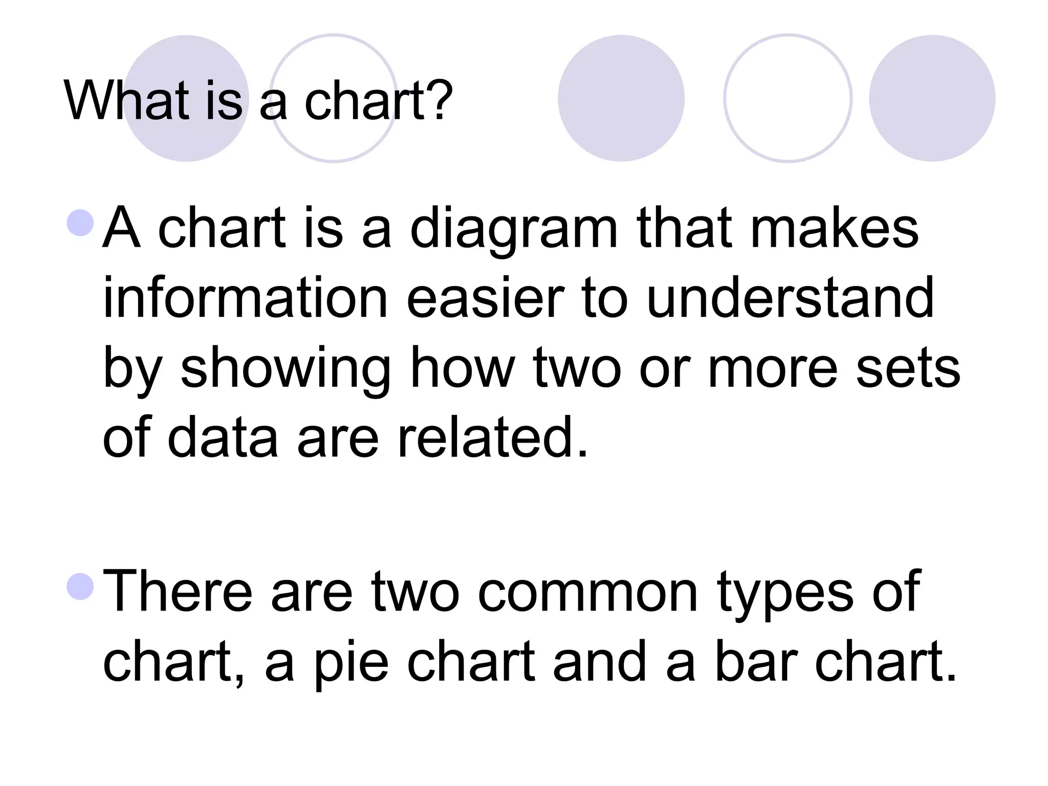
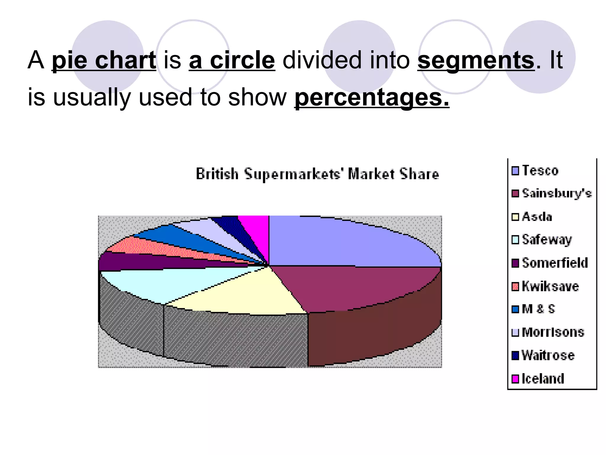
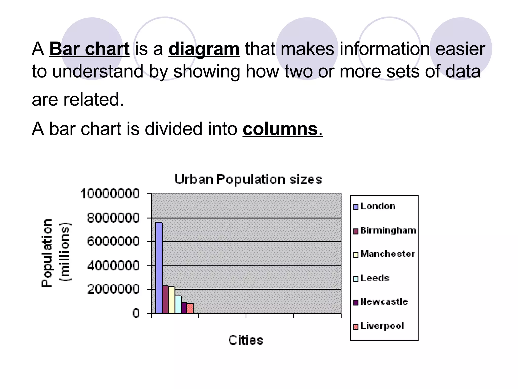
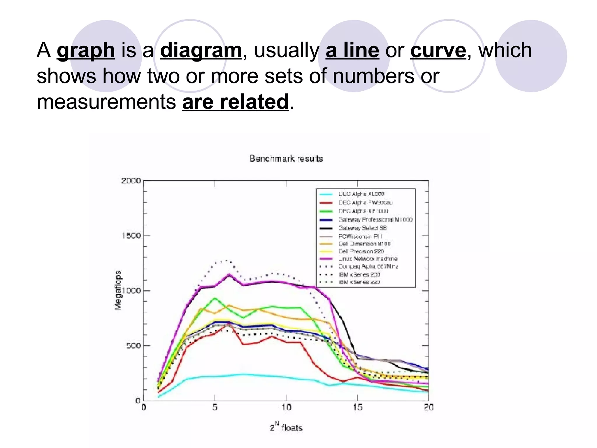
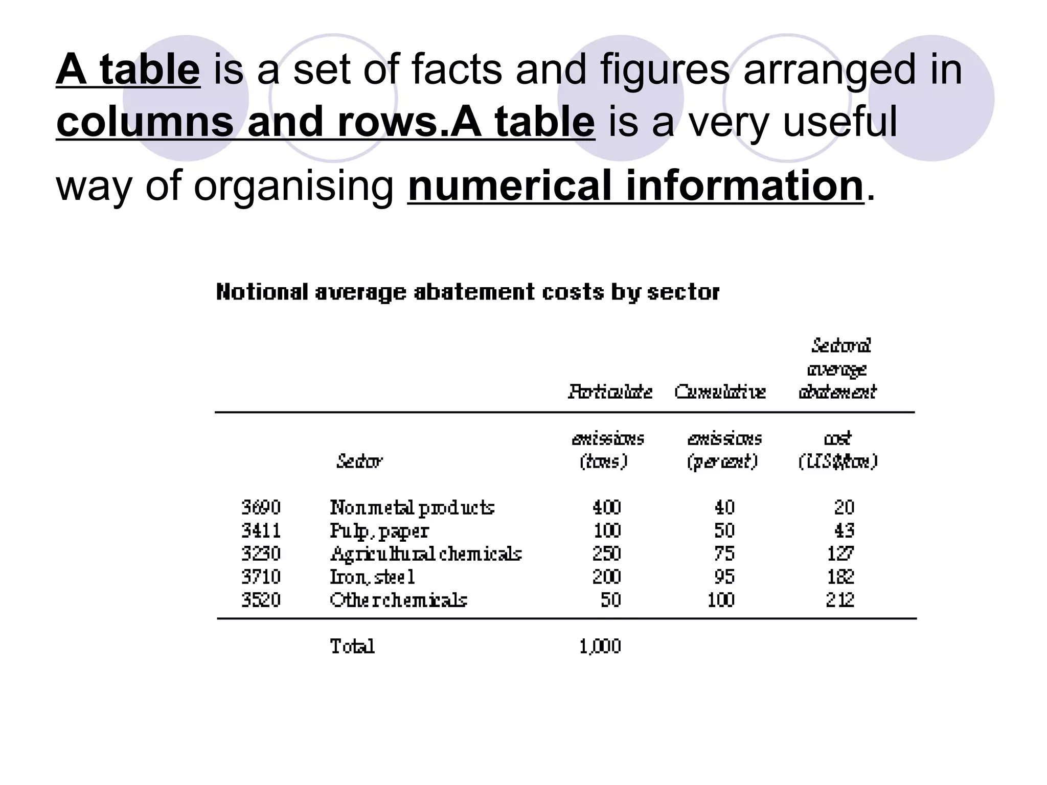
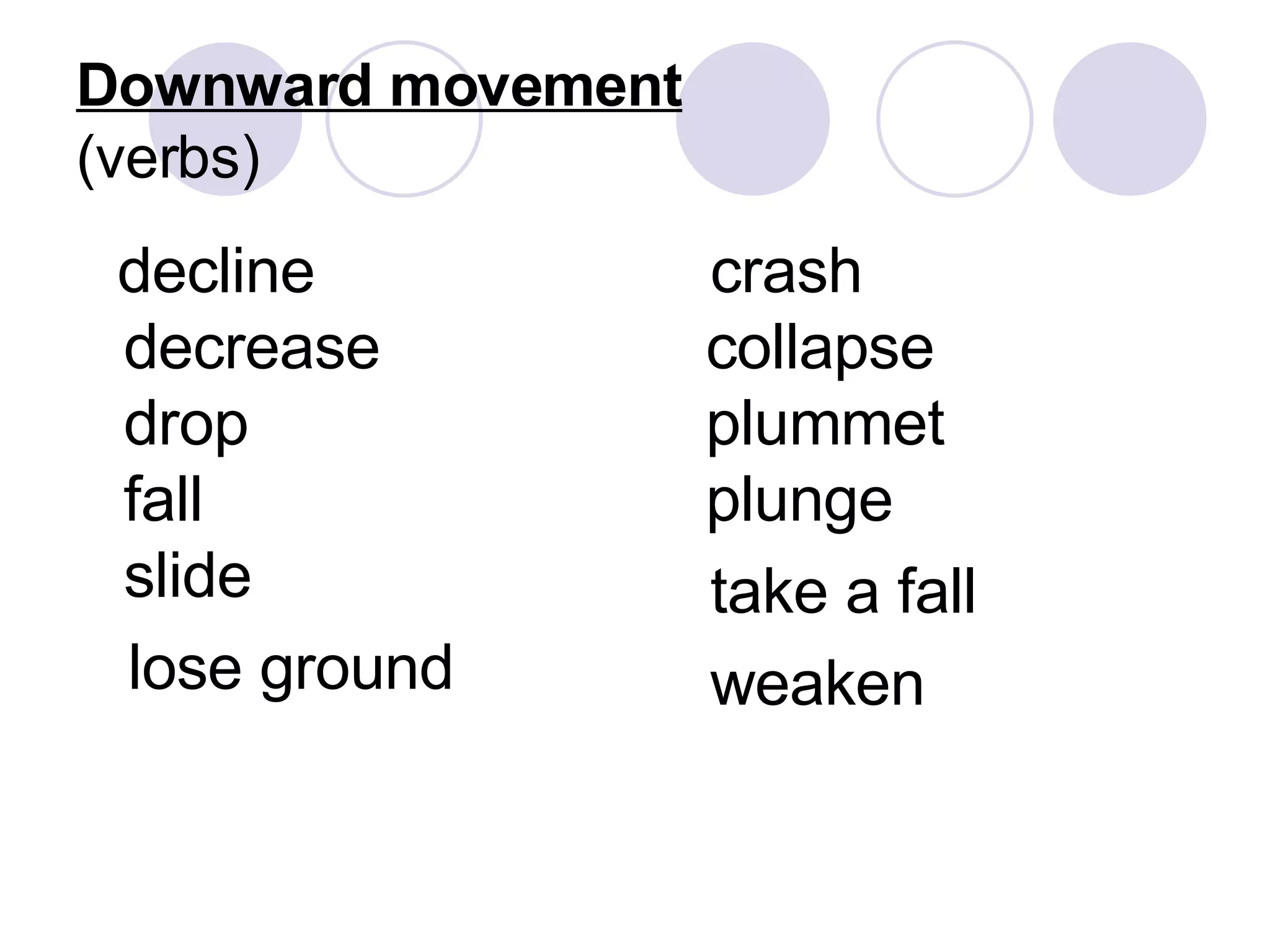
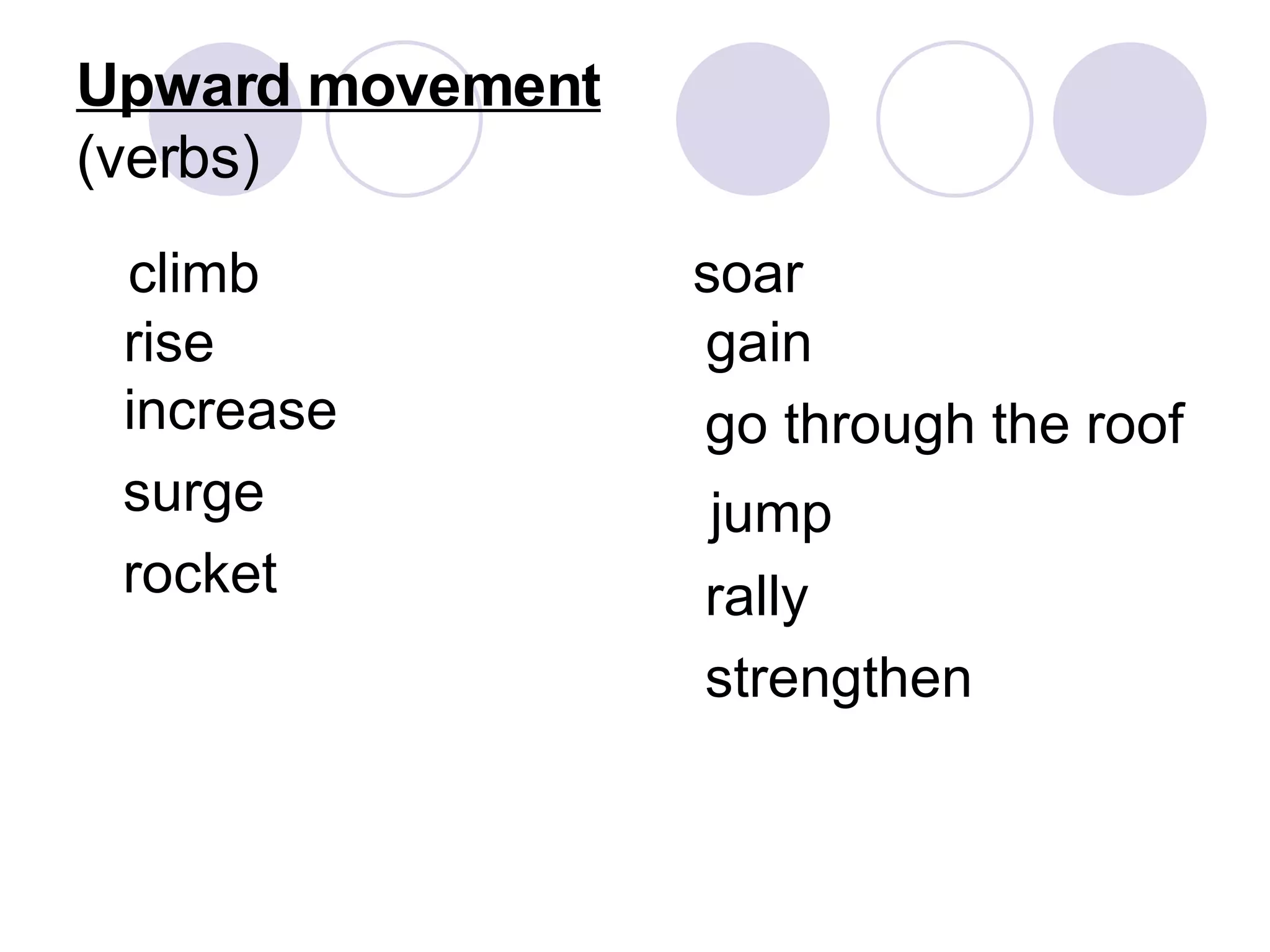
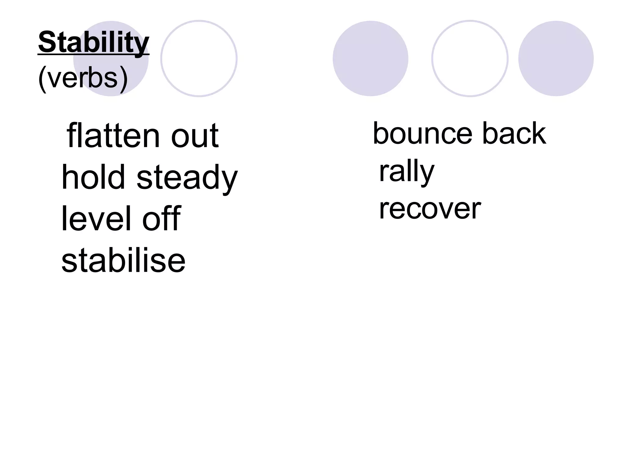
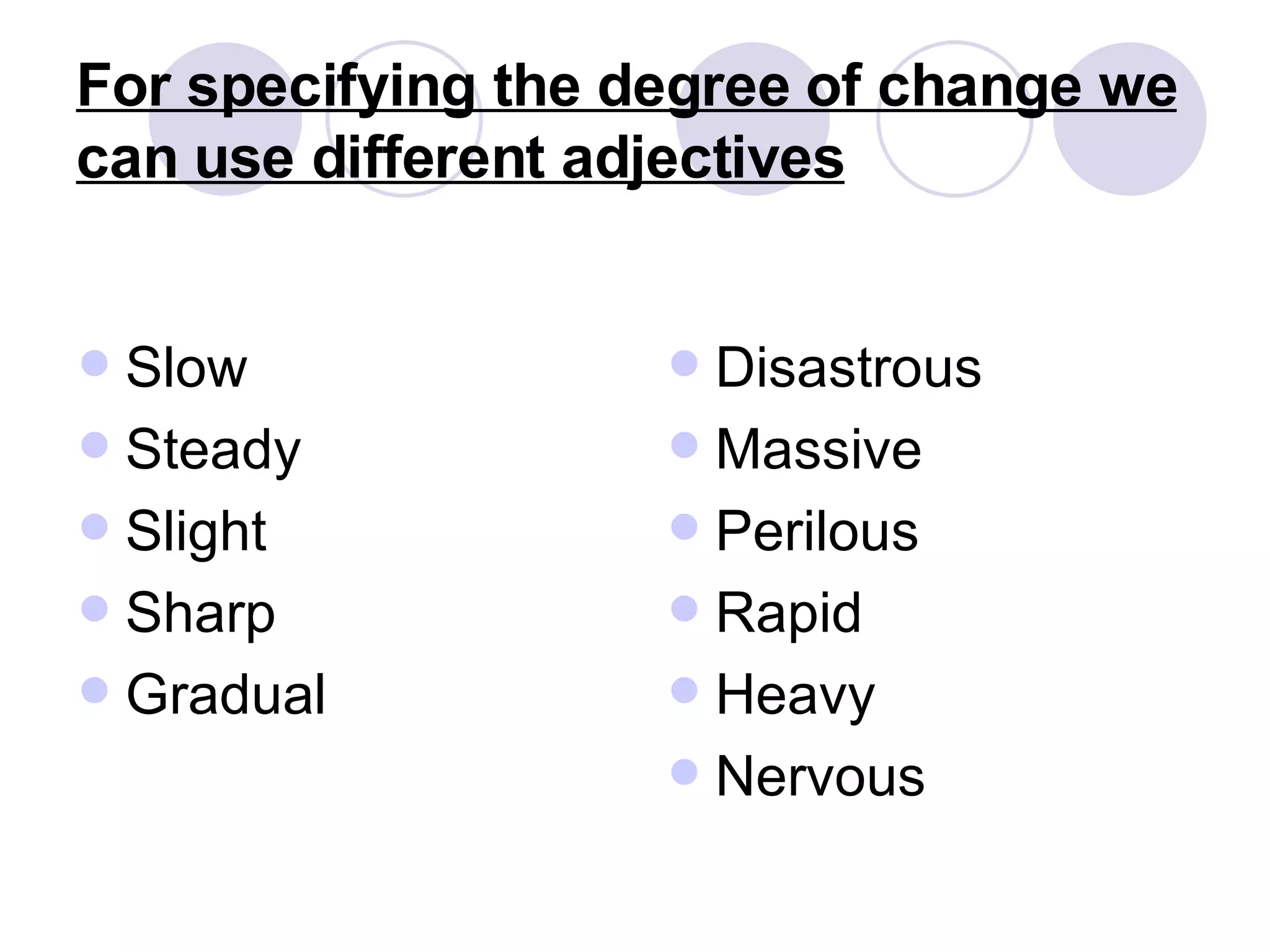

The document defines and describes different types of charts, graphs, and tables used to visualize data relationships. It explains that charts like pie charts and bar charts show how data sets relate, graphs use lines or curves, and tables organize data into rows and columns. Trends in data over time are described using verbs for upward, downward, or stable movement as well as adjectives denoting the degree or speed of change.