By Marcel Caraciolo http://mobideia.blogspot.com Chapter 04 –  MIDP:  User Interface SCMAD Certification  45mm 61mm
Agenda MIDP User interface API’s API’s: High level, low level, game Displayable Command CommandListener Ticker Classes TextBox List Alert Form
MIDP : User Interface API’s AWT is too resource-consuming and complex to fit  inside MIDP, so it defines its own user interface  API: LCDUI (Limited Connected Device UI) Packages: javax.microedition.lcdui:  Low and High-Level API javax.microedition.game:  Game API Every MIDlet has a Display linked to it:  Found by calling Display.getMIDlet(midlet) This Display instance will be valid through all the  MIDlet life, so it may be kept as instance attribute  in the MIDlet  Every “full screen window” extends Displayable
MIDP : User Interface API’s Display has one Displayable set to it (current). Navigation” between screens is done changing the current  Displayable. All UI operations are thread-safe. No synchronization or specific thread needs to be used by the developer to update the UI. Display methods: isColor:  if the device support colours numColors:  Number of colours or gray tones supported flashBacklight(milliseconds):  Flashes the device’s “backlight” vibrate(milliseconds):  Vibrates the device getColor( colorSpecifier):  Returns the colour of an UI component (e.g. background color, border color, etc.)
MIDP : Displayable Every Displayable (either low level or high level)  may have: Zero or more commands associated (user operations that will be  executed on a screen). A single commandListener to execute operations from  commands on a screen  A title A Ticker (Scrolling text)
MIDP : Command Commands are operations to be executed on a screen, usually linked to a soft key on the phone. Every command has a type and a priority. These attributes define where the command will be placed. For instance,  “Back”, “Cancel”  or  “Exit”  buttons are placed on the right button. Priority defines how easy it is to call the operation. This is only a hint to the system, since the real position is defined by the device. Commands also have a label and a short label. Again, which label will be used is up to the device. Command type, priority and label are all set on the constructor.
MIDP : Command Command types: SCREEN:  Concerns all the fields on the screen (e.g. save, submit). BACK:  On navigation screens, go to the previous CANCEL : Cancels the operation OK:  Confirms the operation HELP : Help STOP : Cancels a running operation EXIT : Exits the application ITEM : Concerns only the currently selected item, not all the  items on the screen. This command is only shown when the item  is selected.
MIDP : Command
MIDP : CommandListener Executes a command operation A displayable may have several commands, but will  have a single CommandListener. Defines only one method:  commandAction(command, displayable). Execution must return immediately. If a time-consuming operation will be executed by the command (like a network call) then the execution shall be done on a separated thread.
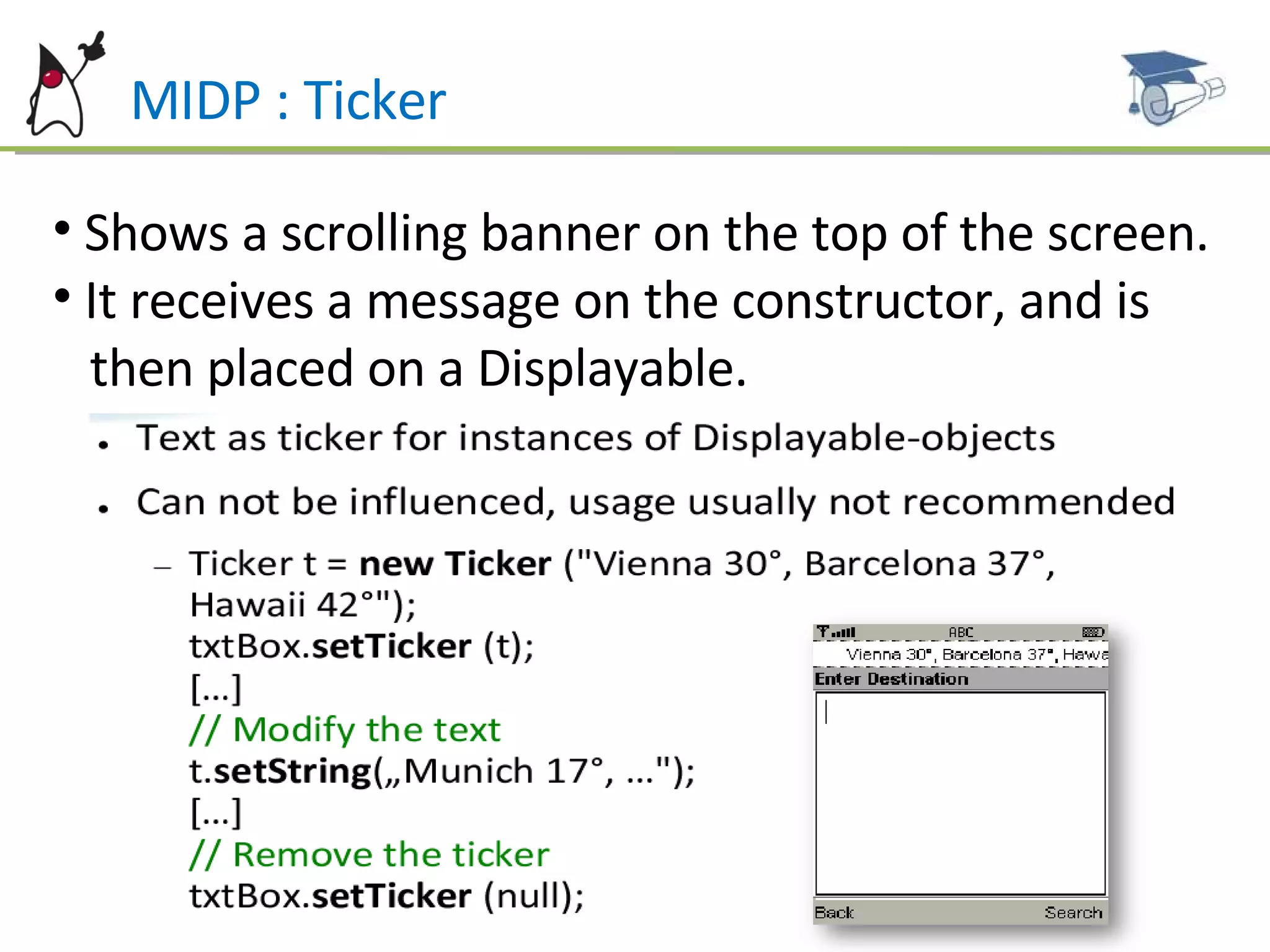
MIDP : Ticker Shows a scrolling banner on the top of the screen. It receives a message on the constructor, and is  then placed on a Displayable.
MIDP – User Interface : Classes
MIDP – High level  User Interface Based on Screen (Displayable sub class). As any Displayable, only one Screen is shown at time and it  fill the whole screen. The components “look-and-feel” is controlled  by the  device. Some very limited customizations are allowed.
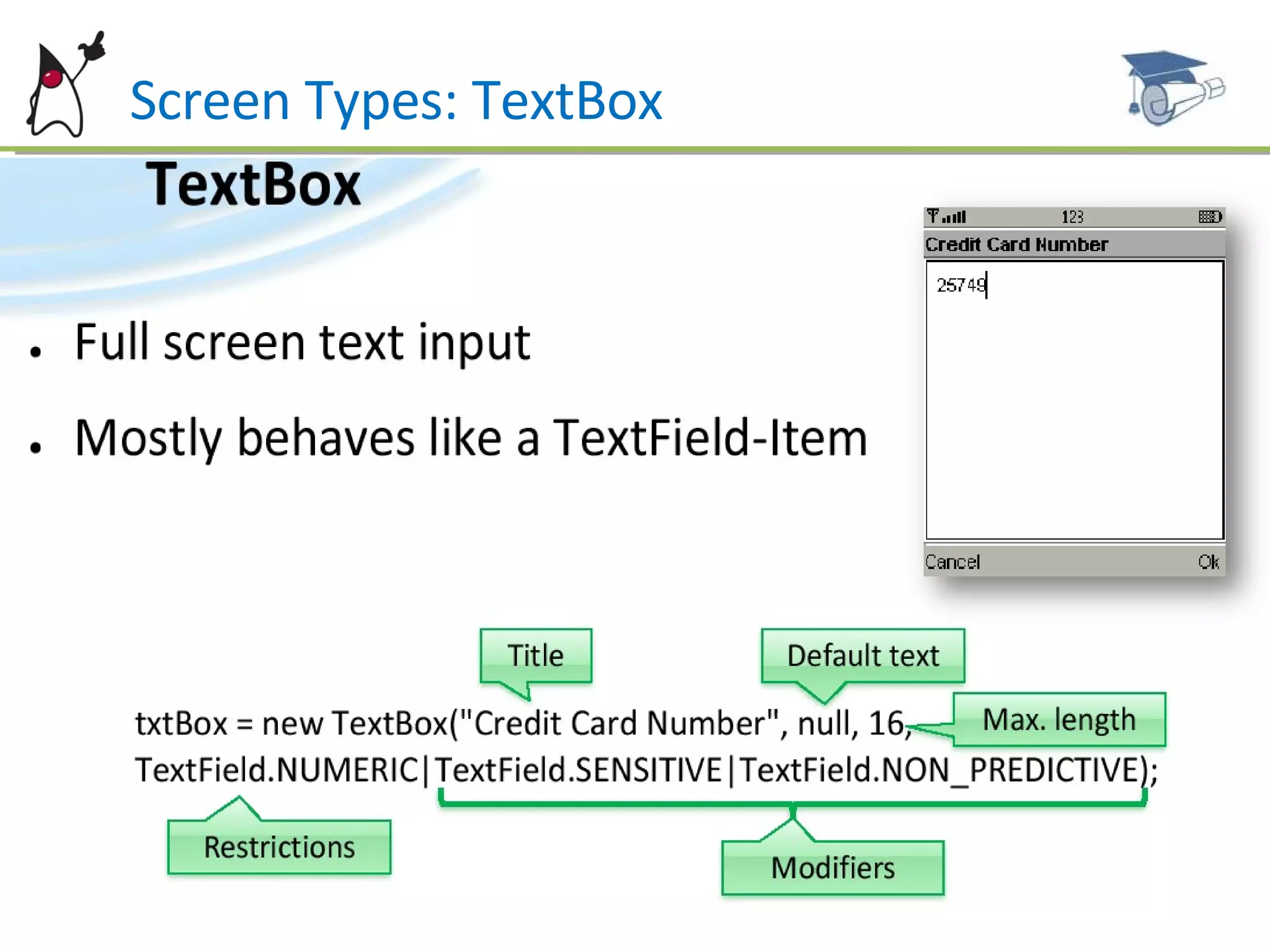
Screen Types: TextBox Shows a input screen. The Constructor is called with: Title and contents Maximum size (UI will prevent the user from entering more  characters than allowed. If the application tries to set a bigger  string an exception will be thrown). Constraints (from TextField class).
Screen Types: TextBox
Screen Types: TextBox All the input operations (like converting two presses on the 2 button to a ‘b’) is managed by the device and is not visible to the developer. Text is generated according to the constraints. Text is obtained by the  getString()  method and can be changed using  setString(String string), insert and delete.  The displayed value does not need to be equal to the returned value (some values may be formatted, e.g. 1234567--> 123-4567 for phone numbers and 1234.56 -->  1.234,56  for floating point numbers).
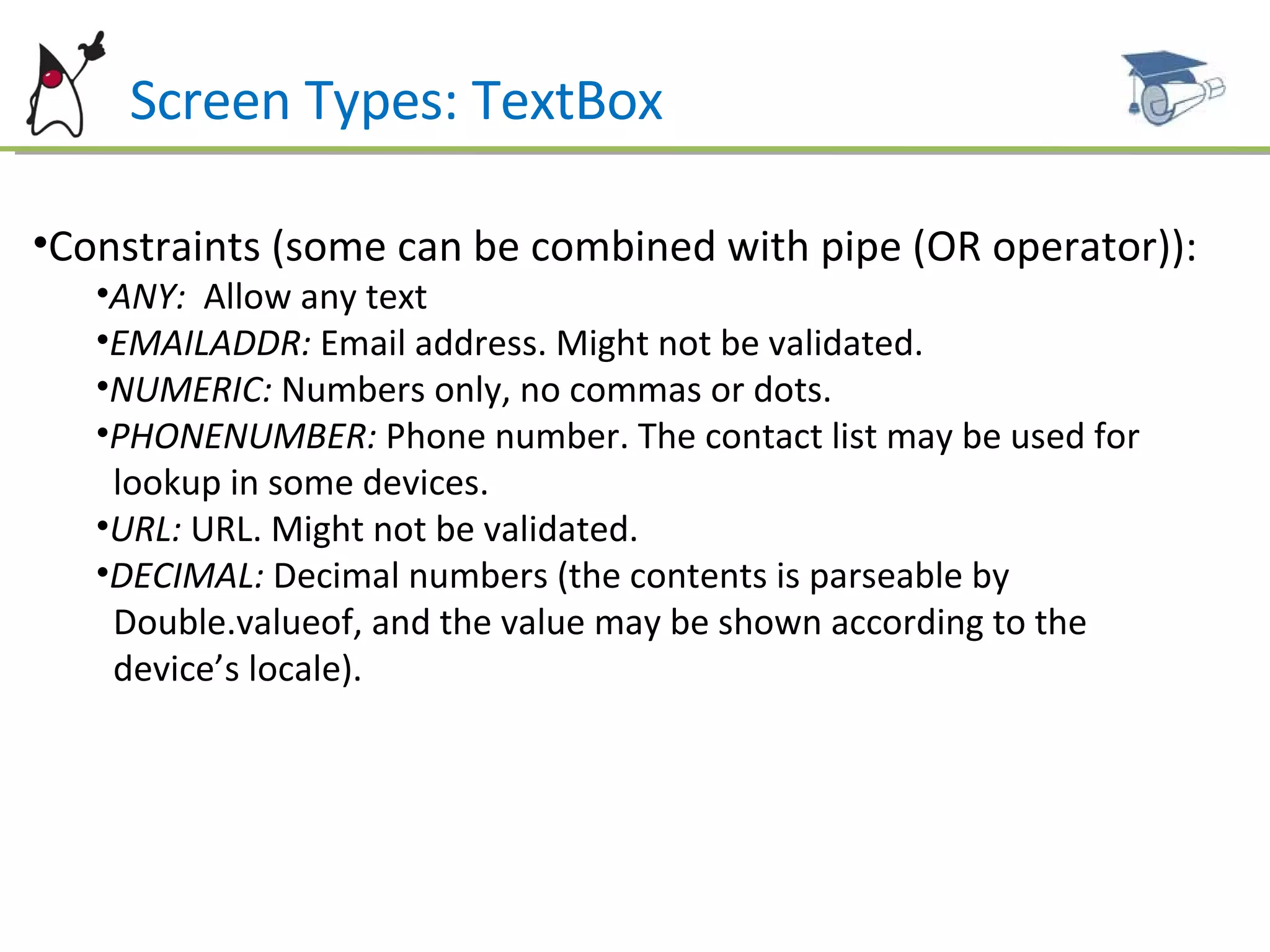
Screen Types: TextBox Constraints (some can be combined with pipe (OR operator)): ANY:  Allow any text EMAILADDR:  Email address. Might not be validated. NUMERIC:  Numbers only, no commas or dots. PHONENUMBER:  Phone number. The contact list may be used for  lookup in some devices. URL:  URL. Might not be validated. DECIMAL:  Decimal numbers (the contents is parseable by  Double.valueof, and the value may be shown according to the  device’s locale).
Screen Types: TextBox Constraints (continued): PASSWORD:  Shows a string of ‘*’ instead of typed characters.  UNEDITABLE:  Blocks the input. SENSITIVE:  Data cannot not be kept on any “history” on the  device (e.g. credit card). NON_PREDICTIVE:  Device shall not guess the input. INITIAL_CAPS_WORD:  Every word is capitalized (e.g. person  name). INITIAL_CAPS_SENTENCE:  Every sentence is capitalized.
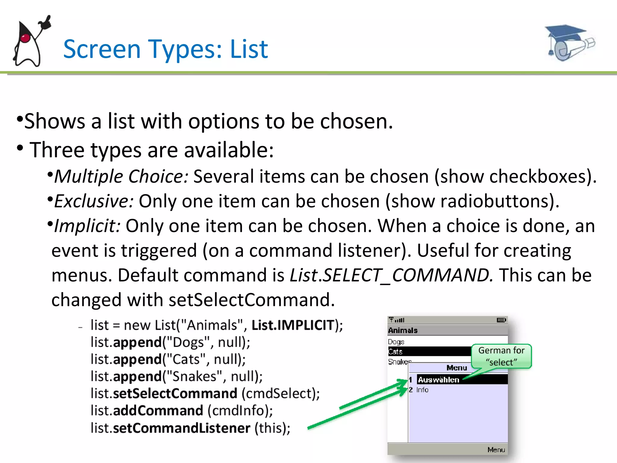
Screen Types: List Shows a list with options to be chosen. Three types are available: Multiple Choice:  Several items can be chosen (show checkboxes). Exclusive:  Only one item can be chosen (show radiobuttons). Implicit:  Only one item can be chosen. When a choice is done, an  event is triggered (on a command listener). Useful for creating  menus. Default command is  List . SELECT_COMMAND.  This can be  changed with setSelectCommand.
Screen Types: List Items are added/removed from the list with the following methods (icon may be null): insert(elementNum, stringPart, imagePart) set(elementNum,stringPart,imagePart) append(stringPart,imagePart) delete( elementNum) deleteAll() Except for the Implicit lists, it might not be possible to  notify the application when a item is selected. This  verification is usually performed when a command is  executed. You can change the font for a specific item with  setFont(elementNum, Font)
Screen Types: List When the item description is too wide, you may call setFitPolicy() with: TEXT_WRAP_DEFAULT TEXT_WRAP_ON  (break lines) TEXT_WRAP_OFF ( don’t break lines, labels may be truncated).
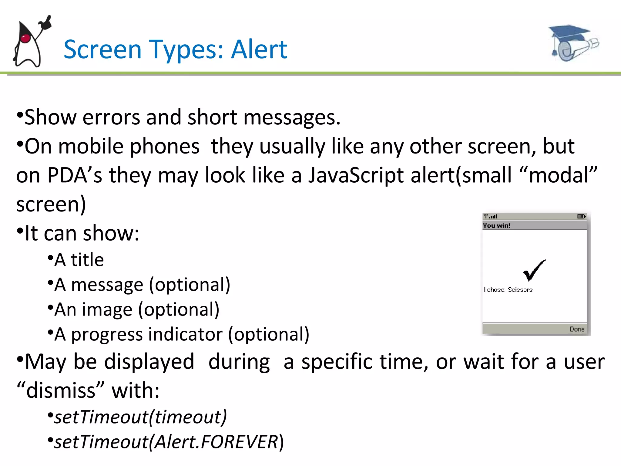
Screen Types: Alert Show errors and short messages. On mobile phones  they usually like any other screen, but  on PDA’s they may look like a JavaScript alert(small “modal”  screen) It can show: A title A message (optional) An image (optional) A progress indicator (optional) May be displayed  during  a specific time, or wait for a user “dismiss” with:  setTimeout(timeout)   setTimeout(Alert.FOREVER )
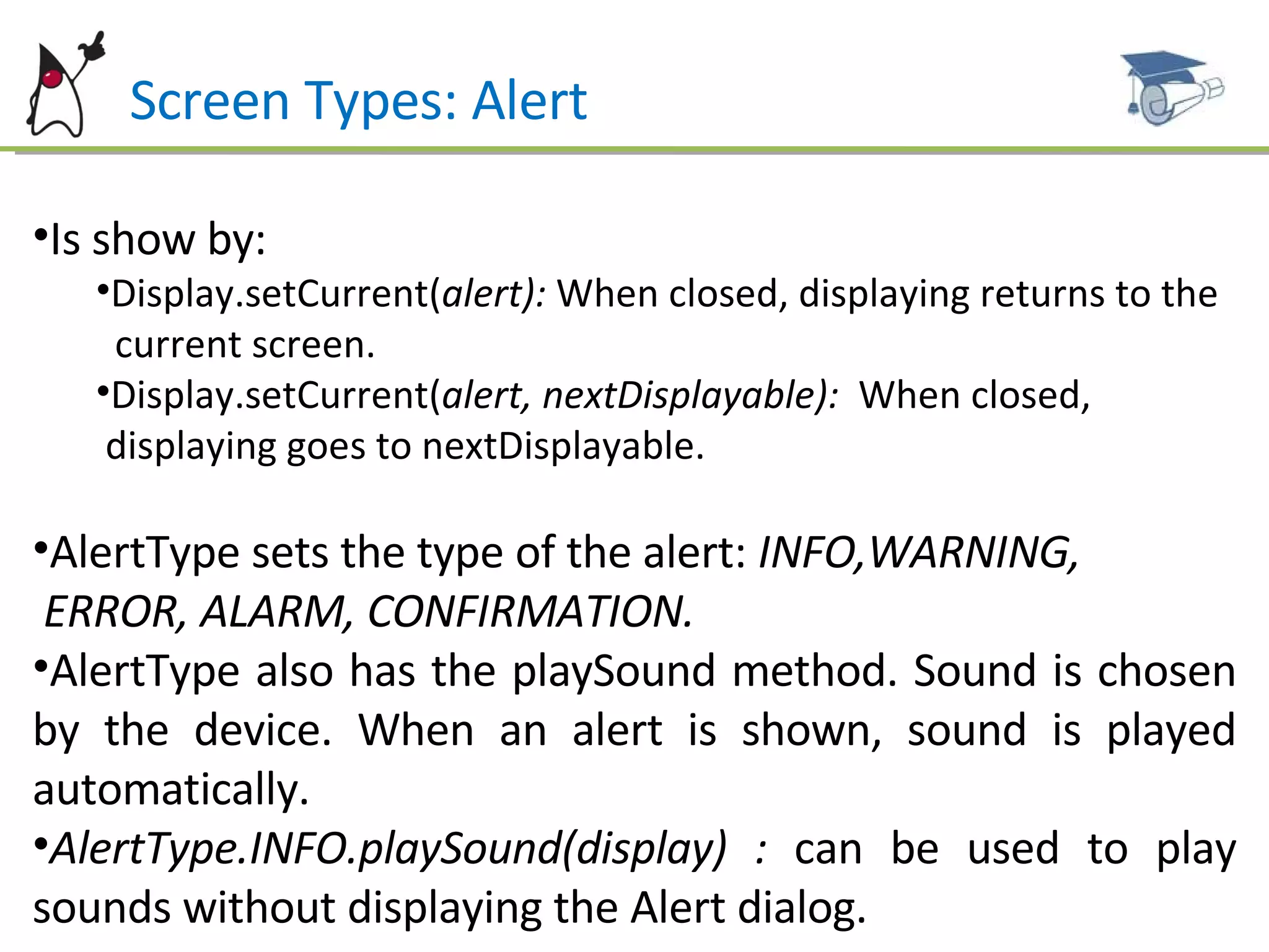
Screen Types: Alert Is show by: Display.setCurrent( alert):  When closed, displaying returns to the  current screen. Display.setCurrent( alert, nextDisplayable):  When closed,  displaying goes to nextDisplayable. AlertType sets the type of the alert:  INFO,WARNING,  ERROR, ALARM, CONFIRMATION. AlertType also has the playSound method.   Sound is chosen by the device. When an alert is shown, sound is played automatically. AlertType.INFO.playSound(display) :  can be used to play sounds without displaying the Alert dialog.
Screen Types: Alert May receive commands, for instance to creating “ Ok/Cancel”  screens: When alerts receive commands, they lose the “dismiss” command: The next screen to be displayed must be controlled by a new CommandListener. When two or more commands are added, the alert is automatically modal. A Gauge may be set as an indicator. This will be discussed on the next chapter.
Screen Types: Form Shows a screen with several components: Labels Text fields Date fields “ Gauge” (e.g. Volume Control) Radio buttons and checkboxes Images It will be discussed on the next chapter.
Screen Types: Form
Example Codes Some examples and MIDlets samples are available for reference and studying  at this link: http://www.dsc.upe.br/~mpc/chapter4.rar The source codes include: AlertMIDlet TextBoxMIDlet ListMIDlet TickerMIDlet DisplayableMIDlet
Future Work Next Chapter: MIDP –User interface - Form Form Item Types Classes Other topics about High level UI
References ALVES F. Eduardo. SCMAD Study Guide,  27/04/2008.  JAKL Andreas, Java Platform, Micro Edition Part  01 slides, 12/2007. Sun Certification Mobile Application Developer  Website:  [http://www.sun.com/training/certification/java/scmad.xml].

Scmad Chapter04

  • 1.
    By Marcel Caraciolohttp://mobideia.blogspot.com Chapter 04 – MIDP: User Interface SCMAD Certification 45mm 61mm
  • 2.
    Agenda MIDP Userinterface API’s API’s: High level, low level, game Displayable Command CommandListener Ticker Classes TextBox List Alert Form
  • 3.
    MIDP : UserInterface API’s AWT is too resource-consuming and complex to fit inside MIDP, so it defines its own user interface API: LCDUI (Limited Connected Device UI) Packages: javax.microedition.lcdui: Low and High-Level API javax.microedition.game: Game API Every MIDlet has a Display linked to it: Found by calling Display.getMIDlet(midlet) This Display instance will be valid through all the MIDlet life, so it may be kept as instance attribute in the MIDlet Every “full screen window” extends Displayable
  • 4.
    MIDP : UserInterface API’s Display has one Displayable set to it (current). Navigation” between screens is done changing the current Displayable. All UI operations are thread-safe. No synchronization or specific thread needs to be used by the developer to update the UI. Display methods: isColor: if the device support colours numColors: Number of colours or gray tones supported flashBacklight(milliseconds): Flashes the device’s “backlight” vibrate(milliseconds): Vibrates the device getColor( colorSpecifier): Returns the colour of an UI component (e.g. background color, border color, etc.)
  • 5.
    MIDP : DisplayableEvery Displayable (either low level or high level) may have: Zero or more commands associated (user operations that will be executed on a screen). A single commandListener to execute operations from commands on a screen A title A Ticker (Scrolling text)
  • 6.
    MIDP : CommandCommands are operations to be executed on a screen, usually linked to a soft key on the phone. Every command has a type and a priority. These attributes define where the command will be placed. For instance, “Back”, “Cancel” or “Exit” buttons are placed on the right button. Priority defines how easy it is to call the operation. This is only a hint to the system, since the real position is defined by the device. Commands also have a label and a short label. Again, which label will be used is up to the device. Command type, priority and label are all set on the constructor.
  • 7.
    MIDP : CommandCommand types: SCREEN: Concerns all the fields on the screen (e.g. save, submit). BACK: On navigation screens, go to the previous CANCEL : Cancels the operation OK: Confirms the operation HELP : Help STOP : Cancels a running operation EXIT : Exits the application ITEM : Concerns only the currently selected item, not all the items on the screen. This command is only shown when the item is selected.
  • 8.
  • 9.
    MIDP : CommandListenerExecutes a command operation A displayable may have several commands, but will have a single CommandListener. Defines only one method: commandAction(command, displayable). Execution must return immediately. If a time-consuming operation will be executed by the command (like a network call) then the execution shall be done on a separated thread.
  • 10.
    MIDP : TickerShows a scrolling banner on the top of the screen. It receives a message on the constructor, and is then placed on a Displayable.
  • 11.
    MIDP – UserInterface : Classes
  • 12.
    MIDP – Highlevel User Interface Based on Screen (Displayable sub class). As any Displayable, only one Screen is shown at time and it fill the whole screen. The components “look-and-feel” is controlled by the device. Some very limited customizations are allowed.
  • 13.
    Screen Types: TextBoxShows a input screen. The Constructor is called with: Title and contents Maximum size (UI will prevent the user from entering more characters than allowed. If the application tries to set a bigger string an exception will be thrown). Constraints (from TextField class).
  • 14.
  • 15.
    Screen Types: TextBoxAll the input operations (like converting two presses on the 2 button to a ‘b’) is managed by the device and is not visible to the developer. Text is generated according to the constraints. Text is obtained by the getString() method and can be changed using setString(String string), insert and delete. The displayed value does not need to be equal to the returned value (some values may be formatted, e.g. 1234567--> 123-4567 for phone numbers and 1234.56 --> 1.234,56 for floating point numbers).
  • 16.
    Screen Types: TextBoxConstraints (some can be combined with pipe (OR operator)): ANY: Allow any text EMAILADDR: Email address. Might not be validated. NUMERIC: Numbers only, no commas or dots. PHONENUMBER: Phone number. The contact list may be used for lookup in some devices. URL: URL. Might not be validated. DECIMAL: Decimal numbers (the contents is parseable by Double.valueof, and the value may be shown according to the device’s locale).
  • 17.
    Screen Types: TextBoxConstraints (continued): PASSWORD: Shows a string of ‘*’ instead of typed characters. UNEDITABLE: Blocks the input. SENSITIVE: Data cannot not be kept on any “history” on the device (e.g. credit card). NON_PREDICTIVE: Device shall not guess the input. INITIAL_CAPS_WORD: Every word is capitalized (e.g. person name). INITIAL_CAPS_SENTENCE: Every sentence is capitalized.
  • 18.
    Screen Types: ListShows a list with options to be chosen. Three types are available: Multiple Choice: Several items can be chosen (show checkboxes). Exclusive: Only one item can be chosen (show radiobuttons). Implicit: Only one item can be chosen. When a choice is done, an event is triggered (on a command listener). Useful for creating menus. Default command is List . SELECT_COMMAND. This can be changed with setSelectCommand.
  • 19.
    Screen Types: ListItems are added/removed from the list with the following methods (icon may be null): insert(elementNum, stringPart, imagePart) set(elementNum,stringPart,imagePart) append(stringPart,imagePart) delete( elementNum) deleteAll() Except for the Implicit lists, it might not be possible to notify the application when a item is selected. This verification is usually performed when a command is executed. You can change the font for a specific item with setFont(elementNum, Font)
  • 20.
    Screen Types: ListWhen the item description is too wide, you may call setFitPolicy() with: TEXT_WRAP_DEFAULT TEXT_WRAP_ON (break lines) TEXT_WRAP_OFF ( don’t break lines, labels may be truncated).
  • 21.
    Screen Types: AlertShow errors and short messages. On mobile phones they usually like any other screen, but on PDA’s they may look like a JavaScript alert(small “modal” screen) It can show: A title A message (optional) An image (optional) A progress indicator (optional) May be displayed during a specific time, or wait for a user “dismiss” with: setTimeout(timeout) setTimeout(Alert.FOREVER )
  • 22.
    Screen Types: AlertIs show by: Display.setCurrent( alert): When closed, displaying returns to the current screen. Display.setCurrent( alert, nextDisplayable): When closed, displaying goes to nextDisplayable. AlertType sets the type of the alert: INFO,WARNING, ERROR, ALARM, CONFIRMATION. AlertType also has the playSound method. Sound is chosen by the device. When an alert is shown, sound is played automatically. AlertType.INFO.playSound(display) : can be used to play sounds without displaying the Alert dialog.
  • 23.
    Screen Types: AlertMay receive commands, for instance to creating “ Ok/Cancel” screens: When alerts receive commands, they lose the “dismiss” command: The next screen to be displayed must be controlled by a new CommandListener. When two or more commands are added, the alert is automatically modal. A Gauge may be set as an indicator. This will be discussed on the next chapter.
  • 24.
    Screen Types: FormShows a screen with several components: Labels Text fields Date fields “ Gauge” (e.g. Volume Control) Radio buttons and checkboxes Images It will be discussed on the next chapter.
  • 25.
  • 26.
    Example Codes Someexamples and MIDlets samples are available for reference and studying at this link: http://www.dsc.upe.br/~mpc/chapter4.rar The source codes include: AlertMIDlet TextBoxMIDlet ListMIDlet TickerMIDlet DisplayableMIDlet
  • 27.
    Future Work NextChapter: MIDP –User interface - Form Form Item Types Classes Other topics about High level UI
  • 28.
    References ALVES F.Eduardo. SCMAD Study Guide, 27/04/2008. JAKL Andreas, Java Platform, Micro Edition Part 01 slides, 12/2007. Sun Certification Mobile Application Developer Website: [http://www.sun.com/training/certification/java/scmad.xml].