1. Masthead/pull quote
Main image
This pull quote has been
made to look like it has been
taken out from a Newspaper.
The oversized bold writing
makes this quote stand out
the most from the article. It
gives the magazine a
rock/indie vibe; the quotes
font is all different sizes. This
also gives us a brief idea of
what is involved in the text.
The style of the text is very
arty and authentic. This pull
quotes looks edge and messy
like it has been done by hand.
This gives the article a
effortless feel.
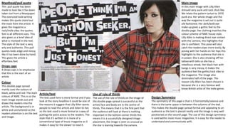
In this main image with Lilly Allen
dressed very punk and rock chick like.
We relate the pattern tartan to 1970
punk era. Her whole image and the
way the magazine is set out is quite
old fashioned. Her dark/bold eye
make-up gives a gothic feel to the
double page. Her clothing matches the
colour scheme of NME house style.
Lilly Allen is making direct eye contact
with the camera, this highlights that
she is confident. This pose will also
catch the readers eyes more easily. By
posing with her hands on her hips this
highlights to the audience that she is
in power. She is also showing off her
tattoo with tells us she has a
rebellious streak. Her black hair with
bangs is very messy, it makes the
audience feel the gothic/rock vibe to
the magazine. The image also
dominates half of the page. The
reason Lilly Allen has been chosen is
because she is a very famous well
know British artist of the Indie genre.
Drops caps
A drops caps is to emphasize
that this is the start of an
article
Colour
This double page spread
mainly uses the colours of
black, white and red. The main
colours of NME. This is so the
main image stands out and
draws the readers into the
article. The background is in
white and uncluttered so the
readers attention is on the text
and image.
Article/text
Use of rule of thirds
The text used here is more formal and if you
look at the story headline it could be one of
the reasons it suggest that Lilly Allen wants
people to read this article and listen to her,
so the text used is more formal as a way of
putting the point across to the readers. The
style that it’s written in is more of a
conventional type of music magazine as it
makes it easy for the viewer to read it.
The use of the rule of thirds on the image of
the double page spread is successful as the
artists face and body are in the centre of
thirds. This means that it is the first part that
the audience will look at there is nothing
important in the bottom corner thirds this
means it is a successfully designed image
placement, the image is seen as unusual as
the star is leaning towards the camera.
Design Symmetry
The symmetry of this page is that is it horizontally balance and
there is the same space in-between the columns of the text.
This makes the double page spread formal and appealing to an
audience as the text is placed neatly and the image is very well
positioned on the second page. The use of this design symmetry
is used within most music magazines; it is easy for the reader to
understand and communicate with.
2. Main image
The main image displays a
really fun and quirky side
of Rhianna. The dress she
is wearing is very revealing
and sexy; this help
reinforce the sexualisation
in this particular image.
The luxurious red colour of
her hair really brings on
the sex appeal. However
red connotes courage,
passion, beauty and love.
The denotations are power
and fierce. She is posing
extremely playfully the
colour white emphasis this
sense of purity. The smaller
image of Rhianna and Nicki
Minaj shows a very
immature side to them are
they are both posing very
silly. It also can been seen
as being slightly seductive
Typeface
as Niki has a lot of her
The typeface used reinforces that
cleavage on display. The
this is a typical article/interview that
caption ‘good girls gone you would usually see in a pop genre
bad’ really suits the image magazine. The font used also runs
as they use to be sweet throughout the magazine carries on
and innocent now they’re this brands identity of it being aimed
at young girls who inspire to be like
seductive, powerful
Rhianna
celebrities.
Colours
The colours of baby pink
and blue reinforce the
target audience for this
magazine at young
female girls that could
either be girl . The blue
and white together give a
cloud effect. White also
gives us the feeling of
purity and that Rihanna is
very elegant and a pure
character. She could also
be looked up by her fans
as being an ‘angel’ all
dressed in white with
silver sparkles. The use of
the colour blue suggests
this is a tom boyish
character that is a bit
rugged around the edges
but this soft baby blue
suggest this gentle side
to Rihanna’s personality.
The body
The pink displays the
The body copy is in a typical article form, in columns. Nothing has been done
feminine side to the
differently; this is a mainstream artist. It constantly consists of a normal plain
Arial font but some of the words and phrases are highlighted pink and in a blue magazine and helps this
text. There is a interview between the article. Between WE LOVE POP MAGAZINE magazine have more of a
and Rhianna. The writing as been spaced out with a look of room in-between so wide audience.
there actually isn’t much text. This has been done; the target audience are young
girls who wouldn’t be wanting to read a 1000 worded article on there artist.
3.
4. A sans serif font is used in the title with the addition of making it bold in order for it to stand out from the rest of the magazine. It is the same type of font and style as
other articles in NME showing consistency within the magazine. The fact that it is made to stand out shows that the article is about them and connotes that it is a big
and important band. The purpose of a headline is to outline what the article is going to be about, as used here as it is showing that the article is going to be about the
band.
In the Kerrang article a sans serif font is used again in the title. Unlike the NME magazine which uses a plain font with a colour that stands out from the background
(following the rule of less is more) to draw attention, Kerrang used red and white writing to draw attention to the title with the addition of it being bigger than the
rest of the writing. “The Best MCR” is the biggest writing of the title a sans serif font is used in the title with a white font which stands out more than the red which
immediately draws our eyes to it. Also like NME it uses the same type of font and style as the other articles which are comforting to the reader as it shows consistency
and makes the magazine easier to follow. The use of an abbreviation (“MCR”) connotes that it is a well known band as the audience wouldn’t understand the
abbreviation if they weren’t. The title is important as it highlights what the article is going to be about, as shown here the article is about how MCR are improving
them.
The purpose of a stand first/slug/subheading is to draw you in to read the article. The stand first in this article has used the same font as the rest of the article but in a
bigger size in order to make it stand out to the reader, it is also placed at the top of the article above the beginning of it in order to, again, bring attention as the
attention will be brought to the beginning of the article. The words used in the stand first are important as one that was plain and boring wouldn’t make someone
want to read the article. For example, strong words are used like “hate” and “shot” to make it more enticing. They also use phrases like “nothing will stop” to bring
attention to the reader as it connotes that the band is going further and further in their success.
The purpose of a stand first/slug/subheading is to draw you in to read the article. Where the stand first in the NME article has used the same font as the rest of the
article but in a bigger size in order to make it stand out to the reader and also placed it above the article away from the title, Kerrang have chose it to also be placed
above the article but below the title, this brings attention as we are drawn to the medium between the two and the use of the bold writing of “my chemical romance”
draws attention also. bring attention as the attention will be brought to the beginning of the article. The words used in the stand first are important as one that was
plain and boring wouldn’t make someone want to read the article. For example, in NME they used words such as “shot” whereas in Kerrang words like “invite” and
“their” are used which makes it sound like a privilege for Kerrang to be there.
A drop cap is where the beginning letter of a sentence is made bigger than the rest of the words. Here, the drop cap is used exactly like that with a highlighted
background in order to make the article look more significant on the page. The way that the drop capital is highlighted brings our eye towards it, enticing us to read
the article.
A drop cap is where the beginning letter of a sentence is made bigger than the rest of the words. Like NME, the drop cap in Kerrang is used exactly like that although
whereas NME use a highlighted background in order to make the article look more significant on the page, Kerrang uses just a red bold M which shows consistency
with the house theme and isn’t too distracting from the article while still drawing attention.
5. The reason behind columns and grid systems is to make the page easier to read and more organised rather than having it all laid out without any order. They are
encouraged to read the article as it looks easy to read and each text used in the article is left aligned which shows a house system which is used continually in the
article. It's easy to follow the article as only one pull quote is used which doesn't distract too much attention from the article yet it adds attention to the article in
general.
The reason behind columns and grid systems is to make the page easier to read and more organised rather than having it all laid out without any order. Like the NME
article the text is left aligned which is comforting to the eye. The article is in two columns and is smaller in comparison to the rest of the text. The third column on the
right hand page is music the band has done which is more information about the band so the reader can find out more about them.
Pull quotes show a quote used in the article but with the font size bigger to make it stand out. It’s a typical convention used in magazines, if the reader reads the pull
quote first and the quote interests them they are more likely to read the article so the text used has to be picked cautiously so that it looks interesting, for example
words like “shot” are used to gain attention, with the following “it’s no big thing for me” which makes the reader think „why is it no big thing‟ and will make them
want to read it. The pull quote in this magazine has been strategically placed in order to break up the article and make it easier for the audience to read.
Pull quotes show a quote used in the article but with the font size bigger to make it stand out. It’s a typical convention used in magazines, although unlike NME,
Kerrang have used a more clever way of introducing the pull quote as the quote is both a pull quote and the title. If the reader reads the pull quote/title then they will
gain more information about the article and will come to a decision of whether or not they read it so the text used has to be picked cautiously so that it looks
interesting, for example words like “best” are used to gain attention, and different words are of different sizes which draws your eye to it. The pull quote in this
magazine has been strategically placed in order to not make the article look too full.
A caption has been used in NME to give credit to the photographer and explain who was in the image which adds anchorage as it gives meaning to the image. They
are important so that the audience know that the images are relevant to the magazine.
Whereas NME uses one photo and one caption, Kerrang uses four photos with four captions. The captions add anchorage to the images as they show what they
mean and who is in the image. They are important so that the audience know that the images are relevant to the magazine.
NME uses one image in their article in order to draw attention. The image is in full colour and the image in articles usually display the band and who is in the band or
who will feature in the interview as done here. Music magazines usually make the main image take up a whole page which is what has been done here.