
Recommended
More Related Content
What's hot
What's hot (17)
Viewers also liked
Similar to Final print screen
Similar to Final print screen (20)
More from kodjoe
Recently uploaded
Recently uploaded (20)
Final print screen
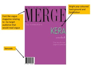
- 1. Bright pop coloured back ground and font colour Font like vogue magazine relating to my target audience that would read vogue barcode
- 2. I edited the photo by adjusting the lighting in the image and emphasising slightly the pink eye shadow on the main image
- 3. The alliteration of I changed the colour of the puff helps the the mast head to a dark attraction and red to match the rock appeal of the music genre and remove the magazine- a friendly connotations of a fashion tone magazine created with the font chosen The black, dark blue and champagne cream colour of the font has been consistent throughout the entire magazine price
- 5. The big k in the background showing continuity within each page and brand recognition Champagne coloured background- more sophisticated background Photo- connoting sophistication and elegance with a bit of sass- great for the pop genre
- 6. Red line between Layout in three the black lines- columns- clean continuity of colour structured along with the ‘contents’ font colour and the numbering of the features
- 7. Faint ‘Kera’ in the background- brand Photos edited identity and and made almost continuity black and white but a more sepia toned variation- the photos breakup the coloured images of the additional artists Additional image of artist VIP back staged Artist index that pass as a free shows some of the give away with a artists featured in rock look to it the magazine adhering to the pop-rock genre
- 8. Artists name written faded in the background Changed the colour of the shoes and pillow to adhere to the pop music genre (bright colours) Champagne background Polaroid photos of artist
- 9. Pull quote, that is depicted by the Polaroid photos of artists with different facial expressions Interview questions from artist and interviewer Faded written text in the background so readers attempt to read it and are drawn in to the interview.
- 10. Changed layout of writing so it fits the equally between the double page as is in line and so the writing forms around the photo of the artist Changed colour of interview Pull quote from interview, in keeping questions to suit rock genre and with the theme of the double page create continuity. spread
- 11. I made the font size of my beginning paragraph bigger to fill the space of the page, improving the overall layout. I changed the layout of the text so that its is three columns, creating a neat and sophisticated effect that my magazine adheres to.