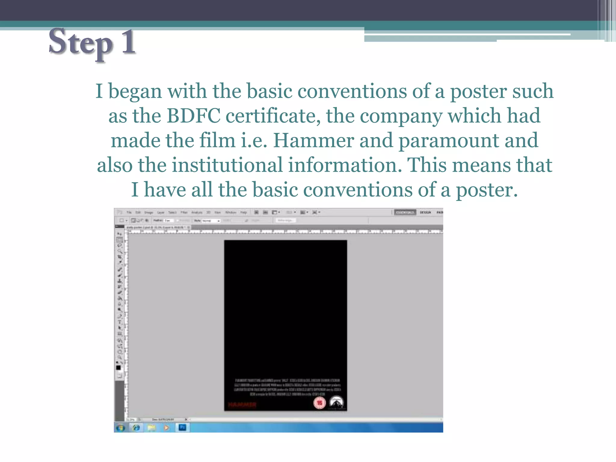
I began with the basic conventions of a poster such
  as the BDFC certificate, the company which had
  made the film i.e. Hammer and paramount and
also the institutional information. This means that
     I have all the basic conventions of a poster.
•I then began experimenting
with three different photos to
 see which one I thought was
        more effective.
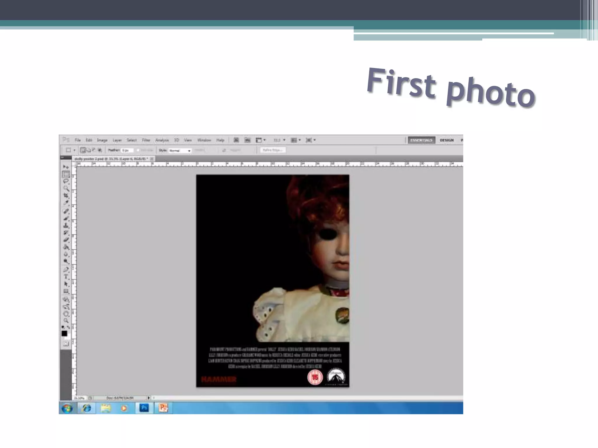
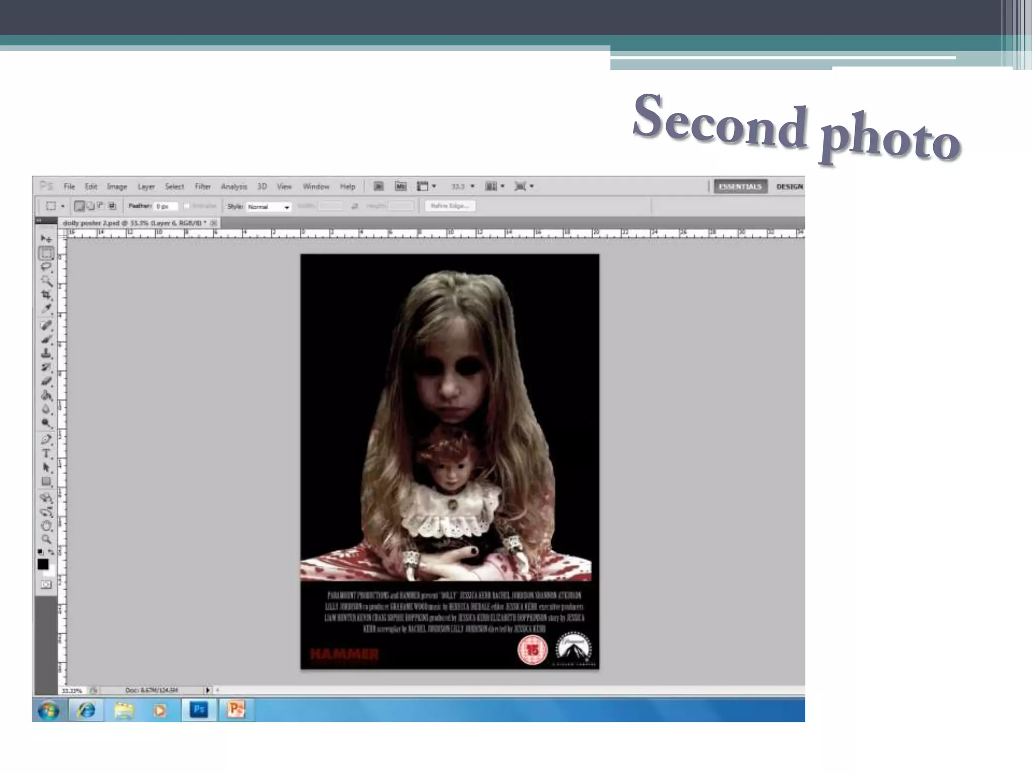
• I uses the brush tool to blacken out the dolls eyes
    which I believe makes the doll look evil. I then
     contrasted the colours to make the dolls hair
   stand out more vibrant and red, which can also
    be a convention of danger. I believe that only
  showing half of the dolls face shows conventions
           that the doll is hiding something.
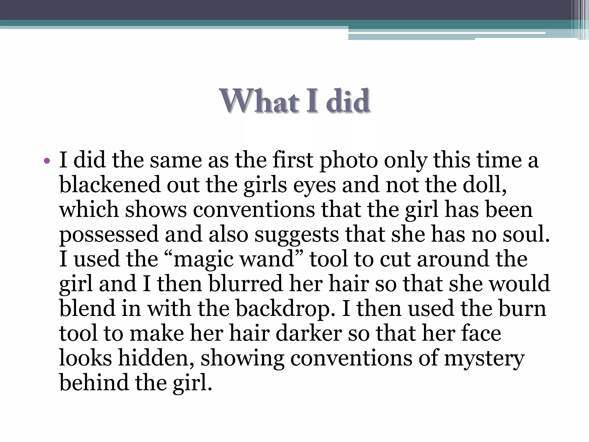
• I did the same as the first photo only this time a
  blackened out the girls eyes and not the doll,
  which shows conventions that the girl has been
  possessed and also suggests that she has no soul.
  I used the “magic wand” tool to cut around the
  girl and I then blurred her hair so that she would
  blend in with the backdrop. I then used the burn
  tool to make her hair darker so that her face
  looks hidden, showing conventions of mystery
  behind the girl.
What I did
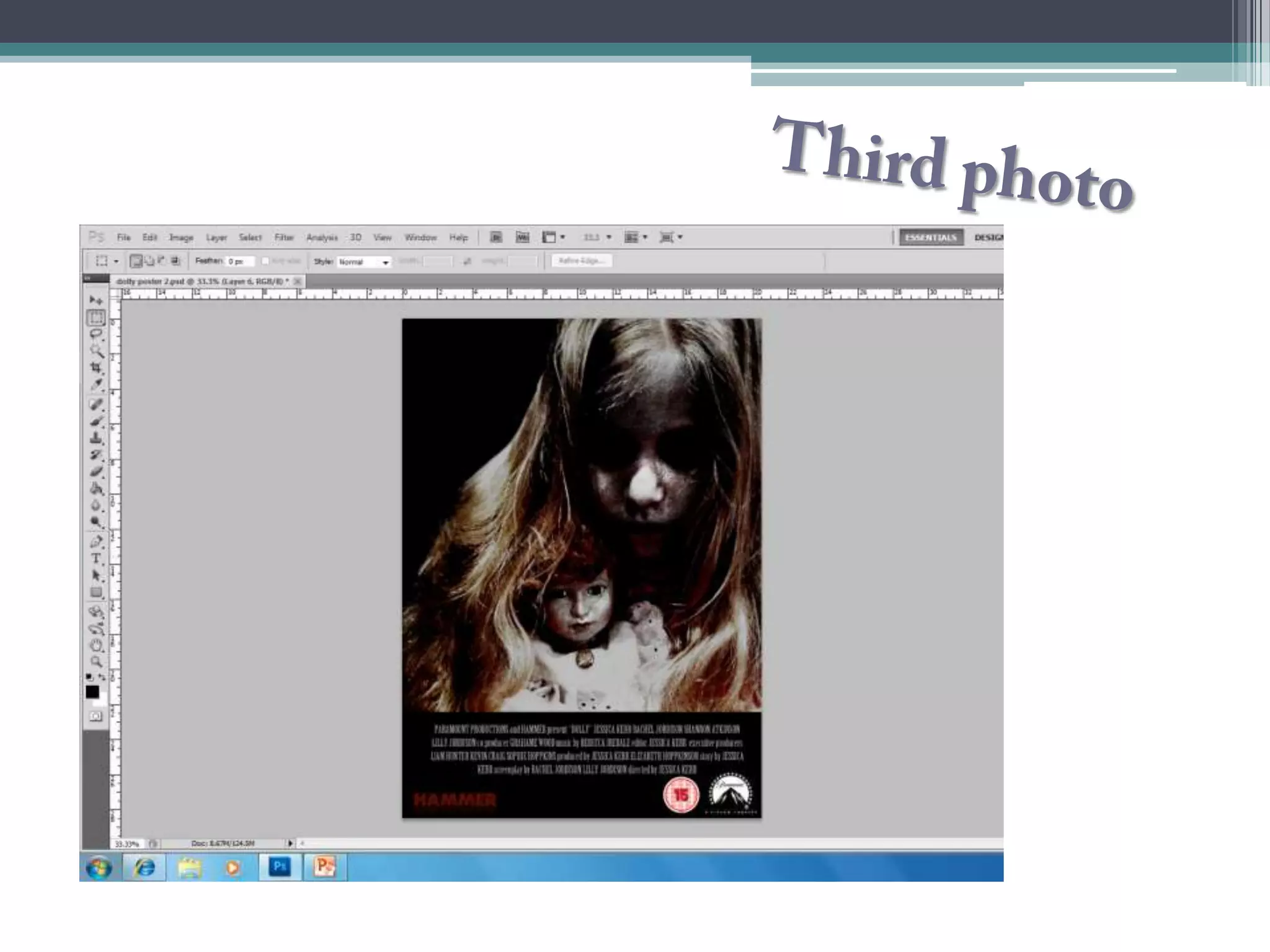
• I used the magic wand tool to cut around the
  girl, then using the blur tool I blurred the
  outside of her image to blend in with the
  background. I used the burn tool to make her
  hair stand out brightly against her face which I
  then saturated to show conventions of
  lifelessness as her face has no colour. I darkened
  her eyes out again but kept the eyes of the doll,
  to suggest that the doll is “normal” but the girl is
  not.
Final photo
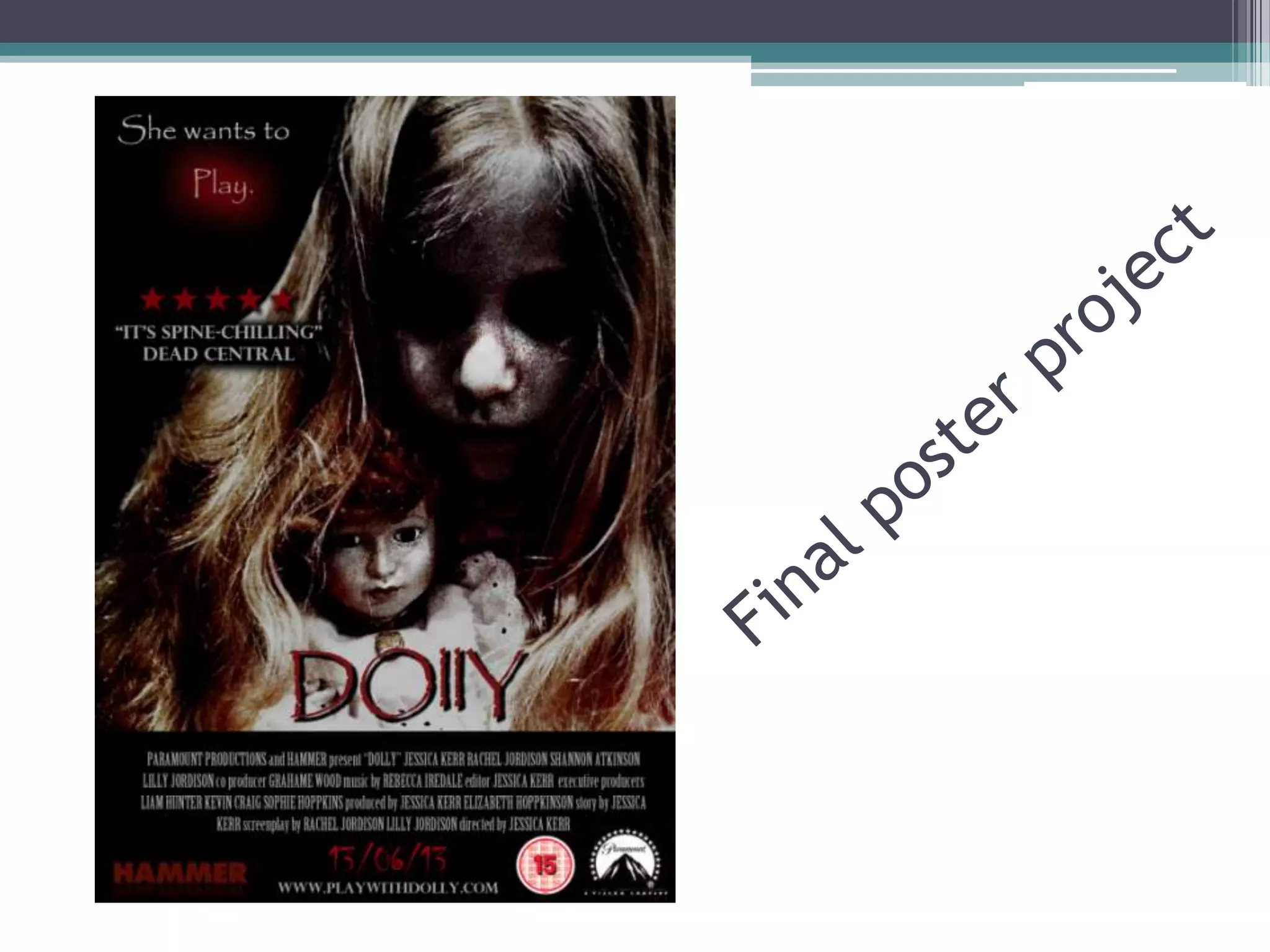
  • I decided to go with photo three because it
 appeared more frightening than the others and
also it covered the entire poster, making it stand
 out. I also liked the idea of draining the colour
    out of the girls face to show conventions of
                        death.
I thought the tagline
Tagline    “she wants to play”
          was effective because
           you don’t know who
           the poster is talking
          about; the doll or the
              girl. I used a dot
           effect behind “play”
               in red to show
          conventions of blood,
             denoting that the
             term “play” has a
           sinister atmosphere
                   about it.
• I have used “Dead central” for my
Critic review     critic review as they are known for
                     their reviews on various horror
                  movies. I used the phrase “its spine
                    chilling” because the language is
                 effective in the colour grey because it
                     has conventions of lifelessness,
                          isolation and mystery.
Date release and website
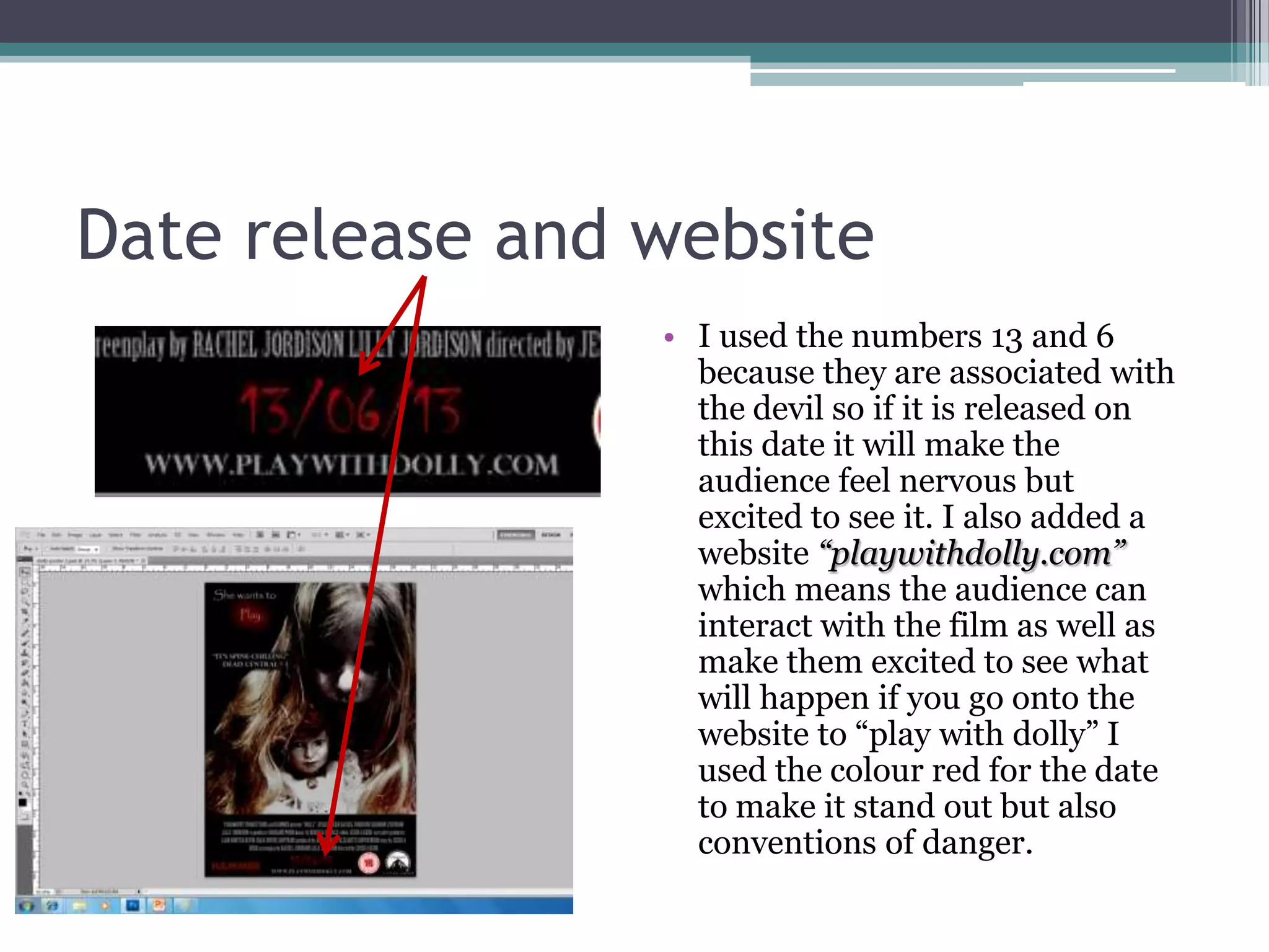
                 • I used the numbers 13 and 6
                   because they are associated with
                   the devil so if it is released on
                   this date it will make the
                   audience feel nervous but
                   excited to see it. I also added a
                   website “playwithdolly.com”
                   which means the audience can
                   interact with the film as well as
                   make them excited to see what
                   will happen if you go onto the
                   website to “play with dolly” I
                   used the colour red for the date
                   to make it stand out but also
                   conventions of danger.
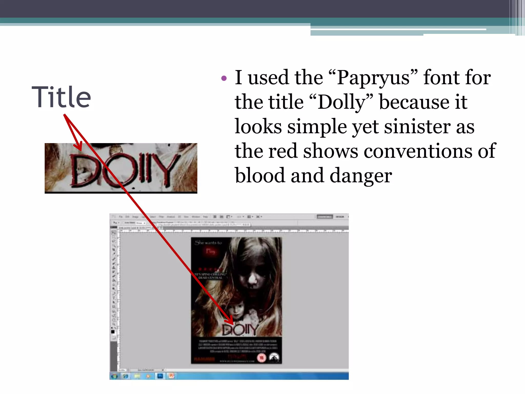
• I used the “Papryus” font for
Title     the title “Dolly” because it
          looks simple yet sinister as
          the red shows conventions of
          blood and danger
Making my poster

Making my poster

  • 2.
    I began withthe basic conventions of a poster such as the BDFC certificate, the company which had made the film i.e. Hammer and paramount and also the institutional information. This means that I have all the basic conventions of a poster.
  • 3.
    •I then beganexperimenting with three different photos to see which one I thought was more effective.
  • 5.
    • I usesthe brush tool to blacken out the dolls eyes which I believe makes the doll look evil. I then contrasted the colours to make the dolls hair stand out more vibrant and red, which can also be a convention of danger. I believe that only showing half of the dolls face shows conventions that the doll is hiding something.
  • 7.
    • I didthe same as the first photo only this time a blackened out the girls eyes and not the doll, which shows conventions that the girl has been possessed and also suggests that she has no soul. I used the “magic wand” tool to cut around the girl and I then blurred her hair so that she would blend in with the backdrop. I then used the burn tool to make her hair darker so that her face looks hidden, showing conventions of mystery behind the girl.
  • 9.
    What I did •I used the magic wand tool to cut around the girl, then using the blur tool I blurred the outside of her image to blend in with the background. I used the burn tool to make her hair stand out brightly against her face which I then saturated to show conventions of lifelessness as her face has no colour. I darkened her eyes out again but kept the eyes of the doll, to suggest that the doll is “normal” but the girl is not.
  • 10.
    Final photo • I decided to go with photo three because it appeared more frightening than the others and also it covered the entire poster, making it stand out. I also liked the idea of draining the colour out of the girls face to show conventions of death.
  • 11.
    I thought thetagline Tagline “she wants to play” was effective because you don’t know who the poster is talking about; the doll or the girl. I used a dot effect behind “play” in red to show conventions of blood, denoting that the term “play” has a sinister atmosphere about it.
  • 12.
    • I haveused “Dead central” for my Critic review critic review as they are known for their reviews on various horror movies. I used the phrase “its spine chilling” because the language is effective in the colour grey because it has conventions of lifelessness, isolation and mystery.
  • 13.
    Date release andwebsite • I used the numbers 13 and 6 because they are associated with the devil so if it is released on this date it will make the audience feel nervous but excited to see it. I also added a website “playwithdolly.com” which means the audience can interact with the film as well as make them excited to see what will happen if you go onto the website to “play with dolly” I used the colour red for the date to make it stand out but also conventions of danger.
  • 14.
    • I usedthe “Papryus” font for Title the title “Dolly” because it looks simple yet sinister as the red shows conventions of blood and danger