1. Packaging design idea 1
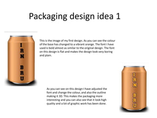
This is the image of my first design. As you can see the colour
of the base has changed to a vibrant orange. The font I have
used is bold almost as similar to the original design. The font
on this design is flat and makes the design look very boring
and plain.
As you can see on this design I have adjusted the
font and change the colour, and also the outline
making it 3D. This makes the packaging more
interesting and you can also see that it look high
quality and a lot of graphic work has been done.
2. Here I have added a few extra works on my packaging. I have made the “32” bold
and also a lighter blue making it stand out from the blue shape in the background.
This makes the text more eye catching at it draws attention to the product name
and it’s the first thing you will notice.
However this might be changed as production goes on as I will try different
designs to see what will work best with the can to make it more professional.
I have developed the design once again and I have decided that I will not be using the
blue shape as the background of the text as it make it look un professional.
However I have replace it with a an athlete silhouette making it look more like an
energy drink and also it gives it away on what kind of drink the product is. The black
silhouette fits well as its bold and eye catching and fits well with the colour scheme
with the orange.
Also I have added the “barr” symbol on the packaging as this will also make the
audience aware that the product is Irn-Bru as its one of the main icons they use on
every product they make.
3. Packaging design idea 2
On my second design you can see I have started with the base of the can with the colour blue
instead of the orange. Also I have used a different can size for this second design and I've gone for
the tall can.
In my design development I have decided that I will also be making a diet version of the energy
drink but keeping it the same but however change the colour scheme.
I have decided to do the diet version design similar is because as I have been doing my research I
have discovered that this technique is effective and also will make the packing look more
professional and will be recongonsied by the audience.
on my next stage of developing is I started with the font and where I thought would fit best
on my can. I have decided that again I’m going to stick with the orange as again it’s fitting in
the original theme of Irn-Bru. I have used a chunky bold font that I have downloaded from
the website “Dafont” as it gave me a verity of choices I could pick from. I decided that I
would go for the font “wanted” as it was clear, cold and eye catching so that the audience
will be able to read the name of the product easily.
4. following on from that, on the font I have made the text more 3D and made it stand
out from the can. I have added the bevel & emboss effect.
I liked this effect because it makes the font bolder and it looks more professional.
Further on with the development I decided that just having the blue, as the main
base of the can was dull. Tweaking the design more I decided that I would then
make half of the can orange this makes the design more interesting.
This is design is also based similar to my first design, I thought it would be interesting
to play around with the design, and also keeping it similar will help be developed the
packaging more and come out with a better outcome.
This will show improvements and also keeping the same style is also professional.
5. Carrying on with the development as I am designing an packaging for Irn-Bru 32 I have
decided that the number “32” will be the edited and will have a ring round the number.
I thought this would emphasise the number more and will draw more attention when
buying the product.
Also with the colour of the can I have changed the opacity making the colours brighter and
making it fit well with the colour of the font.