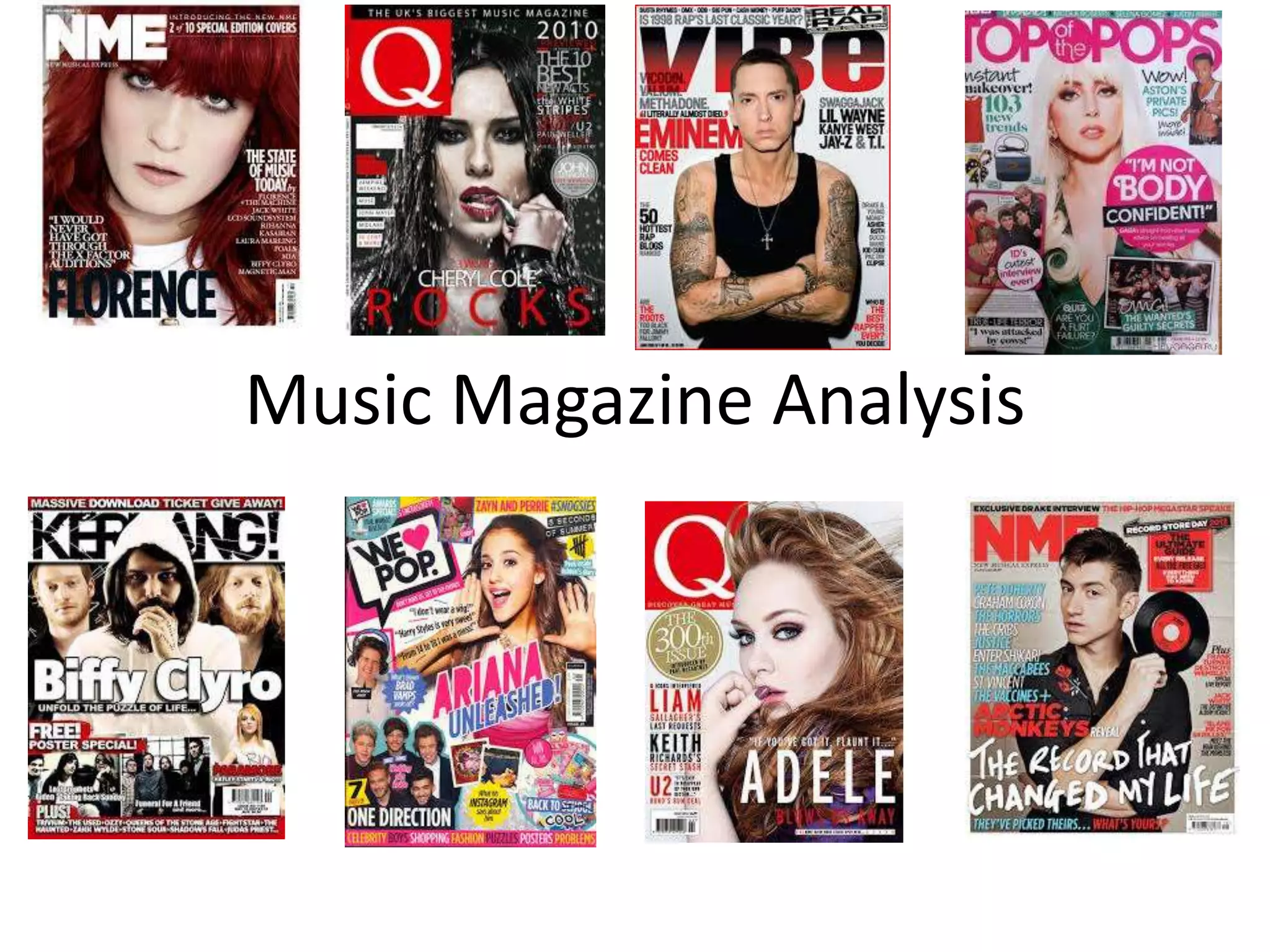
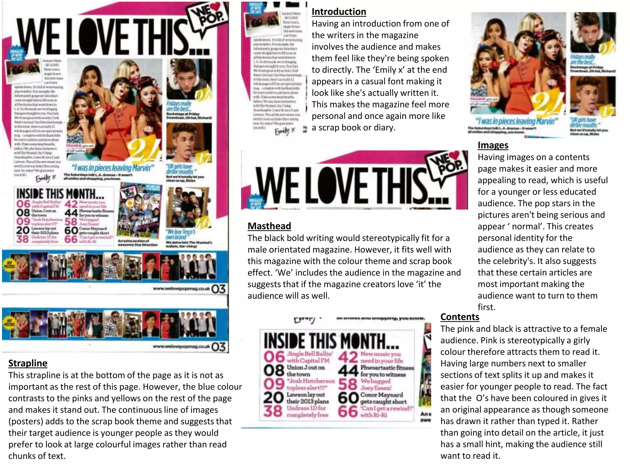
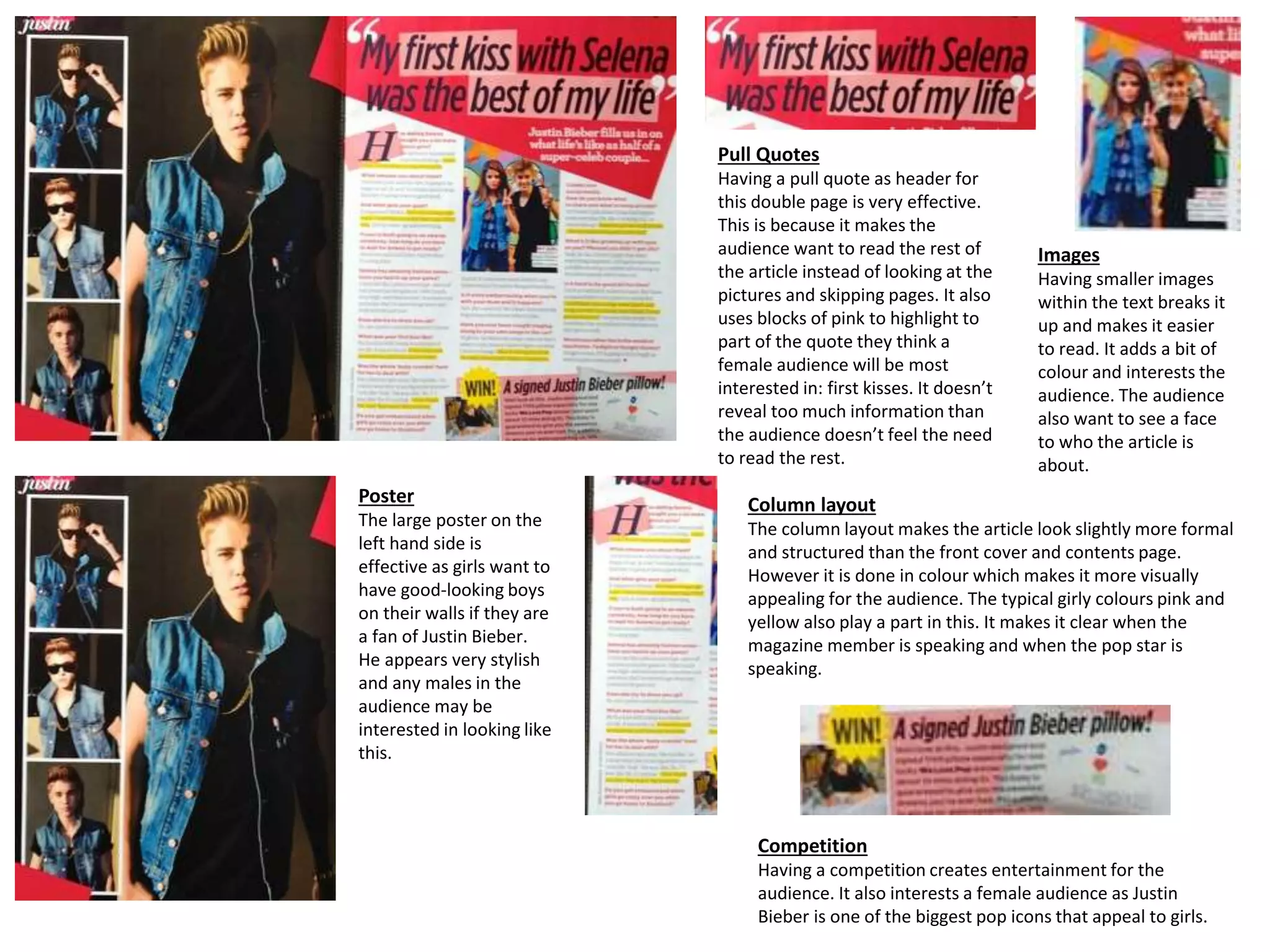
The document analyzes the design elements of various magazine covers and pages.
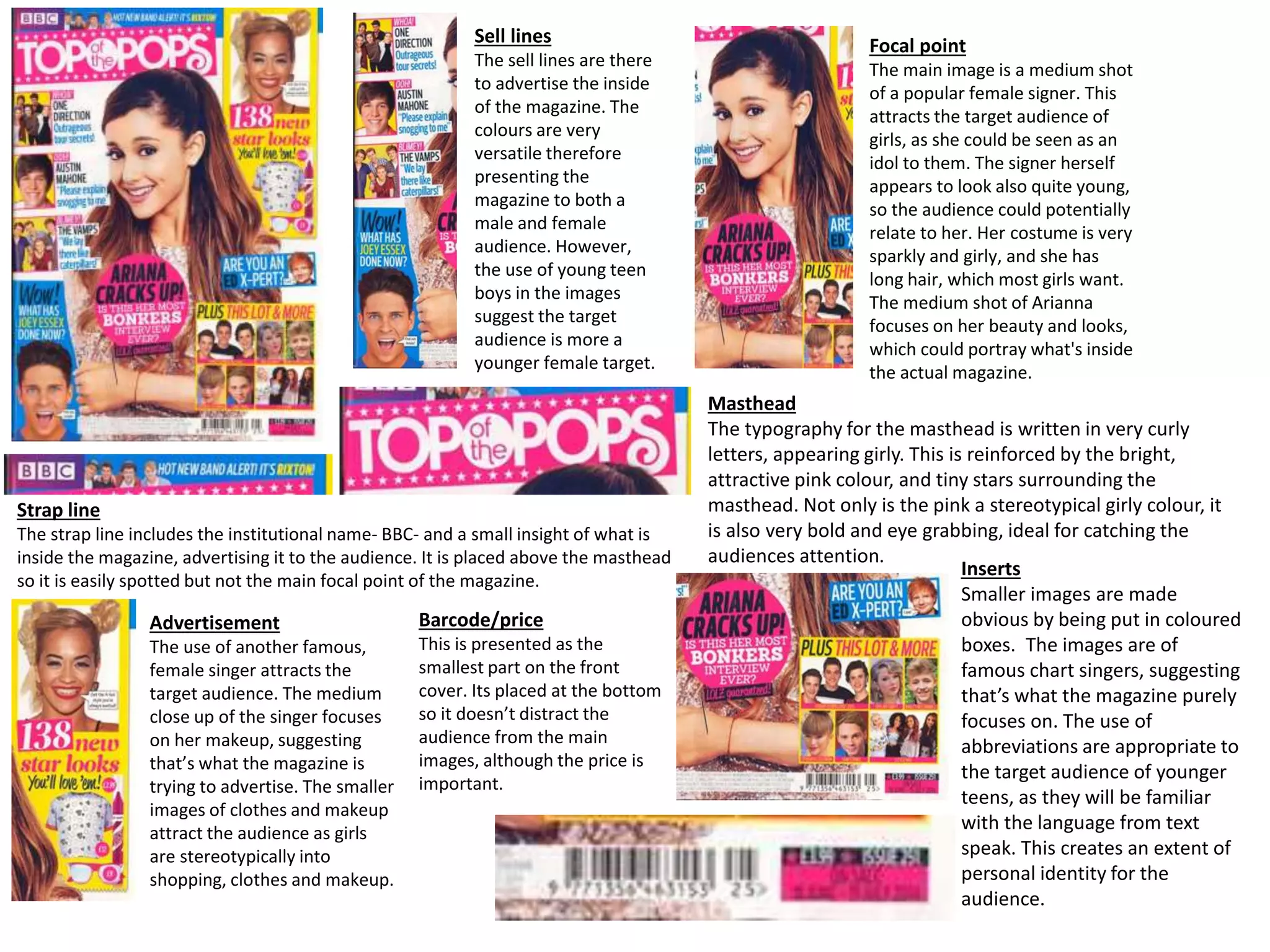
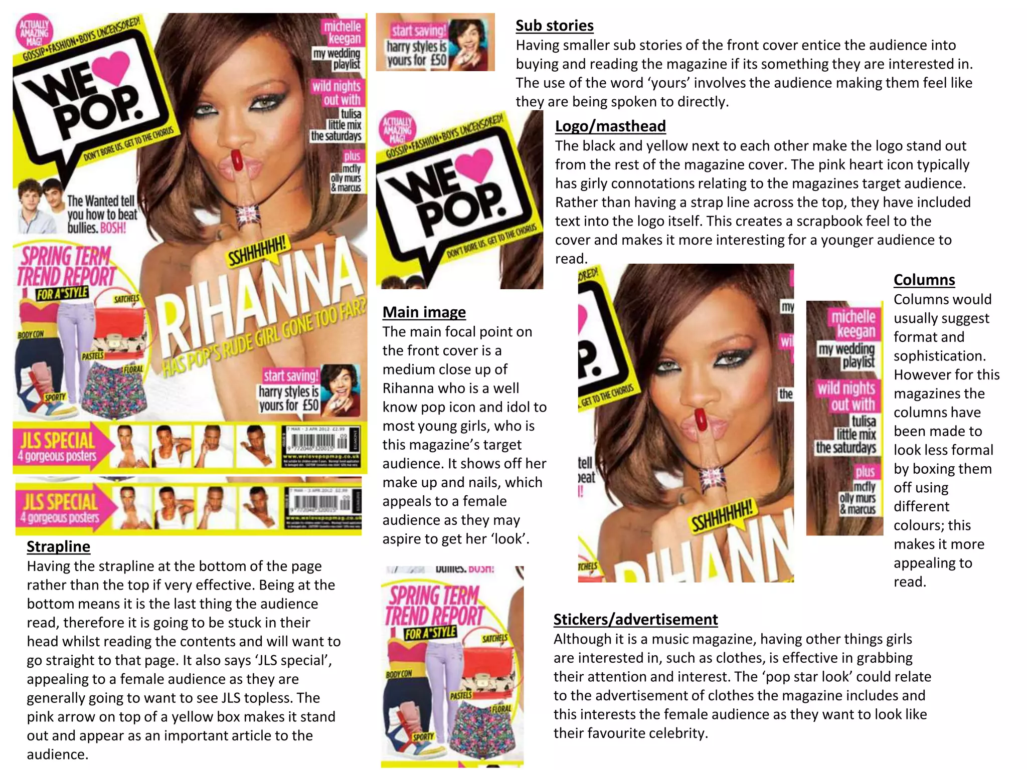
For a music magazine targeted at teenage girls, the cover uses bright pink colors, curly feminine typography, and a close-up photo of a popular young female singer. Smaller images of boy bands are also used to attract the target audience.
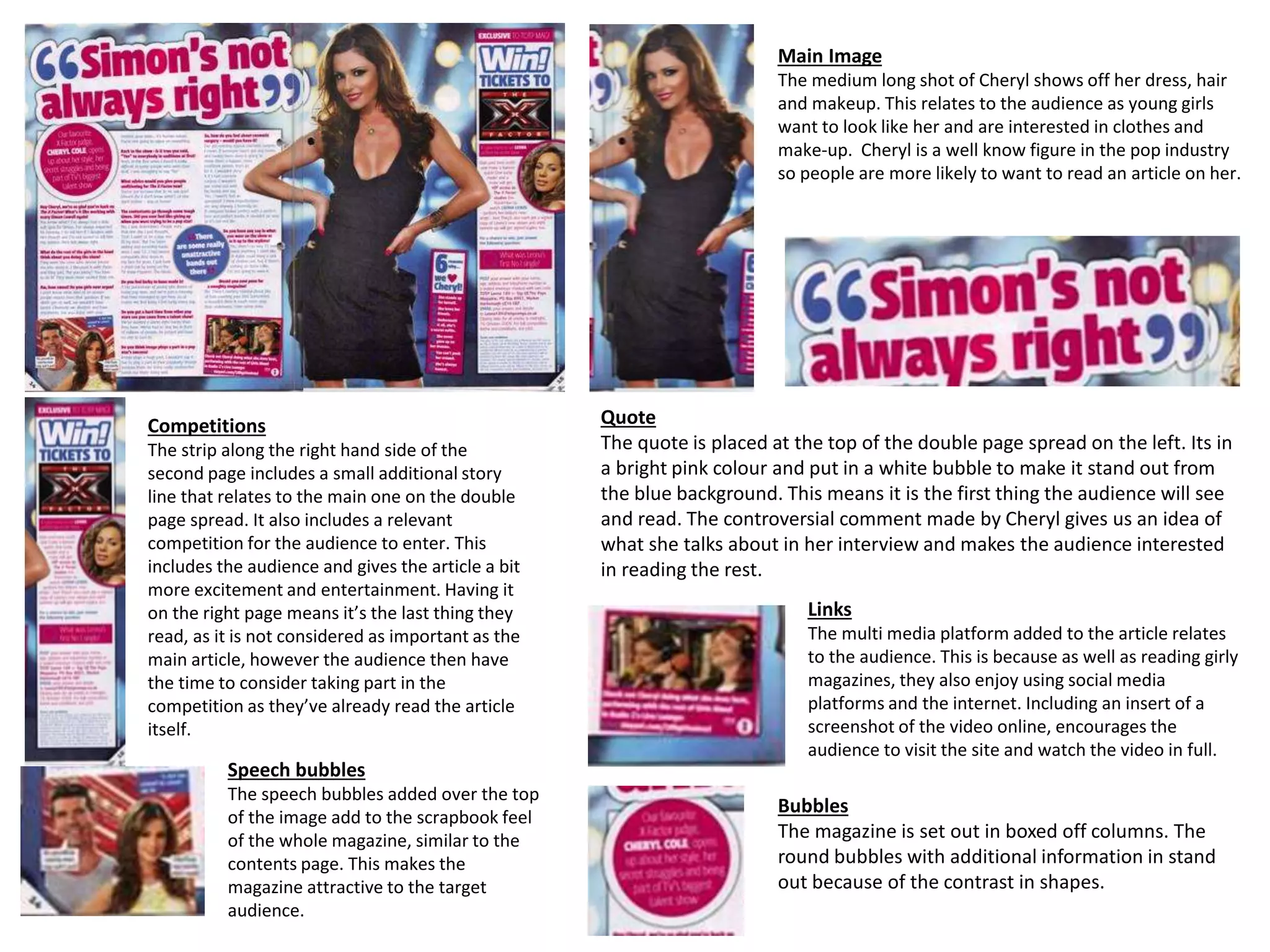
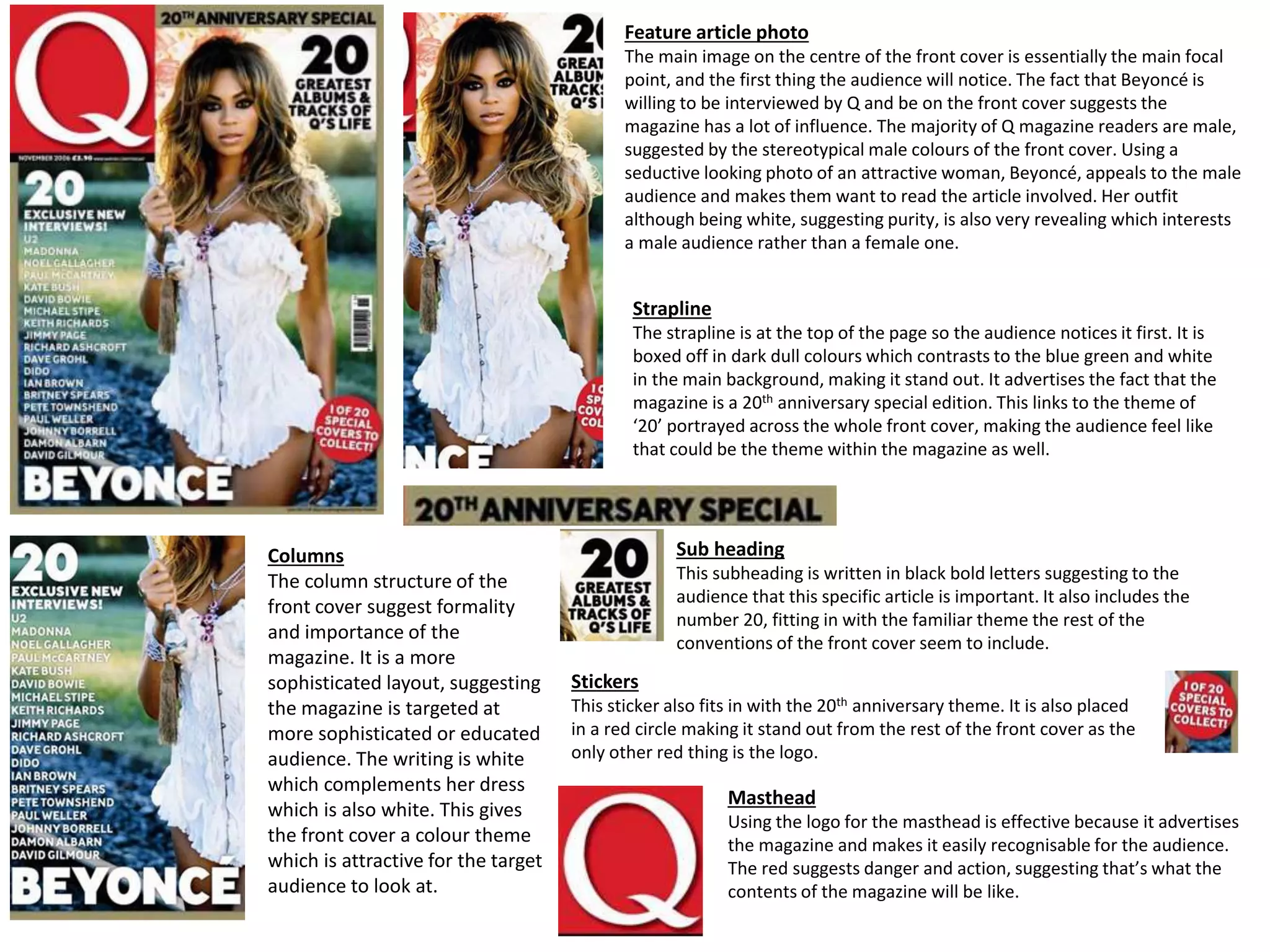
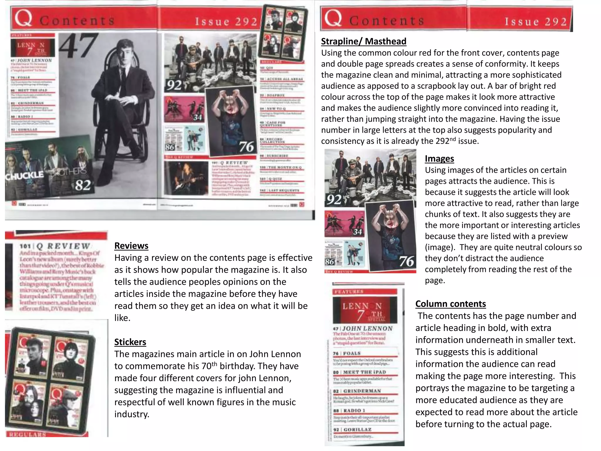
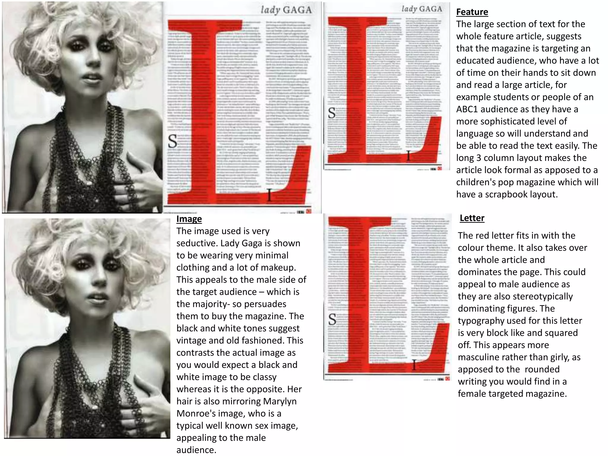
In contrast, a magazine called Q uses a revealing photo of Beyoncé on the cover along with masculine colors and layout, signaling its target audience is primarily adult males.
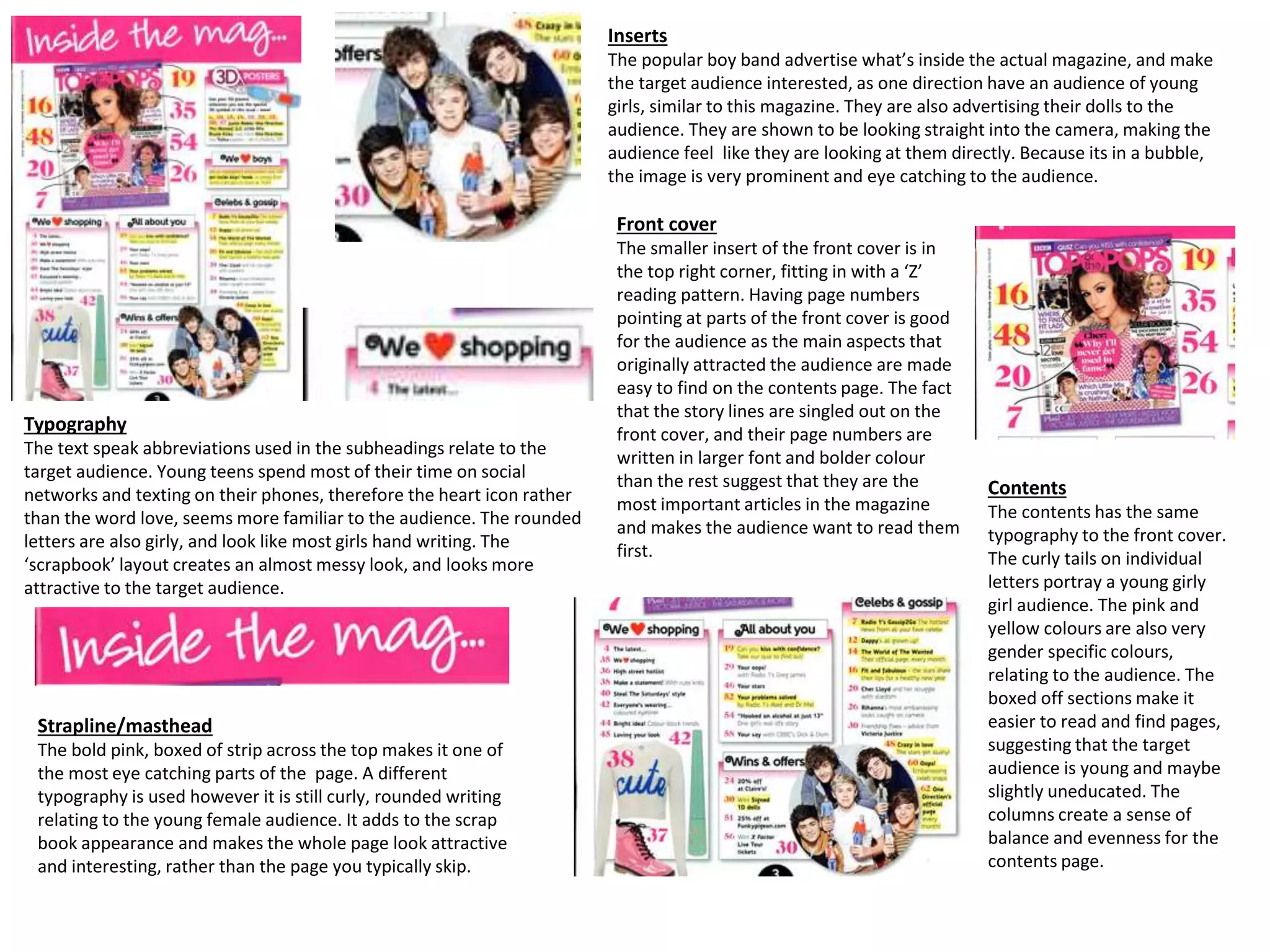
The contents of a magazine aimed at teenage girls uses pink and yellow colors, rounded letters, and images next to article titles to make it easier for a younger audience to read.
2. Sell lines
The sell lines are there
to advertise the inside
of the magazine. The
colours are very
versatile therefore
presenting the
magazine to both a
male and female
audience. However,
the use of young teen
boys in the images
suggest the target
audience is more a
younger female target.
Focal point
The main image is a medium shot
of a popular female signer. This
attracts the target audience of
girls, as she could be seen as an
idol to them. The signer herself
appears to look also quite young,
so the audience could potentially
relate to her. Her costume is very
sparkly and girly, and she has
long hair, which most girls want.
The medium shot of Arianna
focuses on her beauty and looks,
which could portray what's inside
the actual magazine.
Masthead
The typography for the masthead is written in very curly
letters, appearing girly. This is reinforced by the bright,
attractive pink colour, and tiny stars surrounding the
masthead. Not only is the pink a stereotypical girly colour, it
is also very bold and eye grabbing, ideal for catching the
audiences attention.
Strap line
The strap line includes the institutional name- BBC- and a small insight of what is
inside the magazine, advertising it to the audience. It is placed above the masthead
so it is easily spotted but not the main focal point of the magazine.
Inserts
Smaller images are made
obvious by being put in coloured
boxes. The images are of
famous chart singers, suggesting
that’s what the magazine purely
focuses on. The use of
abbreviations are appropriate to
the target audience of younger
teens, as they will be familiar
with the language from text
speak. This creates an extent of
personal identity for the
audience.
Barcode/price
This is presented as the
smallest part on the front
cover. Its placed at the bottom
so it doesn’t distract the
audience from the main
images, although the price is
important.
Advertisement
The use of another famous,
female singer attracts the
target audience. The medium
close up of the singer focuses
on her makeup, suggesting
that’s what the magazine is
trying to advertise. The smaller
images of clothes and makeup
attract the audience as girls
are stereotypically into
shopping, clothes and makeup.
3. Inserts
The popular boy band advertise what’s inside the actual magazine, and make
the target audience interested, as one direction have an audience of young
girls, similar to this magazine. They are also advertising their dolls to the
audience. They are shown to be looking straight into the camera, making the
audience feel like they are looking at them directly. Because its in a bubble,
the image is very prominent and eye catching to the audience.
Front cover
The smaller insert of the front cover is in
the top right corner, fitting in with a ‘Z’
reading pattern. Having page numbers
pointing at parts of the front cover is good
for the audience as the main aspects that
originally attracted the audience are made
easy to find on the contents page. The fact
that the story lines are singled out on the
front cover, and their page numbers are
written in larger font and bolder colour
than the rest suggest that they are the
most important articles in the magazine
and makes the audience want to read them
first.
Contents
The contents has the same
typography to the front cover.
The curly tails on individual
letters portray a young girly
girl audience. The pink and
yellow colours are also very
gender specific colours,
relating to the audience. The
boxed off sections make it
easier to read and find pages,
suggesting that the target
audience is young and maybe
slightly uneducated. The
columns create a sense of
balance and evenness for the
contents page.
Typography
The text speak abbreviations used in the subheadings relate to the
target audience. Young teens spend most of their time on social
networks and texting on their phones, therefore the heart icon rather
than the word love, seems more familiar to the audience. The rounded
letters are also girly, and look like most girls hand writing. The
‘scrapbook’ layout creates an almost messy look, and looks more
attractive to the target audience.
Strapline/masthead
The bold pink, boxed of strip across the top makes it one of
the most eye catching parts of the page. A different
typography is used however it is still curly, rounded writing
relating to the young female audience. It adds to the scrap
book appearance and makes the whole page look attractive
and interesting, rather than the page you typically skip.
4. Main Image
The medium long shot of Cheryl shows off her dress, hair
and makeup. This relates to the audience as young girls
want to look like her and are interested in clothes and
make-up. Cheryl is a well know figure in the pop industry
so people are more likely to want to read an article on her.
Quote
The quote is placed at the top of the double page spread on the left. Its in
a bright pink colour and put in a white bubble to make it stand out from
the blue background. This means it is the first thing the audience will see
and read. The controversial comment made by Cheryl gives us an idea of
what she talks about in her interview and makes the audience interested
in reading the rest.
Competitions
The strip along the right hand side of the
second page includes a small additional story
line that relates to the main one on the double
page spread. It also includes a relevant
competition for the audience to enter. This
includes the audience and gives the article a bit
more excitement and entertainment. Having it
on the right page means it’s the last thing they
read, as it is not considered as important as the
main article, however the audience then have
the time to consider taking part in the
competition as they’ve already read the article
itself.
Links
The multi media platform added to the article relates
to the audience. This is because as well as reading girly
magazines, they also enjoy using social media
platforms and the internet. Including an insert of a
screenshot of the video online, encourages the
audience to visit the site and watch the video in full.
Speech bubbles
The speech bubbles added over the top
of the image add to the scrapbook feel
of the whole magazine, similar to the
contents page. This makes the
magazine attractive to the target
audience.
Bubbles
The magazine is set out in boxed off columns. The
round bubbles with additional information in stand
out because of the contrast in shapes.
5. Feature article photo
The main image on the centre of the front cover is essentially the main focal
point, and the first thing the audience will notice. The fact that Beyoncé is
willing to be interviewed by Q and be on the front cover suggests the
magazine has a lot of influence. The majority of Q magazine readers are male,
suggested by the stereotypical male colours of the front cover. Using a
seductive looking photo of an attractive woman, Beyoncé, appeals to the male
audience and makes them want to read the article involved. Her outfit
although being white, suggesting purity, is also very revealing which interests
a male audience rather than a female one.
Strapline
The strapline is at the top of the page so the audience notices it first. It is
boxed off in dark dull colours which contrasts to the blue green and white
in the main background, making it stand out. It advertises the fact that the
magazine is a 20th anniversary special edition. This links to the theme of
‘20’ portrayed across the whole front cover, making the audience feel like
that could be the theme within the magazine as well.
Columns
The column structure of the
front cover suggest formality
and importance of the
magazine. It is a more
sophisticated layout, suggesting
the magazine is targeted at
more sophisticated or educated
audience. The writing is white
which complements her dress
which is also white. This gives
the front cover a colour theme
which is attractive for the target
audience to look at.
Sub heading
This subheading is written in black bold letters suggesting to the
audience that this specific article is important. It also includes the
number 20, fitting in with the familiar theme the rest of the
conventions of the front cover seem to include.
Stickers
This sticker also fits in with the 20th anniversary theme. It is also placed
in a red circle making it stand out from the rest of the front cover as the
only other red thing is the logo.
Masthead
Using the logo for the masthead is effective because it advertises
the magazine and makes it easily recognisable for the audience.
The red suggests danger and action, suggesting that’s what the
contents of the magazine will be like.
6. Strapline/ Masthead
Using the common colour red for the front cover, contents page
and double page spreads creates a sense of conformity. It keeps
the magazine clean and minimal, attracting a more sophisticated
audience as apposed to a scrapbook lay out. A bar of bright red
colour across the top of the page makes it look more attractive
and makes the audience slightly more convinced into reading it,
rather than jumping straight into the magazine. Having the issue
number in large letters at the top also suggests popularity and
consistency as it is already the 292nd issue.
Reviews
Having a review on the contents page is effective
as it shows how popular the magazine is. It also
tells the audience peoples opinions on the
articles inside the magazine before they have
read them so they get an idea on what it will be
like.
Images
Using images of the articles on certain
pages attracts the audience. This is
because it suggests the article will look
more attractive to read, rather than large
chunks of text. It also suggests they are
the more important or interesting articles
because they are listed with a preview
(image). They are quite neutral colours so
they don’t distract the audience
completely from reading the rest of the
page.
Stickers
The magazines main article in on John Lennon
to commemorate his 70th birthday. They have
made four different covers for john Lennon,
suggesting the magazine is influential and
respectful of well known figures in the music
industry.
Column contents
The contents has the page number and
article heading in bold, with extra
information underneath in smaller text.
This suggests this is additional
information the audience can read
making the page more interesting. This
portrays the magazine to be targeting a
more educated audience as they are
expected to read more about the article
before turning to the actual page.
7. Feature
The large section of text for the
whole feature article, suggests
that the magazine is targeting an
educated audience, who have a lot
of time on their hands to sit down
and read a large article, for
example students or people of an
ABC1 audience as they have a
more sophisticated level of
language so will understand and
be able to read the text easily. The
long 3 column layout makes the
article look formal as apposed to a
children's pop magazine which will
have a scrapbook layout.
LetterImage
The image used is very
seductive. Lady Gaga is shown
to be wearing very minimal
clothing and a lot of makeup.
This appeals to the male side of
the target audience – which is
the majority- so persuades
them to buy the magazine. The
black and white tones suggest
vintage and old fashioned. This
contrasts the actual image as
you would expect a black and
white image to be classy
whereas it is the opposite. Her
hair is also mirroring Marylyn
Monroe's image, who is a
typical well known sex image,
appealing to the male
audience.
The red letter fits in with the
colour theme. It also takes over
the whole article and
dominates the page. This could
appeal to male audience as
they are also stereotypically
dominating figures. The
typography used for this letter
is very block like and squared
off. This appears more
masculine rather than girly, as
apposed to the rounded
writing you would find in a
female targeted magazine.
8. Strapline
Having the strapline at the bottom of the page
rather than the top if very effective. Being at the
bottom means it is the last thing the audience
read, therefore it is going to be stuck in their
head whilst reading the contents and will want to
go straight to that page. It also says ‘JLS special’,
appealing to a female audience as they are
generally going to want to see JLS topless. The
pink arrow on top of a yellow box makes it stand
out and appear as an important article to the
audience.
Sub stories
Having smaller sub stories of the front cover entice the audience into
buying and reading the magazine if its something they are interested in.
The use of the word ‘yours’ involves the audience making them feel like
they are being spoken to directly.
Logo/masthead
The black and yellow next to each other make the logo stand out
from the rest of the magazine cover. The pink heart icon typically
has girly connotations relating to the magazines target audience.
Rather than having a strap line across the top, they have included
text into the logo itself. This creates a scrapbook feel to the
cover and makes it more interesting for a younger audience to
read.
Main image
The main focal point on
the front cover is a
medium close up of
Rihanna who is a well
know pop icon and idol to
most young girls, who is
this magazine’s target
audience. It shows off her
make up and nails, which
appeals to a female
audience as they may
aspire to get her ‘look’.
Stickers/advertisement
Although it is a music magazine, having other things girls
are interested in, such as clothes, is effective in grabbing
their attention and interest. The ‘pop star look’ could relate
to the advertisement of clothes the magazine includes and
this interests the female audience as they want to look like
their favourite celebrity.
Columns
Columns would
usually suggest
format and
sophistication.
However for this
magazines the
columns have
been made to
look less formal
by boxing them
off using
different
colours; this
makes it more
appealing to
read.
9. Introduction
Having an introduction from one of
the writers in the magazine
involves the audience and makes
them feel like they're being spoken
to directly. The ‘Emily x’ at the end
appears in a casual font making it
look like she's actually written it.
This makes the magazine feel more
personal and once again more like
a scrap book or diary.
Images
Having images on a contents
page makes it easier and more
appealing to read, which is useful
for a younger or less educated
audience. The pop stars in the
pictures aren't being serious and
appear ‘ normal’. This creates
personal identity for the
audience as they can relate to
the celebrity's. It also suggests
that these certain articles are
most important making the
audience want to turn to them
first.
Masthead
The black bold writing would stereotypically fit for a
male orientated magazine. However, it fits well with
this magazine with the colour theme and scrap book
effect. ‘We’ includes the audience in the magazine and
suggests that if the magazine creators love ‘it’ the
audience will as well.
Strapline
This strapline is at the bottom of the page as it is not as
important as the rest of this page. However, the blue colour
contrasts to the pinks and yellows on the rest of the page
and makes it stand out. The continuous line of images
(posters) adds to the scrap book theme and suggests that
their target audience is younger people as they would
prefer to look at large colourful images rather than read
chunks of text.
Contents
The pink and black is attractive to a female
audience. Pink is stereotypically a girly
colour therefore attracts them to read it.
Having large numbers next to smaller
sections of text splits it up and makes it
easier for younger people to read. The fact
that the O’s have been coloured in gives it
an original appearance as though someone
has drawn it rather than typed it. Rather
than going into detail on the article, it just
has a small hint, making the audience still
want to read it.
10. Pull Quotes
Having a pull quote as header for
this double page is very effective.
This is because it makes the
audience want to read the rest of
the article instead of looking at the
pictures and skipping pages. It also
uses blocks of pink to highlight to
part of the quote they think a
female audience will be most
interested in: first kisses. It doesn’t
reveal too much information than
the audience doesn’t feel the need
to read the rest.
Images
Having smaller images
within the text breaks it
up and makes it easier
to read. It adds a bit of
colour and interests the
audience. The audience
also want to see a face
to who the article is
about.
Poster
The large poster on the
left hand side is
effective as girls want to
have good-looking boys
on their walls if they are
a fan of Justin Bieber.
He appears very stylish
and any males in the
audience may be
interested in looking like
this.
Competition
Having a competition creates entertainment for the
audience. It also interests a female audience as Justin
Bieber is one of the biggest pop icons that appeal to girls.
Column layout
The column layout makes the article look slightly more formal
and structured than the front cover and contents page.
However it is done in colour which makes it more visually
appealing for the audience. The typical girly colours pink and
yellow also play a part in this. It makes it clear when the
magazine member is speaking and when the pop star is
speaking.
11. Summary
Most music magazines have similar conventions such as the
layout for double page spreads. Most music magazines have a
focal point on the front cover, generally being a medium close up
of a well known musician/singer. I found that the magazines
aimed more at younger girls had conventions such as ‘emojis’
and girly colours, where as magazines for an older audience such
as NME, are more dull colours and sophisticated layouts.