Ecological Succession. ( ECOSYSTEM, B. Pharmacy, 1st Year, Sem-II, Environmen...
NME Double Page Analysis
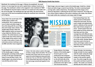
1. Masthead: the masthead of this page is ‘Mission Accomplished’, the word
mission is in very large font size and in capital letters making it stand out on
the page. The masthead is similar to the magazine’s main masthead of ‘NME’
the masthead has two font styles in order for it to stand out to the reader and
the rest of the page. The masthead over laps each other, the word mission
covers part of the word accomplished making the masthead more interesting
and intriguing.
Main Image: only one image is used on the double page. A bold fun, cheeky
black and white image is used of Lana Del Rey. The artist is wearing looped
earrings with a white netted dress. The background of the image is of an
American flag which is reflecting the fact the artist is American. The image also
has a direct mode of address as the artist is winking as the reader, this entices
the reader while also creating fun and unique style of image.
House Style: the overall style of the
double page is modern and
professional. This is created by the
use of a black and white image of
the artist along with the use of light
blue and orange colour scheme. The
double page spread is taken the
NME magazine which are known for
using simple but effective colour
schemes. The article features a drop
capital at the start of the article and
in the middle of the article in order
to make it clear where it starts, this
extremely common technique used
by NME and other music magazines.
Text Content/Type Face: the
article consists of information
related the mast head. The text
used is simple and sophisticated
which is reflective of the Lana Del
Rey’s style of lyrics and genre of
music. Certain quotes have also
been pulled out of the article and
have been put into a blue
rectangle box with different sizes
and colour of text featured within
it, in order to stand out from the
rest of the article. Number figures
have been used in the box to
entice and intrigue readers are to
what they mean and how they
relate to the artist.
Target Audience: the target audience
of the double page is a young
demographic consisting mainly of girls
as they are the type of people that
listen to Lana Del Rey’s music. The
double page is also aimed at fans of
Lana Del Rey and her music.
Colour: the main colours used on the page
are blue, orange, black and white. The use of
the blue and orange makes the text stand out
against the white background along with black
article text. The use of the blue could be linked
to the United States flag used on the page. The
blue and orange contrast well together on the
page.
Design Balance: the design
balance of the double page is
formal to give it a more
professional and composed
look. The image is positioned
on the left hand side of the
page with all the article text
positioned on the right in neat
and structured columns.
Design Principle: the Gutenberg
design principle has been applied
with the reader seeing the image
of the artist winking enticing
readers in the primary optical
area. The artists image the main
focus point and draw in point for
readers. The reader can instantly
identify who the article is about.
NME Magazine Double Page Analysis