Organic Name Reactions for the students and aspirants of Chemistry12th.pptx
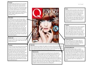
Florence Welch Q Front Cover
1. Masthead
centred in the top left hand corner. The use of the
bright red behind the white ‘Q’ really makes the
magazines name stand out and make it the first
thing you see. Formal font is used and is quite big. It
is extremely noticeable as it is in the top left hand
corner where people look first as we read left to
right. The selling line really shows the magazines
popularity ‘Discover great music’ this also attracts a
variety of different target audiences that are
interested in music.
Amy Fogarty
Colour
the colours used are red, white and blue, they are all
contrasting colours that allow each other to stand
out. The main cover line and the other cover lines
stand out against the main cover image due to the
intense red colour of her hair. It could also be
suggested that the use of red, white and blue could
be representing the United Kingdom flag as Florence
Welch is British. The colours could be used to show
that she is a successful British artist and that she
should be proud.
Main image
an extreme close up is used of Florence Welch’s
face. This shows the audience who the magazine is
featured on. She is looking straight at the audience
of the magazine this is a great use of direct address,
it catches and draws in people’s attention. Blue eye
shadow is used around her eyes to enhance and
draw the audience’s attention to her face. The
image has high key lighting and is illuminated, this
makes her really stand out against the brightness
and intense red colour of her hair. It could also be
suggested that the image is quite provocative with
her lips being parted and the heavy use of make-up
around her eyes could also draw in male attention
towards the magazine.
Typefaces
the text used on the front cover is easy to read due to
the text on the page being in bold, block capitals
which is sans serif meaning more people may
purchase the magazine as it is easy to read. The text
is also in different sizes to fit on the cover and also
show to the audience that there is a lot of content
within the magazine resulting in the wanting to buy it
as the coverlines draw them in to read the full story.
Model credit
this goes along with the cover line as it has been
merged into one. Popular model is used and it also
clearly states who it is.
Coverlines
all of the cover lines are situated around the outside
of the main image of Florence Welch, this shows
people that she is the main focus of the front cover
not the cover lines. Each cover line vary in size but
all consistent with the use of white bold block
capitals this also makes the main image of Florence
Welch stand out as the white goes well with the
brightness and intense red colour of her hair making
them easy to read. Each cover line is separated by a
small blue dash this shows where each cover line
ends while the blue links with the blue eye shadow
around Florence’s eyes.
House Style
the house style will run throughout the magazine. The colours used are red, white and blue
they all contrast and make the other colours stand out. All the wording and cover lines are
in block capitals which will make it more eye catching and will also make the reader want to
read it as it may be important. The font is easy for the readers to read.
Main cover line
the main cover line is situated at the top right hand corner of the magazine
cover, it is partially covering the main cover image of Florence Welch. It is a lot
bigger in size compared to the other cover lines suggesting it to be the main
cover line. It also shows that the main cover line is linked to the main cover
image and it is also one of the first things you see when looking at the magazine.
The main cover line also stands out as two different fonts are used, as well as the
use of two different sizes of font with the artists name being the biggest font.
The words are quite dramatic and in return makes the audience want to buy the
magazine in order to find out what Florence is talking about.
Photography lighting
high key lighting is used, the image is bright and
illuminated, making Florence Welch look flawless.
This also contrasts with the darkness of the artists
hair colour, making the cover standout.
Design Principles Used?
The Gutenberg design principle is used quite
effectively. In the primary optical area there is the
mast head to make it the first thing that the audience
see when they pick up the magazine. The mast head
is in big bold lettering making it stand out. Barcodes
have been put in the fallow area as that area isn’t as
important and is the last area that the audience look
at. The axis of orientation is also used well and is also
easy to read this makes it more appealing to the
reader.